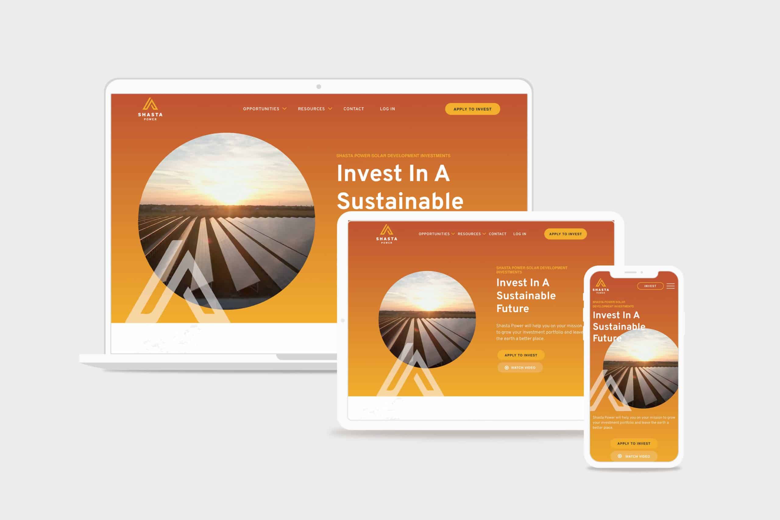
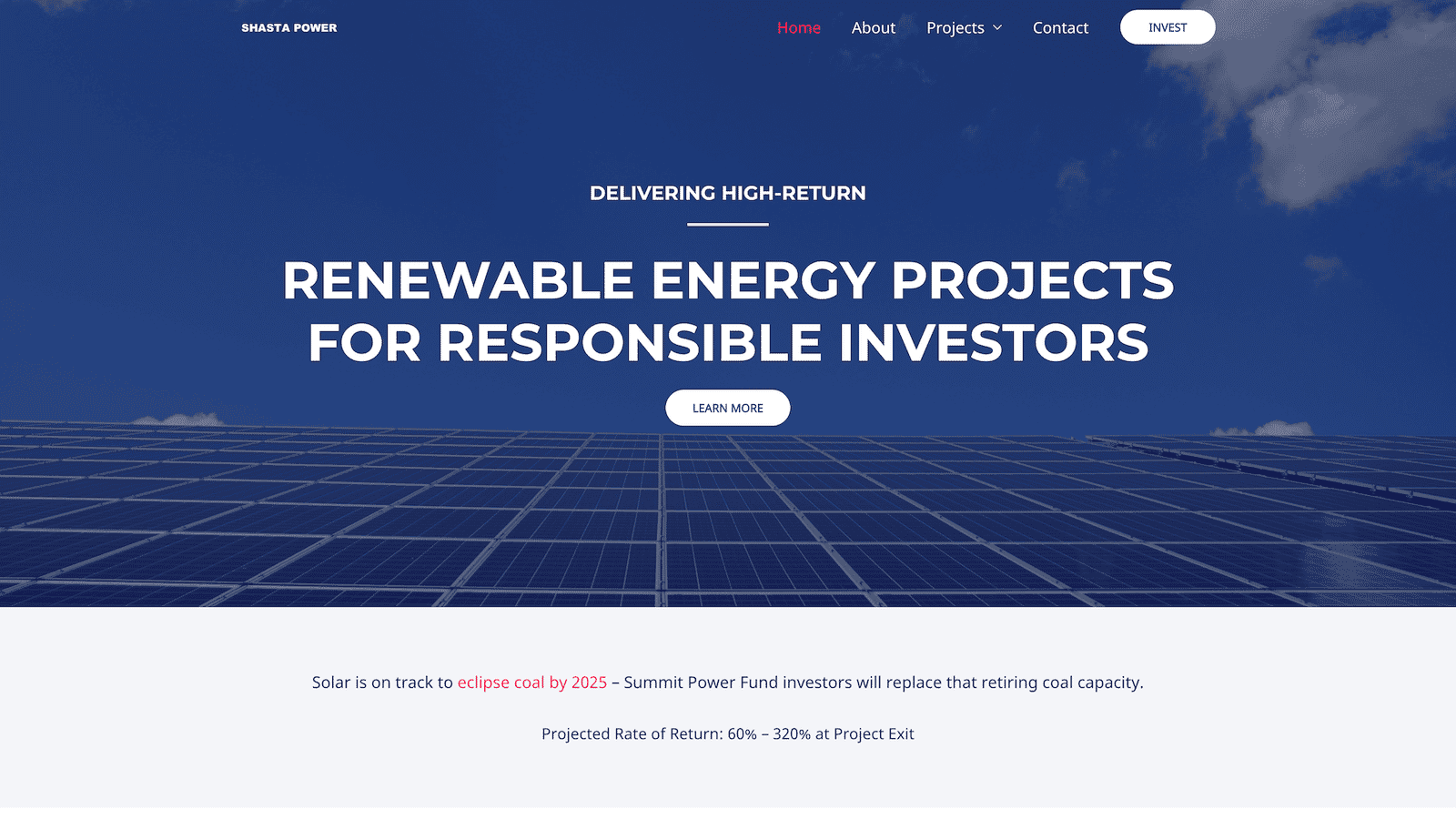
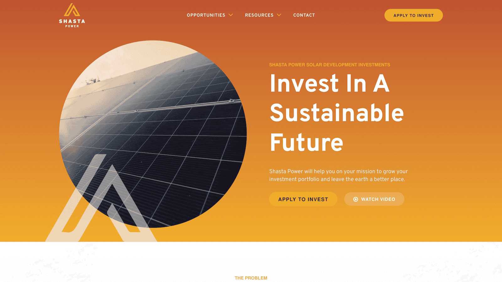
Shasta Power came to us with an outdated, confusing website that didn’t represent their offering well. So we helped them revise their visual identity and message—culminating in an impactful website redesign.

Challenge
Shasta Power built its first website on a budget. It was time to invest in a professional website, but the other website design and development firms Shasta Power spoke to wanted to throw them into a box. They didn’t listen or care about the business or user’s needs.
Solution
We took Shasta Power through our Website Process, starting with understanding the website goals. We then did a brand refresh and designed a custom, responsive website. The website development was on WordPress and integrated its business systems with the website
Results
Awareness metrics have risen across the board, including new followers and site visitors, up over 600% and 200%, respectively. We worked quickly against a short timeline while maintaining an impressive quality standard for the brand.


If I had to boil it down to one thing, I would say their integrity is their best quality. I get a sense of honesty and quality from them; they take their work seriously and do it in a professional manner.
max roe, partner

Logo Design
When Shasta Power came to us, they didn’t have an official logo. So the first thing we did was explore logo options for their new website design. We delivered a handful of comps, ideas, and styles for them to review. After a few iterations, we landed on a logo that was strong, confident and represented Mount Shasta—the symbol behind the brand.
Similarly, Shasta Power didn’t have any colors representing its product or mission. As a company as a solar investment firm, we developed a pallet that represented the earthy nature of their work. We lead with a solid orange and yellow gradient, with supporting blue, green, and clay colors representing the environments they develop in.
Website Design
As with all website design, you can’t have a great beautiful site that makes no sense. So we invested heavily in information architecture, wireframing, and content development. This strategic process helped ensure the site helped users progress through the content and was simple and easy to understand—all the while representing Shasta Power in its best light. Once we had the blueprint down, we applied the brand, and it turned out beautifully.
Shasta Power wanted to use its website to generate leads, so we built a custom webinar registration flow. This included a landing page template they could use and replicate for any webinars they host for marketing or customer engagement. Additionally, it had a registration form and a webinar video page where they could embed their live content for users to engage with.
Website Development
Shasta power was familiar with WordPress CMS, which we love to build with. So we built their new site in a very similar way to their old site using a custom theme and Advanced Custom Fields content editing fields. This kept the entire experience familiar and allows them to swap out photos and make copy changes when they want to without worrying they’re going to break anything.
On the front end, Shasta Power added an Animation Package so that the content fades smoothly as a user scrolls down the site. This small addition makes a massive difference for the user and helps them stay focused on the contact right in front of them while guiding them through the site.
Website Management
Shasta Power took advantage of our Startup Website Management Package, so they didn’t have to worry about regularly updating WordPress core, theme, or plug-ins. They also appreciated being able to reach out to us here and there to update content on the site or ask questions without starting a new project.
Moreover, Shasta power has trusted us as an ongoing partner to help them grow their website through additional digital marketing initiatives.

