Tag: advanced custom fields

  • Shasta Power Website Redesign

    Shasta Power Website Redesign

    Shasta Power came to us with an outdated, confusing website that didn’t represent their offering well. So we helped them revise their visual identity and message—culminating in an impactful website redesign.
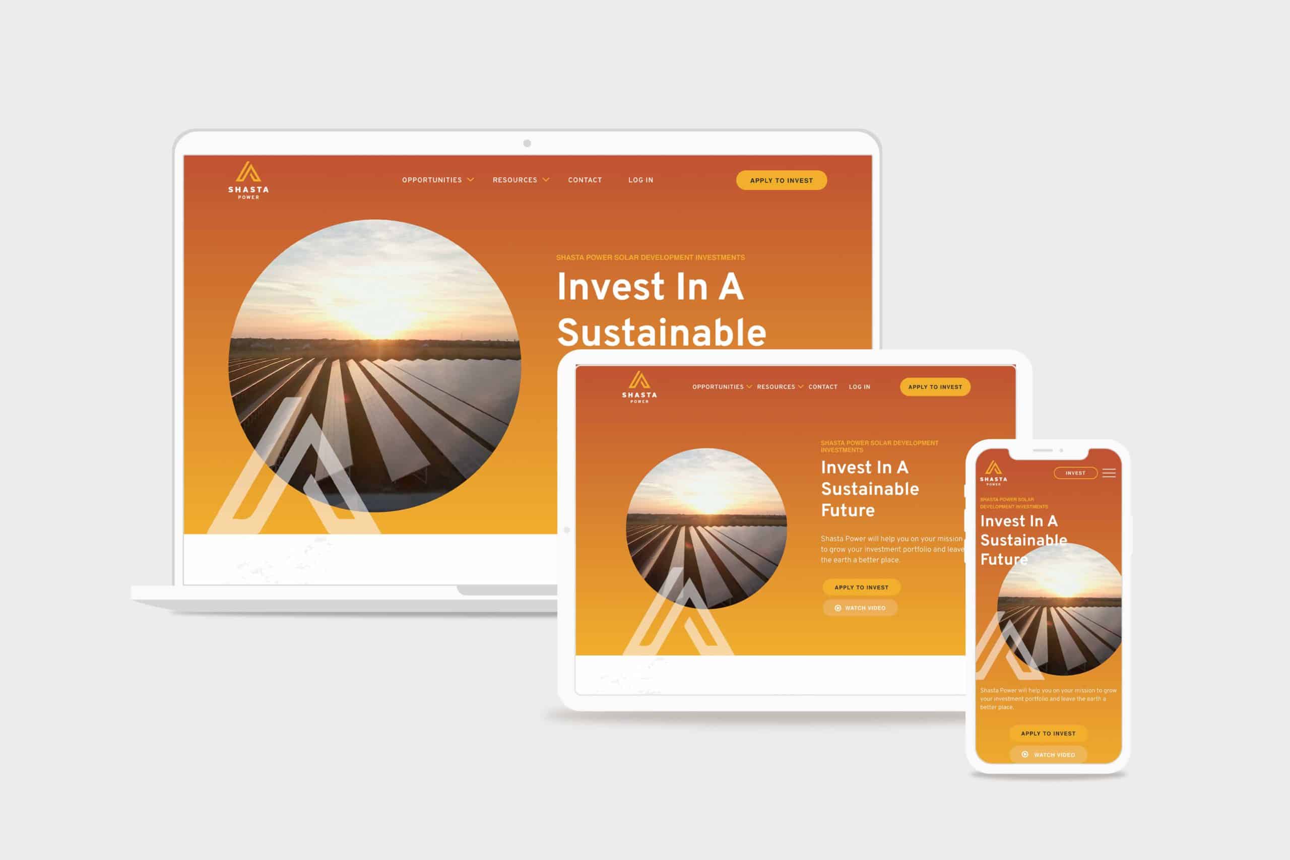
    Shasta Power Website Redesign Hero
    shasta power hero

    Challenge

    Shasta Power built its first website on a budget. It was time to invest in a professional website, but the other website design and development firms Shasta Power spoke to wanted to throw them into a box. They didn’t listen or care about the business or user’s needs.

    Solution

    We took Shasta Power through our Website Process, starting with understanding the website goals. We then did a brand refresh and designed a custom, responsive website. The website development was on WordPress and integrated its business systems with the website

    Results

    Awareness metrics have risen across the board, including new followers and site visitors, up over 600% and 200%, respectively. We worked quickly against a short timeline while maintaining an impressive quality standard for the brand.
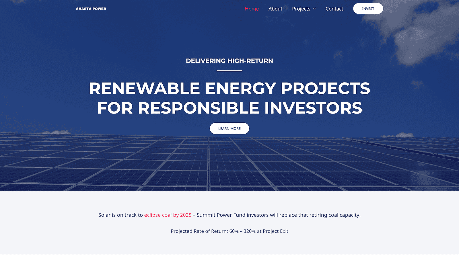
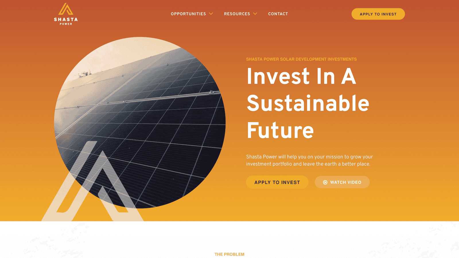
    Shasta Power Website Redesign Before
    shastapower.com before
    Shasta Power Website Redesign After
    shastapower.com after

    If I had to boil it down to one thing, I would say their integrity is their best quality. I get a sense of honesty and quality from them; they take their work seriously and do it in a professional manner.

    max roe, partner
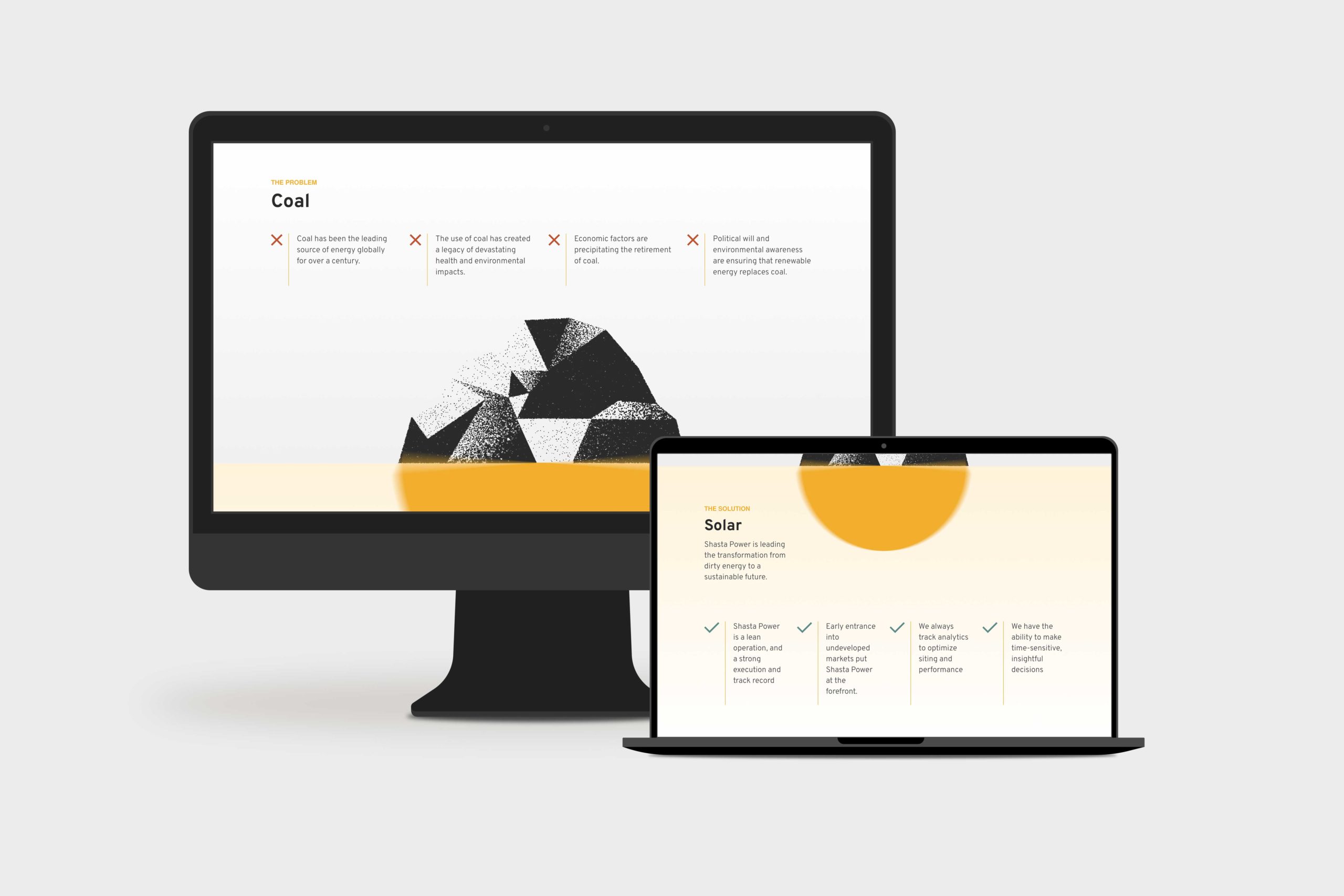
    Shasta Power Website Redesign Product Page
    summit power fund product page

    Logo Design

    When Shasta Power came to us, they didn’t have an official logo. So the first thing we did was explore logo options for their new website design. We delivered a handful of comps, ideas, and styles for them to review. After a few iterations, we landed on a logo that was strong, confident and represented Mount Shasta—the symbol behind the brand.

    Similarly, Shasta Power didn’t have any colors representing its product or mission. As a company as a solar investment firm, we developed a pallet that represented the earthy nature of their work. We lead with a solid orange and yellow gradient, with supporting blue, green, and clay colors representing the environments they develop in.

    Website Design

    As with all website design, you can’t have a great beautiful site that makes no sense. So we invested heavily in information architecture, wireframing, and content development. This strategic process helped ensure the site helped users progress through the content and was simple and easy to understand—all the while representing Shasta Power in its best light. Once we had the blueprint down, we applied the brand, and it turned out beautifully.

    Shasta Power wanted to use its website to generate leads, so we built a custom webinar registration flow. This included a landing page template they could use and replicate for any webinars they host for marketing or customer engagement. Additionally, it had a registration form and a webinar video page where they could embed their live content for users to engage with.

    Website Development

    Shasta power was familiar with WordPress CMS, which we love to build with. So we built their new site in a very similar way to their old site using a custom theme and Advanced Custom Fields content editing fields. This kept the entire experience familiar and allows them to swap out photos and make copy changes when they want to without worrying they’re going to break anything.

    On the front end, Shasta Power added an Animation Package so that the content fades smoothly as a user scrolls down the site. This small addition makes a massive difference for the user and helps them stay focused on the contact right in front of them while guiding them through the site.

    Website Management

    Shasta Power took advantage of our Startup Website Management Package, so they didn’t have to worry about regularly updating WordPress core, theme, or plug-ins. They also appreciated being able to reach out to us here and there to update content on the site or ask questions without starting a new project.

    Moreover, Shasta power has trusted us as an ongoing partner to help them grow their website through additional digital marketing initiatives.

  • Warrick

    Warrick

    Repositioning a 20-year leadership consultancy around the work it had grown into

    For more than 20 years, James Warrick had advised CEOs and leadership teams at companies including Nike, Intel, Merrill Lynch, and Williams Sonoma.

    His work had evolved considerably over that time.

    His brand hadn’t.

    People encountering James online often assumed he was a traditional life or executive coach. That description wasn’t technically wrong, but it no longer captured the caliber of the work, the clients he served, or the role he actually played in their lives and organizations.

    James wanted to enter the market in a new way.

    The problem was that after two decades inside the business, he was too close to it to clearly articulate what made his work different.

    That’s where we started.


    The Challenge

    Warrick didn’t need a prettier website.

    It needed clarity about what the company had become.

    The existing brand—Take Flight Coaching—was rooted in an earlier chapter of James’ career. His reputation and client work had moved far beyond it, but his positioning, language, and digital presence still told the old story.

    Before creating anything, we needed to understand:

    • How that strategy should shape the name, language, identity, and customer experience
    • Why accomplished CEOs actually hired James
    • What they experienced in the relationship that was difficult to describe
    • Which problems James was uniquely equipped to solve
    • What his company should stand for going forward

    Discovery before answers

    Rather than beginning with assumptions about what the new brand should look or sound like, I started with discovery.

    I interviewed James and five longtime clients to understand the company from both sides of the relationship.

    We explored why clients initially engaged him, what changed through the work, why they continued working with him, and what differentiated James from other coaches and advisors.

    We also worked through his beliefs, mission, vision, values, character, and ambitions for the next chapter of the business.

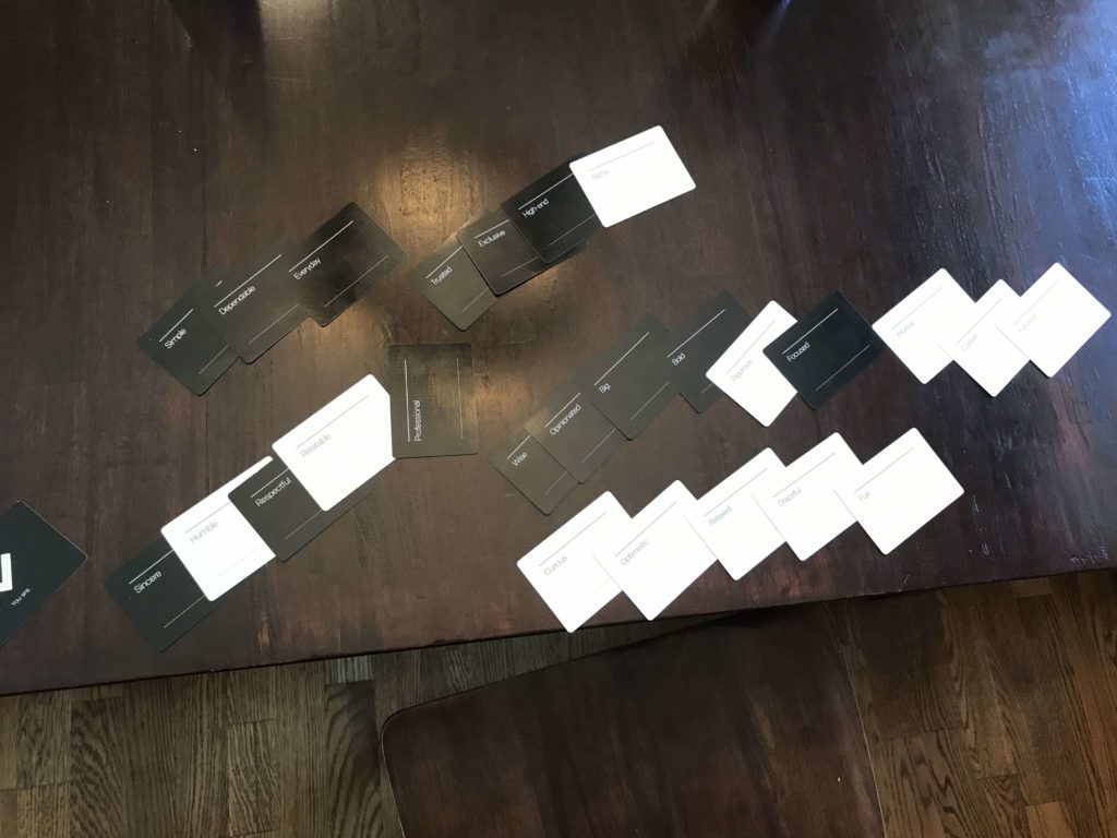
    Strategy Workshop: Brand Character & Personality Exploration

    A deeper pattern began to emerge.

    Clients weren’t simply hiring James to become better professional leaders.

    They relied on him for the confidence, clarity, and perspective required to make difficult decisions and move forward.

    James wasn’t merely coaching leaders.

    He had become a leader to leaders.

    “We now have a framework for how to communicate and a clear plan for leveraging our brand with new and existing clients. My brand is stronger than it’s ever been.”

    James Warrick, Principal


    Turning insight into strategy

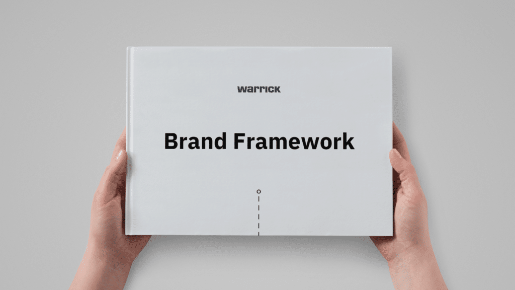
    The discovery work became a 27-page Brand Framework that gave James and his team a shared foundation for the business.

    Warrick Brand Framework: Cover

    It included:

    • Customer insight and motivations
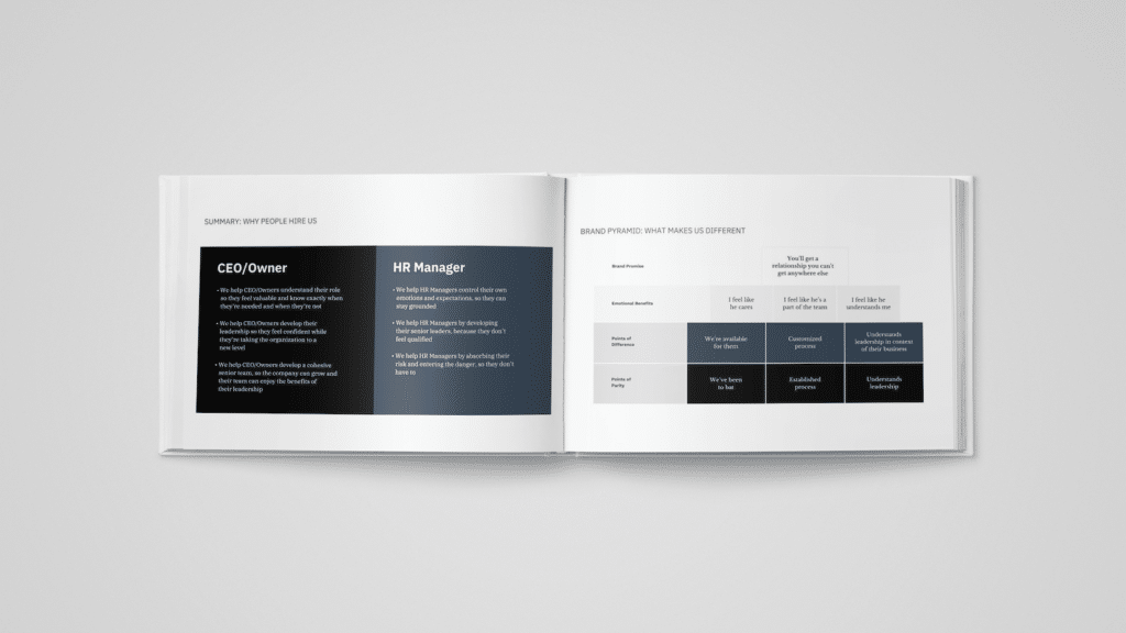
    • Three differentiated value propositions
    • Mission, vision, and values
    • Brand character and personality
    • Voice and messaging direction
    • Brand pyramid
    • Strategic principles for future marketing and communication

    The framework mattered because it created more than marketing language.

    It gave the team a common understanding of who they were, who they served, why the work mattered, and how to make future decisions consistently.

    Warrick Brand Framework: Value Propositions (left) & Brand Pyramid (right)

    Becoming Warrick

    The strategy also exposed a fundamental issue with the existing name.

    “Take Flight Coaching” reinforced the exact perception we were trying to move beyond.

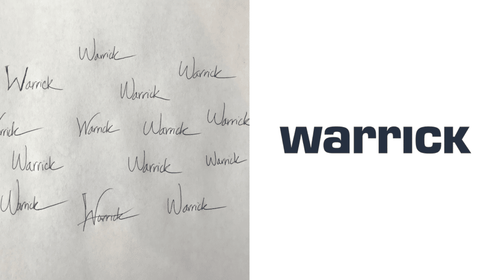
    We developed 13 naming directions using a structured naming process and evaluated them against the company’s positioning and long-term ambitions.

    Then we discovered something hiding in plain sight:

    Warrick means “strong leader.”

    The name connected naturally to James’ own identity, the work he had spent decades doing, and the people he served.

    The decision became obvious.

    Take Flight Coaching became Warrick.

    From there, the team developed a bold typographic identity designed to preserve the simplicity and authority of the name.

    Original logo sketches (left) & Final Warrick logomark

    Turning the strategy into an experience

    The next question was how the brand should actually feel.

    One phrase from James’ work became especially important.

    At the end of a meeting, he would often ask:

    “What’s our movement?”

    It captured something central to the brand: clarity should result in forward motion.

    That idea became a creative principle for the website experience.

    Rather than simply publishing a new brochure site, we used movement and interaction throughout the experience to guide visitors deeper into the Warrick story and reinforce the feeling of progress.

    The final experience brought together:

    • Brand strategy
    • Positioning and messaging
    • Naming
    • Creative direction
    • Copywriting
    • Information architecture
    • UX strategy
    • Visual and motion design
    • Front-end and back-end development

    The website wasn’t the strategy.

    It was the expression of the strategy.


    The result

    Warrick emerged with a brand that finally reflected the work clients had already been experiencing for years.

    The project gave James:

    • A clearer articulation of his value
    • A deeper understanding of his customers
    • A differentiated market position
    • A new company name and identity
    • A shared language for his team
    • A strategic framework for future decisions
    • A digital experience capable of expressing the caliber of the work

    Most importantly, James had greater clarity and confidence about the direction of the company.

    “Simon and his team were crucial for the direction that I am now taking my company. The relationship I have with Simon is irreplaceable.”

    James Warrick, Principal


    My role

    I led the strategy and discovery process, including founder and client interviews, workshop facilitation, customer insight synthesis, value proposition development, brand positioning, naming, messaging, and content strategy.

    I then translated that strategic foundation into creative direction and worked with Structure’s design and development team to bring the new identity and digital experience to life.

    Strategy

    Brand Strategy
    Customer Research
    Positioning
    Naming
    Messaging
    UX Strategy
    Content Strategy

    Creative

    Creative Direction
    Copywriting
    Identity Direction
    Digital Experience