Category: Website Design

  • Totem Mats Website Redesign & Build

    Totem Mats Website Redesign & Build

    Totem Mats is a leading access mat supplier in the United States, with over 85 production and inventory locations throughout the U.S. They came to Structure because they felt like their website wasn’t competing in the marketplace. They wanted to create an excellent first impression and drive more leads and sales.
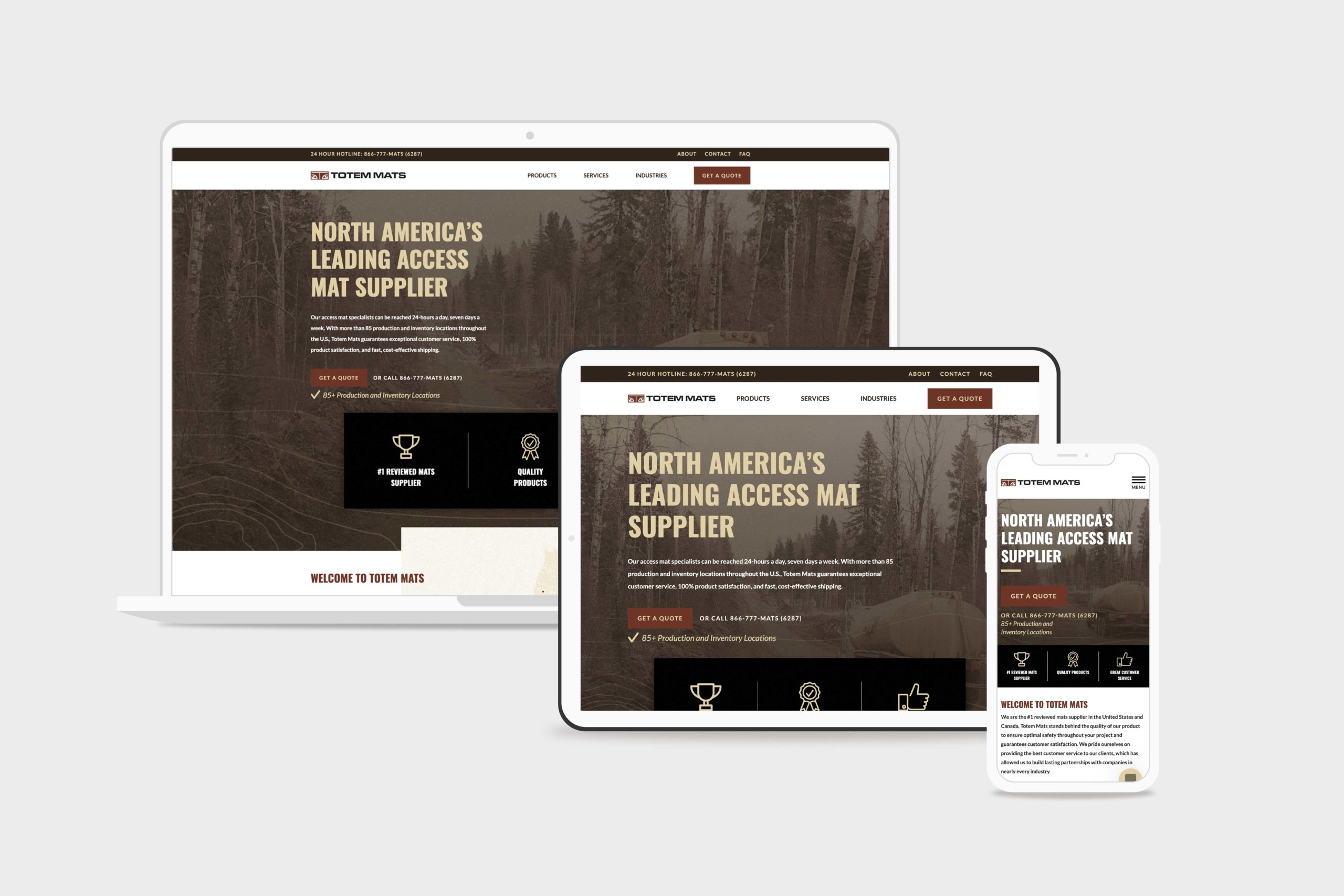
    Totem Mats Website Design & Development

    Challenge

    When Totem Mats contacted Structure, their website was broken, outdated, and underperforming. They needed to be redesigned and rebuilt with a fresh look and additional features without losing traction in Organic search. Furthermore, they needed the leads they generated on the website to feed to Salesforce, their ERP/CRM.

    Solution

    Totem Mats got a facelift from the ground up. We enhanced their overall look and feel with a refined color palette and texture pack, culminating in an updated visual design. Our UX design team restructured the product pages to showcase their products better, and our development team ensured the site was built lean to perform well in low-data environments.

    Results

    The updated Totem Mats WordPress website launched without a hitch, including no noticeable traffic losses. SEO traffic increased by 69%. Lead generation efforts improved and the website automated many business processes that were previously manual, saving time and money. Lastly, the website looks strong and helped the Totem Mats team feel more confident.

    Since the launch of the new website, we have successfully forged ahead with no discernable traffic losses whatsoever. Credit to Simon (Structure) and his meticulousness in executing this project so well. I have personally been involved directly or peripherally in many website redesign projects, and on many occasions, there is a significant drop in SEO traffic after a redesign. We got things right.

    Kyle, totem mats SEO Advisor

    Website Design & Development

    There’s a rule in website design, and that is this: keep what works. In this project, our WordPress website design team aimed to keep what was working for Totem Mats while improving in the underperforming areas.

    For Totem Mats, that was the first impression in their website hero, the navigation, the product pages, and the contact form.

    Transforming the hero

    There’s another rule in web design: if someone isn’t interested in the first five seconds after landing on your website, they will leave.

    So we traded the old Totem Mats hero with something more interesting: a big, tall, and tan Oswald font over a highly designed background image of a tanker truck driving on their access mats.

    There’s nothing like showing the product in action!

    A home page hero should show the transformation or result that your product or service provides. For Totem Mats, that’s access to inaccessible areas.
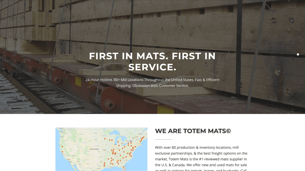
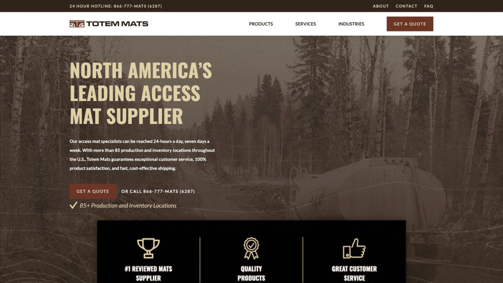
    Totem Mats website before redesign
    totemmats.com before
    Totem Mats website after redesign
    totemmats.com after

    Their continued efforts on everything we threw and their abilities to overcome challenging problems were incredible.

    Trevor, ceo

    Improving the website navigation

    The old Totem Mats website had a navigation menu in the code. Because it was outdated, the menus had broken, leaving no way for customers to find product pages or contact the company. Yikes!

    We prioritized the navigation with a contact menu at the very top, and a primary pages menu below it—including a Get a Quote call-to-action button.

    Enhancing the product pages

    It’s common for some of the most popular pages on a website to be its products or services pages. Typically, those pages are the front door to many website visitors. The same was valid for Totem Mats.

    The only caveat, however, is that many of Totem Mats’ customers would buy multiple products in the same order. Therefore, it was essential to making it easy to navigate between products to compare and contrast. And the Products tab in the navigation menu wasn’t cut it.

    We devised a resource-style category navigation menu so customers could easily navigate through it.

    Driving Leads with a Quote Request Form

    What was previously a simple, boring contact form became a lead generation machine after we added a Quote Request form. 
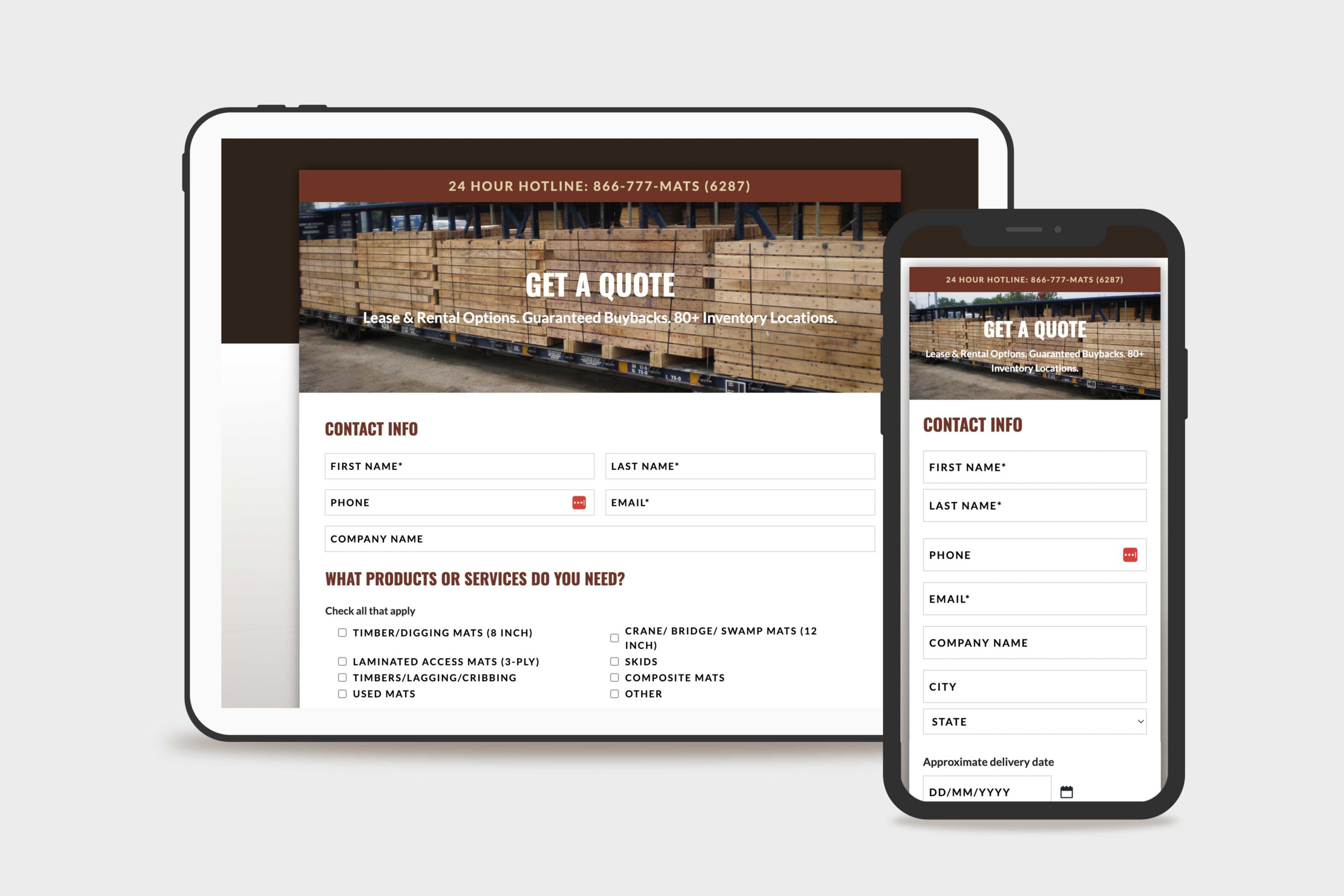
    Totem Mats Quote Form Lead Generation Web Design & Development

    Connecting Gravity Forms to Salesforce

    We mapped specific form fields directly to the Totem Mats Salesforce account so team members could manage every request using the CRM Perks Gravity Forms Salesforce Plugin.

    Getting contact data to map perfectly to Salesforce (or any CRM for that matter) can be a difficult task—as was the case with the Totem Mats quote request Salesforce integration. One challenging field was the Company Name field, as customers from the same company would spell or case the company name differently. The result was Salesforce developed multiple accounts for the same company. This was confusing to the sales team and needed to be remedied.

    We implemented a custom Gravity Forms ZoomInfo integration to create predictions so that quote requesters could quickly add their company name consistently every time. The experience is much like Google autocomplete predictions. The data from the form field is cross-checked with ZoomInfo’s database and sent directly to Salesforce.

    Gravity Forms Split Testing

    The Totem Mats Request a Quote form is lengthy. While it provides an abundance of information for their sales team, they feared it would detract from the number of leads who would fill out the form.

    We answered that question by running an A/B testing campaign using a Gravity Wiz split testing snippet to determine which fields were vital. In this test, we showed three quote form variants to users at an equal ratio and determined which version was filled out the most.

    WordPress Website Management

    Managing a custom WordPress website can be complex, especially when you’re running paid advertising campaigns, relying on it to generate qualified leads, and want to put the best foot forward in the market like Totem Mats.

    They had never paid for professional WordPress website management before. They were hesitant to do so, but after remembering the trouble with their last website and the desire to keep their team focused on other things instead of website management, they decided to hire Structure to help after the launch.

    The most valuable aspect of our Essential WordPress Website Management package to Totem Mats was the ability to have a dedicated Account Manager they could message directly about marketing or website questions—and get a thoughtful, detailed response within 24 hours most of the time.

    In addition, they appreciate having a well-oiled website machine that’s up-to-date, secure, and working for them without having to think much about it regularly.

  • The Expositors Academy E-Course WordPress Website Design & Development

    The Expositors Academy E-Course WordPress Website Design & Development

    OnePassion Ministries, founded by Dr. Steven J. Lawson, came to Structure looking for a professional website to market, sell, and manage their new online course: The Expositors Academy. We came in on the ground floor to define the website strategy, provide a custom design that fits their goals, and develop an e-commerce and learning management system to create a seamless experience for their students.

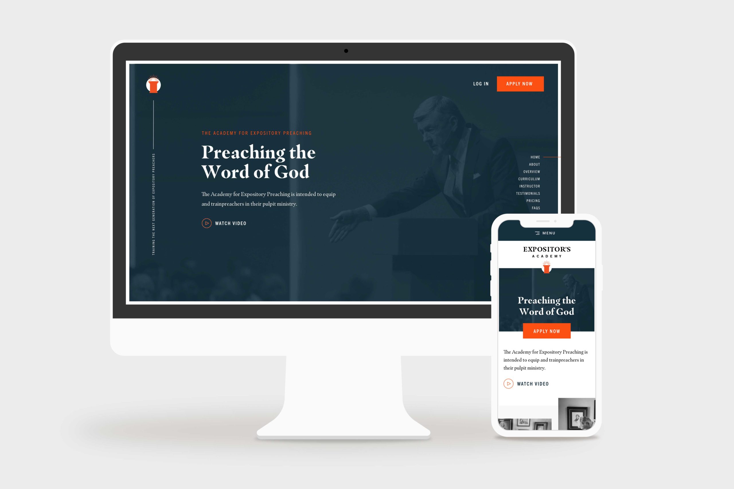
    The Expositors Academy Website Home Page Mockup
    the expositors academy home page hero, desktop and mobile

    Challenge

    One Passion Ministries had never launched a digital product like The Expositors Academy, so they were looking to us for ideas and action. Particularly in coordinating marketing, e-commerce, learning management, and business systems to launch their new course successfully.

    Solution

    Starting with strategy, we took The Expositors Academy through an end-to-end website design and development process. We used a thoughtful platform combination of WordPress, WooCommerce, and LearnDash, to create a first-rate online course experience.

    Results

    Within six months after launch, The Expositors Academy had 125+ students interacting with their platform. Better yet, The Expositors Academy manages the website and the product with little effort—and without constant bugs, issues, and maintenance headaches.

    I have had the opportunity to work closely with Simon and the Structure Team, and I couldn’t recommend them higher. They truly care about the service they provide and ensure that any project they are a part of is delivered with excellence. From creative ideas to execution, they are a professional team that will serve your business well.

    Jackson, Marketing Director

    Website Strategy

    When The Expositors Academy came to us, they were unsure which platforms, systems, or processes they needed to create an online course. 

    As is usually the case, while a website may look simple on the surface, a lot is happening in the background. That’s why we started with a website strategy package to help them plan and define precisely what they needed the website to accomplish.

    They wanted three different payment options, including a subscription option and an option to purchase a course license for another student who couldn’t afford it.

    They also had a remote team of assignment graders who needed to keep track of submitted assignments, provide document markup, and communicate feedback directly to the student.

    Last but not least, they needed to automate email communication to students that weren’t keeping up with the schedule, missing assignment deadlines, or hadn’t logged on for a while.

    Our website strategy team researched the best learning management system to fit their needs. We evaluated different options like Teachable, Thinkific, Kajabi, and others. However, those options didn’t integrate easily with The Expositors Academy business systems and became cost-prohibitive when providing user accounts for dozens of graders to do their work.

    That’s when we landed on LearnDash because it fit their requirements and perfectly supported their sitemap and customer journey. 

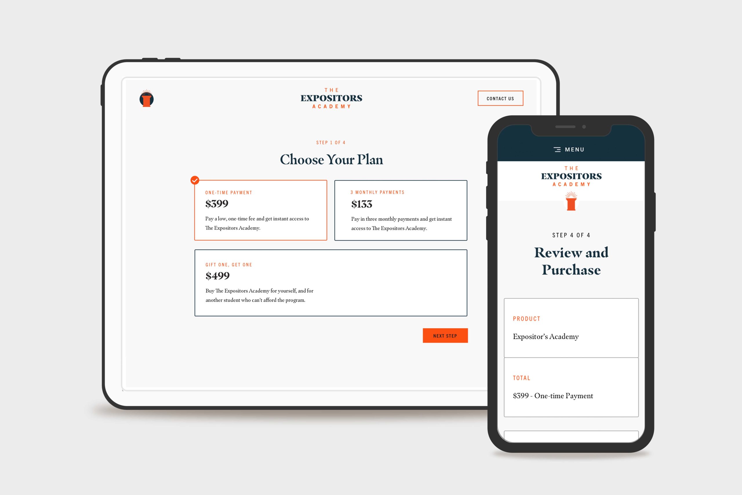
    The Expositors Academy Website Custom WooCommerce Checkout Flow Mockup
    The Expositors Academy Website Custom WooCommerce Checkout

    Website Design

    Next, we began website design. The website design process resulted in 15 screens of ready-to-build, fully-responsive marketing, ecommerce, and online course designs.

    Marketing Website Design

    To keep the website simple and fees as low as possible, we designed a simple three-page marketing website to generate leads. The three pages were Home, Application, and Contact.

    • Prospective students could learn about the course and curriculum on the home page.
    • They could apply for the program on the application page and ensure they were the right fit.
    • On the contact page, users could ask questions or inquire about details they needed clarification on.

    E-commerce Design

    Furthermore, we designed a custom e-commerce experience that seamlessly guided students through Payment Options, Checkout, and Account Creation for the course. When they finished the checkout process, they were logged into the course and ready to start.

    Learning Management System Design

    Lastly, we customized the LearnDash course dashboard by combining The Expositors Academy brand styles with the default layouts provided by the plugin (including a few interface improvements, of course!).

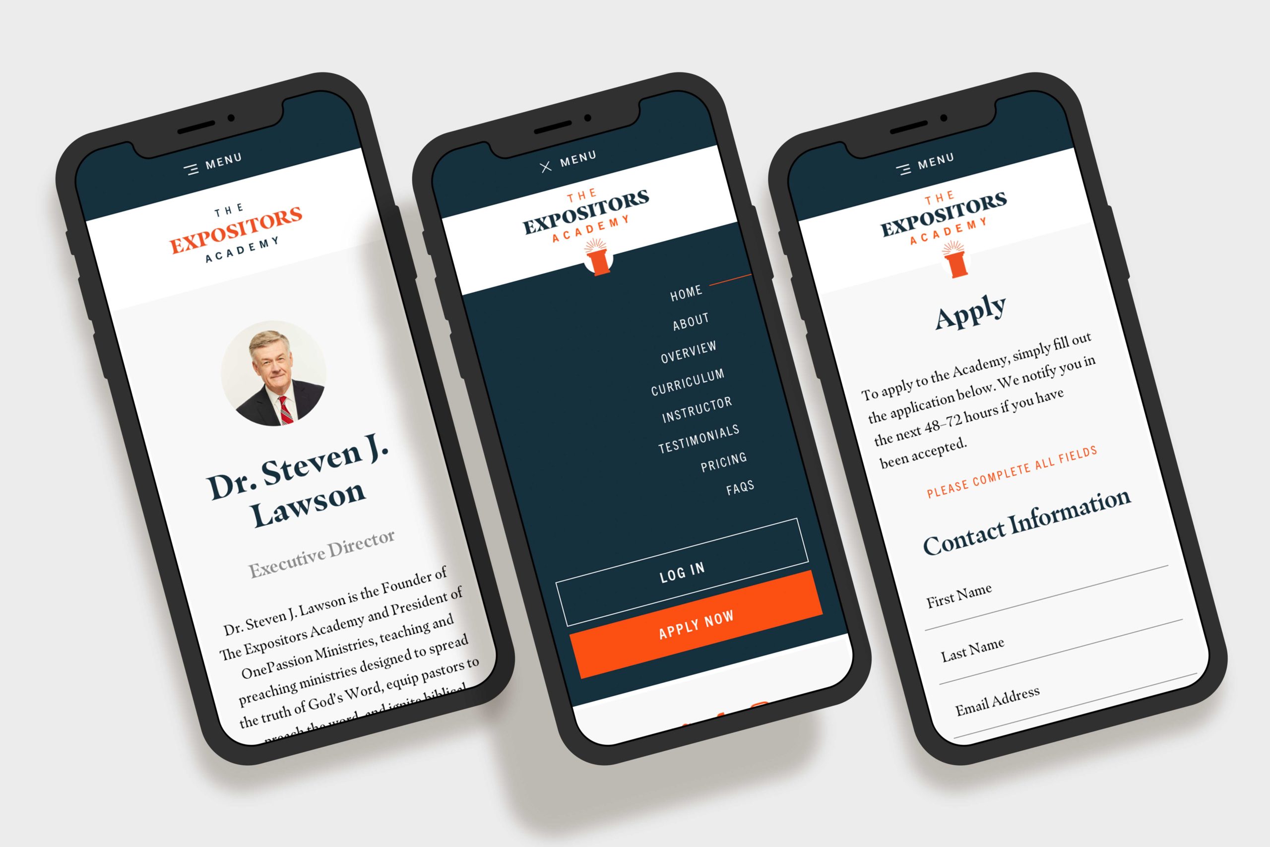
    The Expositors Academy Website Mobile Mockups
    The Expositors Academy Mobile Mockups

    Website Development

    The Expositors Academy was already familiar with WordPress CMS since we used it to build OnePassion.org, one of the other websites. 

    Front-end Website Development

    We developed a custom theme for The Expositors Academy built according to the design spec. We included custom Javascript animations from the Animate On Scroll Library to enhance user experience.

    Additionally, the website design called for a few other features like a nested accordion to house the curriculum information, an on-page navigation to help the user navigate the landing page sections, and a dynamic testimonial carousel.

    Back-end Website development

    We used WordPress and the LearnDash LMS WordPress plugin as the learning management platform. It was a helpful integration, so they could keep their marketing site and learning management system in the same place (and not have to manage multiple platforms).

    Using Genesis Custom Blocks with embedded Custom Fields, we set up the backend so they could edit the website content independently without breaking any formatting.

    Then, we integrated WooCommerce with WordPress and LearnDash, which made product creation, payment processing, order tracking, and more a breeze. Not to mention keeping the entire customer journey under one roof, from awareness to advocacy.

    QA, Training, and Support

    After populating the content we’d written and doing a thorough quality assurance process, we trained The Expositors Academy on a recorded video call. They walked away from the call with a thorough understanding of how the site worked and a recording and documentation for future reference.

    Final Thoughts

    The Expositors Academy online course WordPress website design and website development project is one we’re proud to share. It took months of united planning and preparation, with an incredible result.

    Ultimately, the website platform we built allowed the OnePassion Ministries team to enter the market in a new way and further their vision of training new expositors—and helping them reform the church.

    For additional reading, we designed and developed the nonprofit website for OnePassion Ministries at OnePassion.org .

  • Shasta Power Website Redesign

    Shasta Power Website Redesign

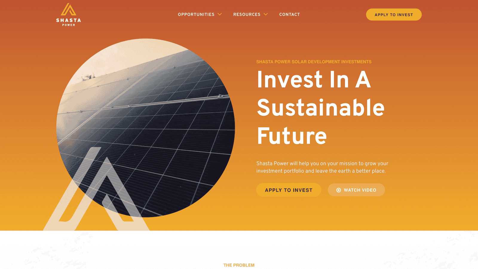
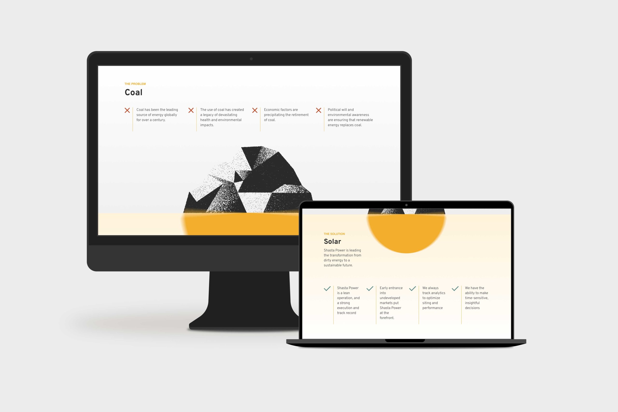
    Shasta Power came to us with an outdated, confusing website that didn’t represent their offering well. So we helped them revise their visual identity and message—culminating in an impactful website redesign.

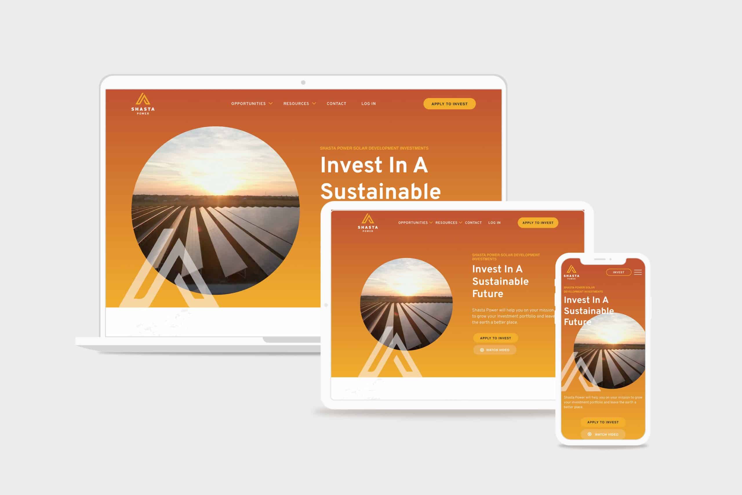
    Shasta Power Website Redesign Hero
    shasta power hero

    Challenge

    Shasta Power built its first website on a budget. It was time to invest in a professional website, but the other website design and development firms Shasta Power spoke to wanted to throw them into a box. They didn’t listen or care about the business or user’s needs.

    Solution

    We took Shasta Power through our Website Process, starting with understanding the website goals. We then did a brand refresh and designed a custom, responsive website. The website development was on WordPress and integrated its business systems with the website

    Results

    Awareness metrics have risen across the board, including new followers and site visitors, up over 600% and 200%, respectively. We worked quickly against a short timeline while maintaining an impressive quality standard for the brand.

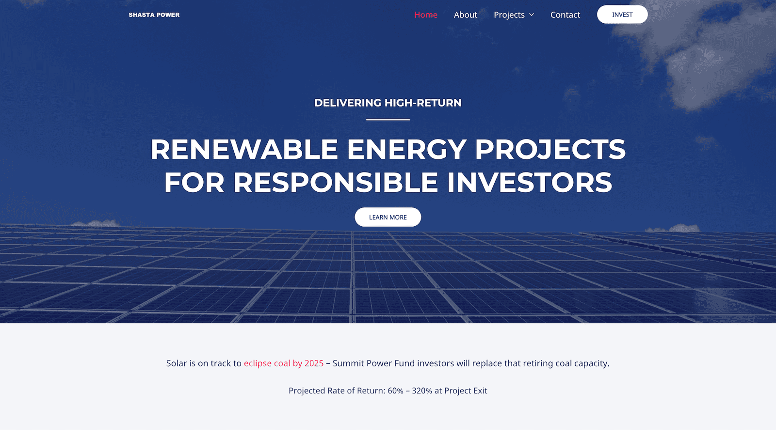
    Shasta Power Website Redesign Before
    shastapower.com before
    Shasta Power Website Redesign After
    shastapower.com after

    If I had to boil it down to one thing, I would say their integrity is their best quality. I get a sense of honesty and quality from them; they take their work seriously and do it in a professional manner.

    max roe, partner
    Shasta Power Website Redesign Product Page
    summit power fund product page

    Logo Design

    When Shasta Power came to us, they didn’t have an official logo. So the first thing we did was explore logo options for their new website design. We delivered a handful of comps, ideas, and styles for them to review. After a few iterations, we landed on a logo that was strong, confident and represented Mount Shasta—the symbol behind the brand.

    Similarly, Shasta Power didn’t have any colors representing its product or mission. As a company as a solar investment firm, we developed a pallet that represented the earthy nature of their work. We lead with a solid orange and yellow gradient, with supporting blue, green, and clay colors representing the environments they develop in.

    Website Design

    As with all website design, you can’t have a great beautiful site that makes no sense. So we invested heavily in information architecture, wireframing, and content development. This strategic process helped ensure the site helped users progress through the content and was simple and easy to understand—all the while representing Shasta Power in its best light. Once we had the blueprint down, we applied the brand, and it turned out beautifully.

    Shasta Power wanted to use its website to generate leads, so we built a custom webinar registration flow. This included a landing page template they could use and replicate for any webinars they host for marketing or customer engagement. Additionally, it had a registration form and a webinar video page where they could embed their live content for users to engage with.

    Website Development

    Shasta power was familiar with WordPress CMS, which we love to build with. So we built their new site in a very similar way to their old site using a custom theme and Advanced Custom Fields content editing fields. This kept the entire experience familiar and allows them to swap out photos and make copy changes when they want to without worrying they’re going to break anything.

    On the front end, Shasta Power added an Animation Package so that the content fades smoothly as a user scrolls down the site. This small addition makes a massive difference for the user and helps them stay focused on the contact right in front of them while guiding them through the site.

    Website Management

    Shasta Power took advantage of our Startup Website Management Package, so they didn’t have to worry about regularly updating WordPress core, theme, or plug-ins. They also appreciated being able to reach out to us here and there to update content on the site or ask questions without starting a new project.

    Moreover, Shasta power has trusted us as an ongoing partner to help them grow their website through additional digital marketing initiatives.

  • BeGOAT Website Design

    BeGOAT Website Design

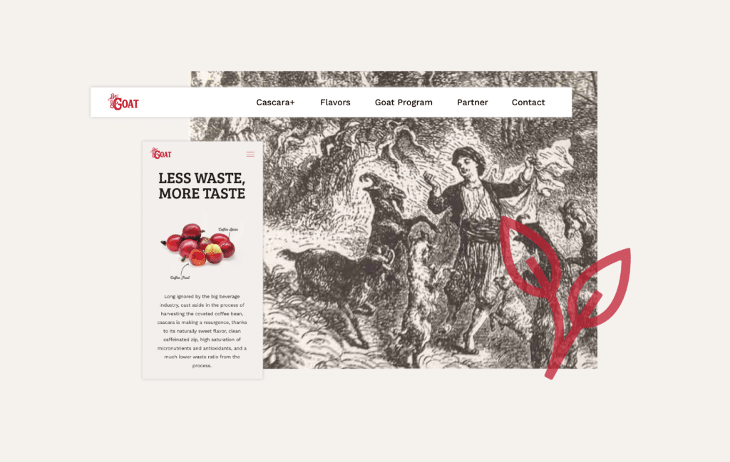
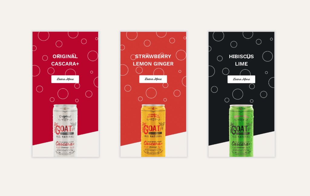
    BeGOAT is an innovative energy drink company that figured out a way to use the trash from coffee fruit and turn it into treasure. We worked to bring their brand to life with a fully-optimized custom website that was interactive and filled with energy.

    The Challenge

    As a new company, BeGOAT needed a website that showcased its product and launched their brand. Our goal for this project was to enable BeGOAT’s core business goals: create demand, deliver distributor leads, and make it easy for current distributors to manage their account and order more product.

    Working closely with RoadTrip, Structure expanded the new brand into a thoughtful digital experience that was appealing on the front end and easy-to-update on the back end.

    DrinkBeGoat.com was fully built on WordPress using Elementor Pro, with custom coded animations that incorporated some advanced interactive elements.

    The Solution

    This simple tech stack enabled RoadTrip and BeGOAT to easily make updates to the website content themselves, without having to engage a professional for the small things. As a new company, this objective was really important.

    As Structure, we were intrigued by the efficiency and sustainability of their product. Instead of using the coffee bean and discarding the coffee fruit, they harvested both and turned it into Cascara: a suite of caffeine, antioxidants, and micronutrients.


    Strategy

    UX Strategy
    Information Architecture
    Content Strategy

    Design

    UX / UI Design
    Creative Direction
    Visual Design
    Motion Design

    Engineering

    Front-end Development
    Content Management System


  • Warrick

    Warrick

    Repositioning a 20-year leadership consultancy around the work it had grown into

    For more than 20 years, James Warrick had advised CEOs and leadership teams at companies including Nike, Intel, Merrill Lynch, and Williams Sonoma.

    His work had evolved considerably over that time.

    His brand hadn’t.

    People encountering James online often assumed he was a traditional life or executive coach. That description wasn’t technically wrong, but it no longer captured the caliber of the work, the clients he served, or the role he actually played in their lives and organizations.

    James wanted to enter the market in a new way.

    The problem was that after two decades inside the business, he was too close to it to clearly articulate what made his work different.

    That’s where we started.


    The Challenge

    Warrick didn’t need a prettier website.

    It needed clarity about what the company had become.

    The existing brand—Take Flight Coaching—was rooted in an earlier chapter of James’ career. His reputation and client work had moved far beyond it, but his positioning, language, and digital presence still told the old story.

    Before creating anything, we needed to understand:

    • How that strategy should shape the name, language, identity, and customer experience
    • Why accomplished CEOs actually hired James
    • What they experienced in the relationship that was difficult to describe
    • Which problems James was uniquely equipped to solve
    • What his company should stand for going forward

    Discovery before answers

    Rather than beginning with assumptions about what the new brand should look or sound like, I started with discovery.

    I interviewed James and five longtime clients to understand the company from both sides of the relationship.

    We explored why clients initially engaged him, what changed through the work, why they continued working with him, and what differentiated James from other coaches and advisors.

    We also worked through his beliefs, mission, vision, values, character, and ambitions for the next chapter of the business.

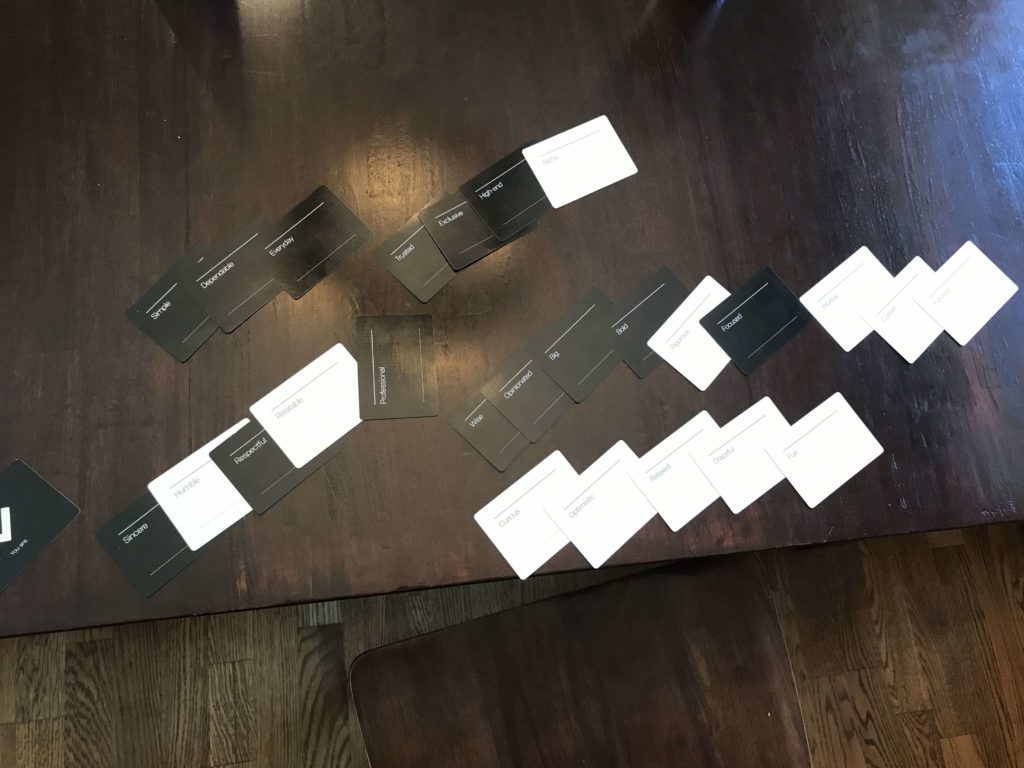
    Strategy Workshop: Brand Character & Personality Exploration

    A deeper pattern began to emerge.

    Clients weren’t simply hiring James to become better professional leaders.

    They relied on him for the confidence, clarity, and perspective required to make difficult decisions and move forward.

    James wasn’t merely coaching leaders.

    He had become a leader to leaders.

    “We now have a framework for how to communicate and a clear plan for leveraging our brand with new and existing clients. My brand is stronger than it’s ever been.”

    James Warrick, Principal


    Turning insight into strategy

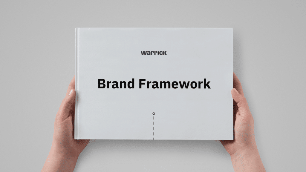
    The discovery work became a 27-page Brand Framework that gave James and his team a shared foundation for the business.

    Warrick Brand Framework: Cover

    It included:

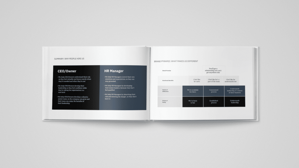
    • Customer insight and motivations
    • Three differentiated value propositions
    • Mission, vision, and values
    • Brand character and personality
    • Voice and messaging direction
    • Brand pyramid
    • Strategic principles for future marketing and communication

    The framework mattered because it created more than marketing language.

    It gave the team a common understanding of who they were, who they served, why the work mattered, and how to make future decisions consistently.

    Warrick Brand Framework: Value Propositions (left) & Brand Pyramid (right)

    Becoming Warrick

    The strategy also exposed a fundamental issue with the existing name.

    “Take Flight Coaching” reinforced the exact perception we were trying to move beyond.

    We developed 13 naming directions using a structured naming process and evaluated them against the company’s positioning and long-term ambitions.

    Then we discovered something hiding in plain sight:

    Warrick means “strong leader.”

    The name connected naturally to James’ own identity, the work he had spent decades doing, and the people he served.

    The decision became obvious.

    Take Flight Coaching became Warrick.

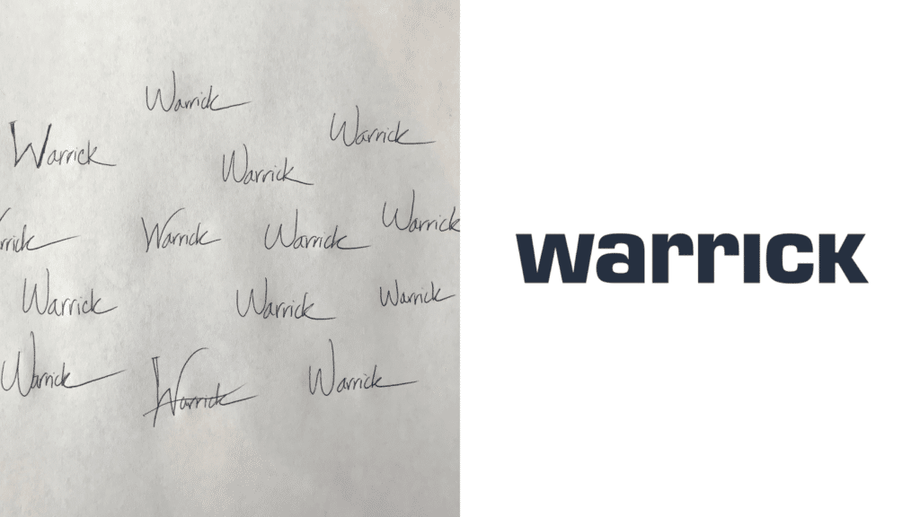
    From there, the team developed a bold typographic identity designed to preserve the simplicity and authority of the name.

    Original logo sketches (left) & Final Warrick logomark

    Turning the strategy into an experience

    The next question was how the brand should actually feel.

    One phrase from James’ work became especially important.

    At the end of a meeting, he would often ask:

    “What’s our movement?”

    It captured something central to the brand: clarity should result in forward motion.

    That idea became a creative principle for the website experience.

    Rather than simply publishing a new brochure site, we used movement and interaction throughout the experience to guide visitors deeper into the Warrick story and reinforce the feeling of progress.

    The final experience brought together:

    • Brand strategy
    • Positioning and messaging
    • Naming
    • Creative direction
    • Copywriting
    • Information architecture
    • UX strategy
    • Visual and motion design
    • Front-end and back-end development

    The website wasn’t the strategy.

    It was the expression of the strategy.


    The result

    Warrick emerged with a brand that finally reflected the work clients had already been experiencing for years.

    The project gave James:

    • A clearer articulation of his value
    • A deeper understanding of his customers
    • A differentiated market position
    • A new company name and identity
    • A shared language for his team
    • A strategic framework for future decisions
    • A digital experience capable of expressing the caliber of the work

    Most importantly, James had greater clarity and confidence about the direction of the company.

    “Simon and his team were crucial for the direction that I am now taking my company. The relationship I have with Simon is irreplaceable.”

    James Warrick, Principal


    My role

    I led the strategy and discovery process, including founder and client interviews, workshop facilitation, customer insight synthesis, value proposition development, brand positioning, naming, messaging, and content strategy.

    I then translated that strategic foundation into creative direction and worked with Structure’s design and development team to bring the new identity and digital experience to life.

    Strategy

    Brand Strategy
    Customer Research
    Positioning
    Naming
    Messaging
    UX Strategy
    Content Strategy

    Creative

    Creative Direction
    Copywriting
    Identity Direction
    Digital Experience