Category: Website

  • Shasta Power Website Redesign

    Shasta Power Website Redesign

    Shasta Power came to us with an outdated, confusing website that didn’t represent their offering well. So we helped them revise their visual identity and message—culminating in an impactful website redesign.

    Shasta Power Website Redesign Hero
    shasta power hero

    Challenge

    Shasta Power built its first website on a budget. It was time to invest in a professional website, but the other website design and development firms Shasta Power spoke to wanted to throw them into a box. They didn’t listen or care about the business or user’s needs.

    Solution

    We took Shasta Power through our Website Process, starting with understanding the website goals. We then did a brand refresh and designed a custom, responsive website. The website development was on WordPress and integrated its business systems with the website

    Results

    Awareness metrics have risen across the board, including new followers and site visitors, up over 600% and 200%, respectively. We worked quickly against a short timeline while maintaining an impressive quality standard for the brand.
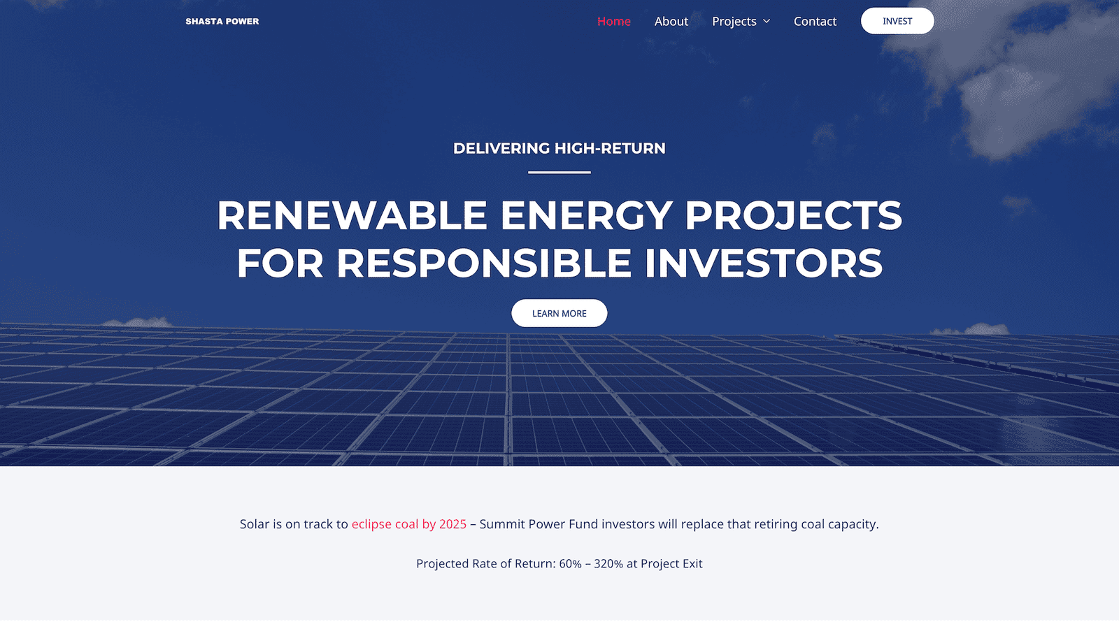
    Shasta Power Website Redesign Before
    shastapower.com before
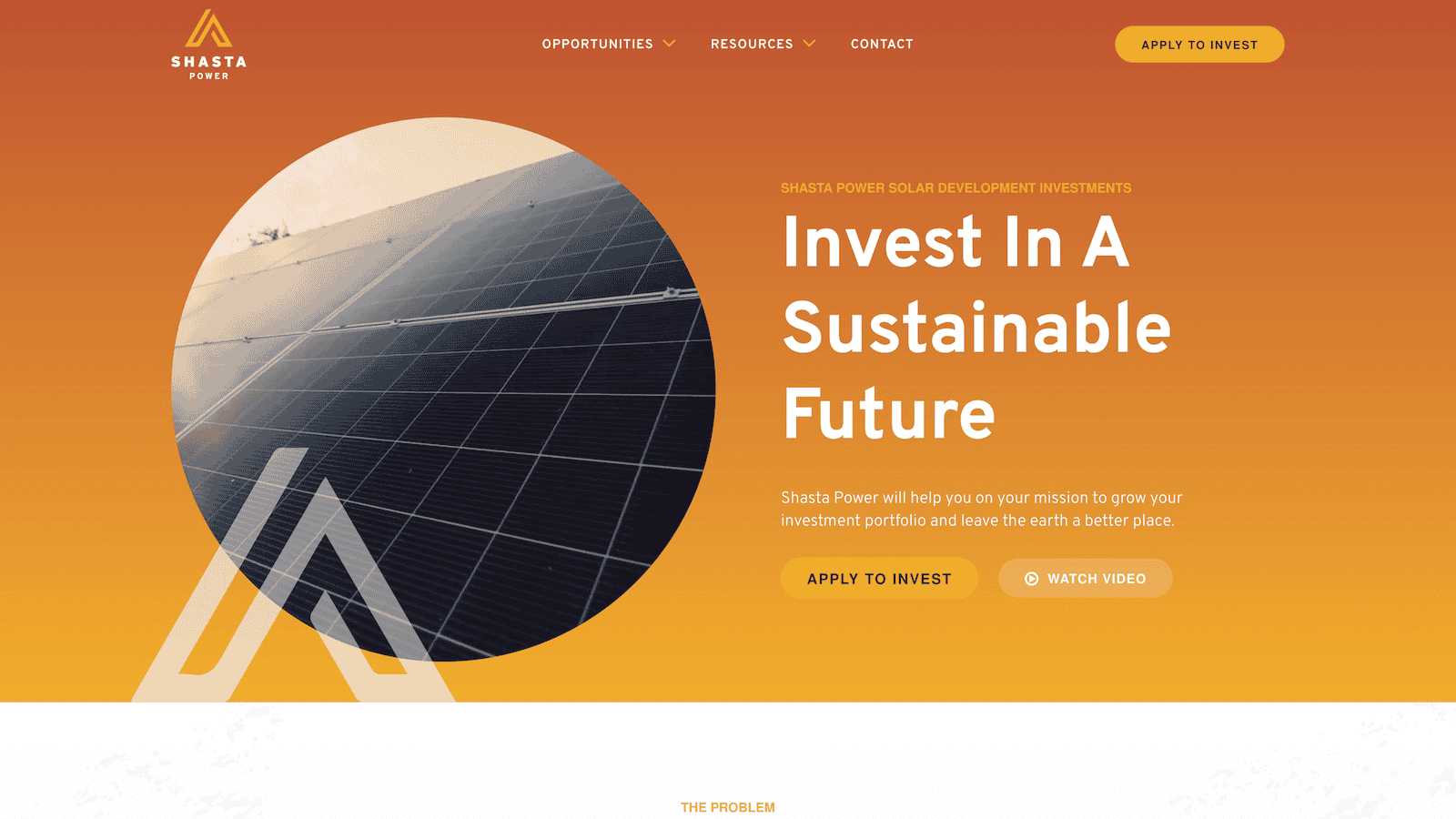
    Shasta Power Website Redesign After
    shastapower.com after

    If I had to boil it down to one thing, I would say their integrity is their best quality. I get a sense of honesty and quality from them; they take their work seriously and do it in a professional manner.

    max roe, partner
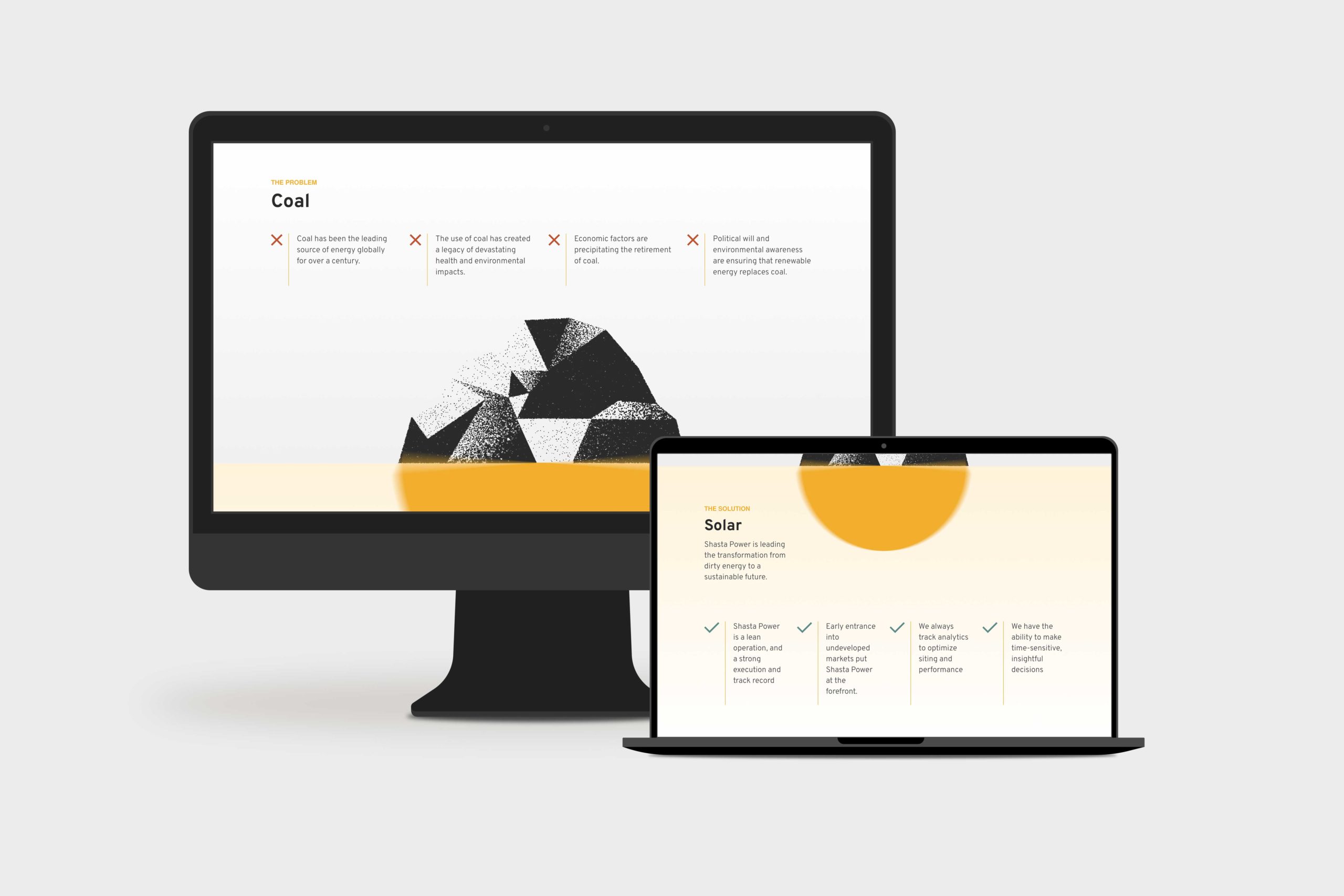
    Shasta Power Website Redesign Product Page
    summit power fund product page

    Logo Design

    When Shasta Power came to us, they didn’t have an official logo. So the first thing we did was explore logo options for their new website design. We delivered a handful of comps, ideas, and styles for them to review. After a few iterations, we landed on a logo that was strong, confident and represented Mount Shasta—the symbol behind the brand.

    Similarly, Shasta Power didn’t have any colors representing its product or mission. As a company as a solar investment firm, we developed a pallet that represented the earthy nature of their work. We lead with a solid orange and yellow gradient, with supporting blue, green, and clay colors representing the environments they develop in.

    Website Design

    As with all website design, you can’t have a great beautiful site that makes no sense. So we invested heavily in information architecture, wireframing, and content development. This strategic process helped ensure the site helped users progress through the content and was simple and easy to understand—all the while representing Shasta Power in its best light. Once we had the blueprint down, we applied the brand, and it turned out beautifully.

    Shasta Power wanted to use its website to generate leads, so we built a custom webinar registration flow. This included a landing page template they could use and replicate for any webinars they host for marketing or customer engagement. Additionally, it had a registration form and a webinar video page where they could embed their live content for users to engage with.

    Website Development

    Shasta power was familiar with WordPress CMS, which we love to build with. So we built their new site in a very similar way to their old site using a custom theme and Advanced Custom Fields content editing fields. This kept the entire experience familiar and allows them to swap out photos and make copy changes when they want to without worrying they’re going to break anything.

    On the front end, Shasta Power added an Animation Package so that the content fades smoothly as a user scrolls down the site. This small addition makes a massive difference for the user and helps them stay focused on the contact right in front of them while guiding them through the site.

    Website Management

    Shasta Power took advantage of our Startup Website Management Package, so they didn’t have to worry about regularly updating WordPress core, theme, or plug-ins. They also appreciated being able to reach out to us here and there to update content on the site or ask questions without starting a new project.

    Moreover, Shasta power has trusted us as an ongoing partner to help them grow their website through additional digital marketing initiatives.

  • DryFireMag eCommerce Website Redesign

    DryFireMag eCommerce Website Redesign

    DryFireMag is a fast-growing firearms safety company in Idaho that primarily sells its products on its e-commerce store. We helped them increase their conversion rate and redesign their website so customers could find and purchase products more efficiently.

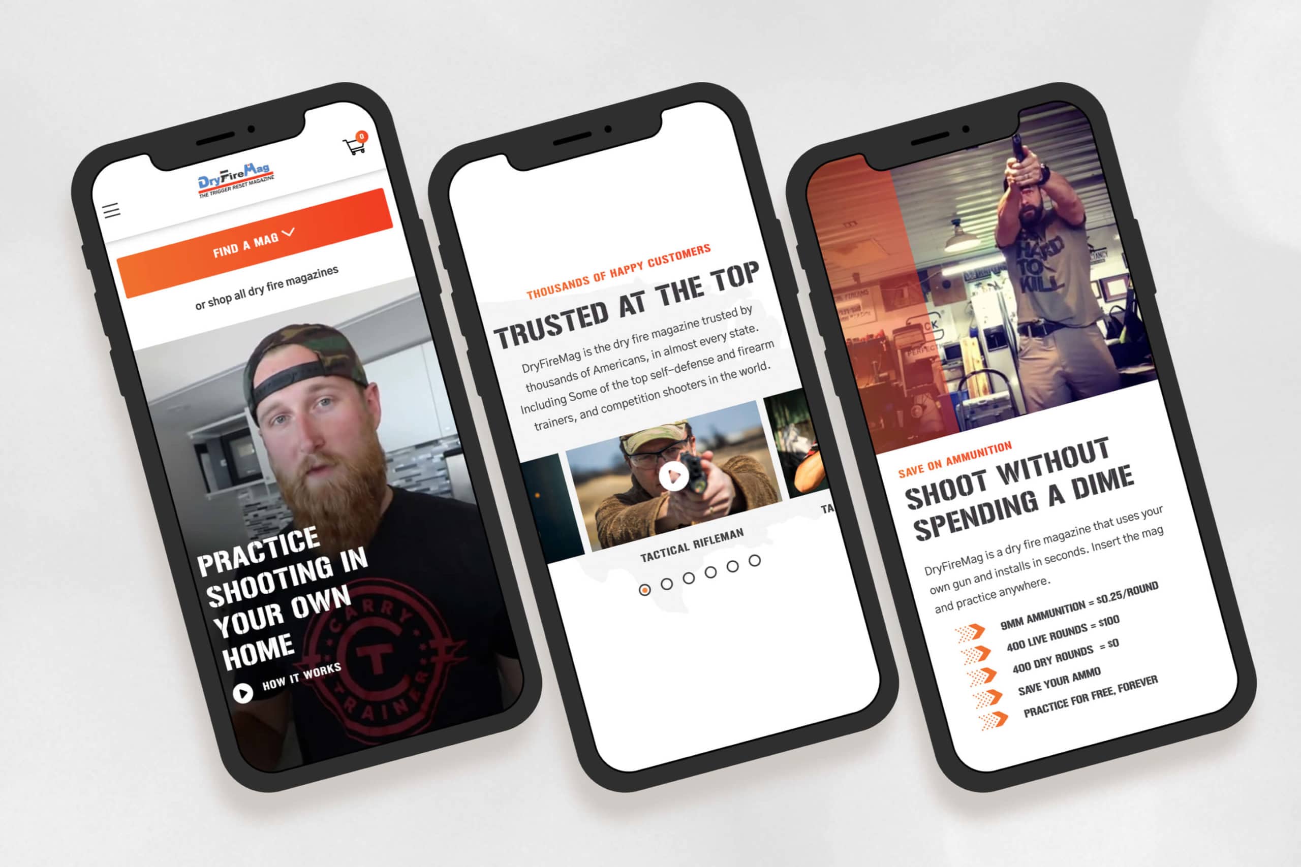
    DryFireMag E-commerce Website Redesign mobile mockups

    Challenge

    Their website was never what they hoped it would be. It was cumbersome and did not help customers find what they needed—in fact, it did the opposite. DryFireMag saw sales decreasing and needed a resolution.

    Solution

    We analyzed how customers used their website using heatmaps and user testing. Then, we designed the website from the ground up so customers could quickly find what they were looking for.

    Results

    The result is a high-converting site that has only grown in traffic, traction, and sales for DryFireMag since we launched. The success has put them in a new position to open up to international sales.

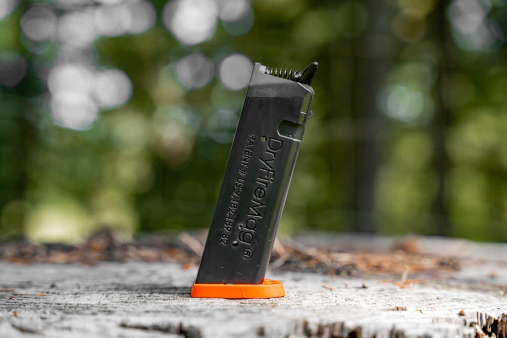
    DryFiremag in a Glock 22
    DryFiremag in a Glock 22
    dryfiremag for small frame glocks
    dryfiremag for small frame Glocks

    “Structure was the most professional, responsive and personal of them all.”

    John Seigler, head of product

    Website Strategy

    The website strategy was one of the most significant issues with the old DryFireMag site.

    As the business grew, they felt they needed to communicate more things to their customers on their website: product information, shipping notices, and marketing announcements.

    The site became cluttered, and we helped them get back to the basics—and figure out a way to organize the content, so it supported customers during the checkout flow instead of distracting them.

    Brand Design

    The DryFireMag brand was severely underdeveloped.

    While the DryFireMag didn’t want to invest in a rebranding or brand strategy process, we were able to bring out the best of the brand as-is and bring in some new elements that helped the website feel more exciting and align a bit better with its target audience.

    Beautiful, functional web design

    Another challenge was helping customers find the right mag for their pistol.

    The DryFireMag team received dozens of support calls and returns daily from customers who had purchased the wrong product. Finding a solution would result in happier customers, less overhead, and more profit for the business.

    We designed and built a fun product quiz right in the navigation so that customers could select their pistol and get redirected to the perfect product.

    Web Development

    Since their e-commerce store was already live and bustling (with a sizeable shipping and logistics team behind it), we took great care to retain the integrity of their integrations, business systems, and customer data.

    The site already used WordPress CMS with WooCommerce e-commerce functionality, so there was no reason to reinvent the wheel; however, ensuring customer data didn’t get lost or changed was a challenge. Luckily, this wasn’t our first rodeo, and the launch went off without a hitch.


    Strategy

    User Testing
    Conversion Rate Optimization
    Information Architecture
    Content Strategy
    UX Strategy

    Design

    UI / UX Design
    Visual Design
    Creative Direction
    Animation Design

    Content

    Copywriting
    Photography
    Art Direction

    Development

    Front-end Development
    Back-end Development
    E-Commerce Development
    Quality Assurance
    Consulting

  • HydroSide Website Redesign

    HydroSide Website Redesign

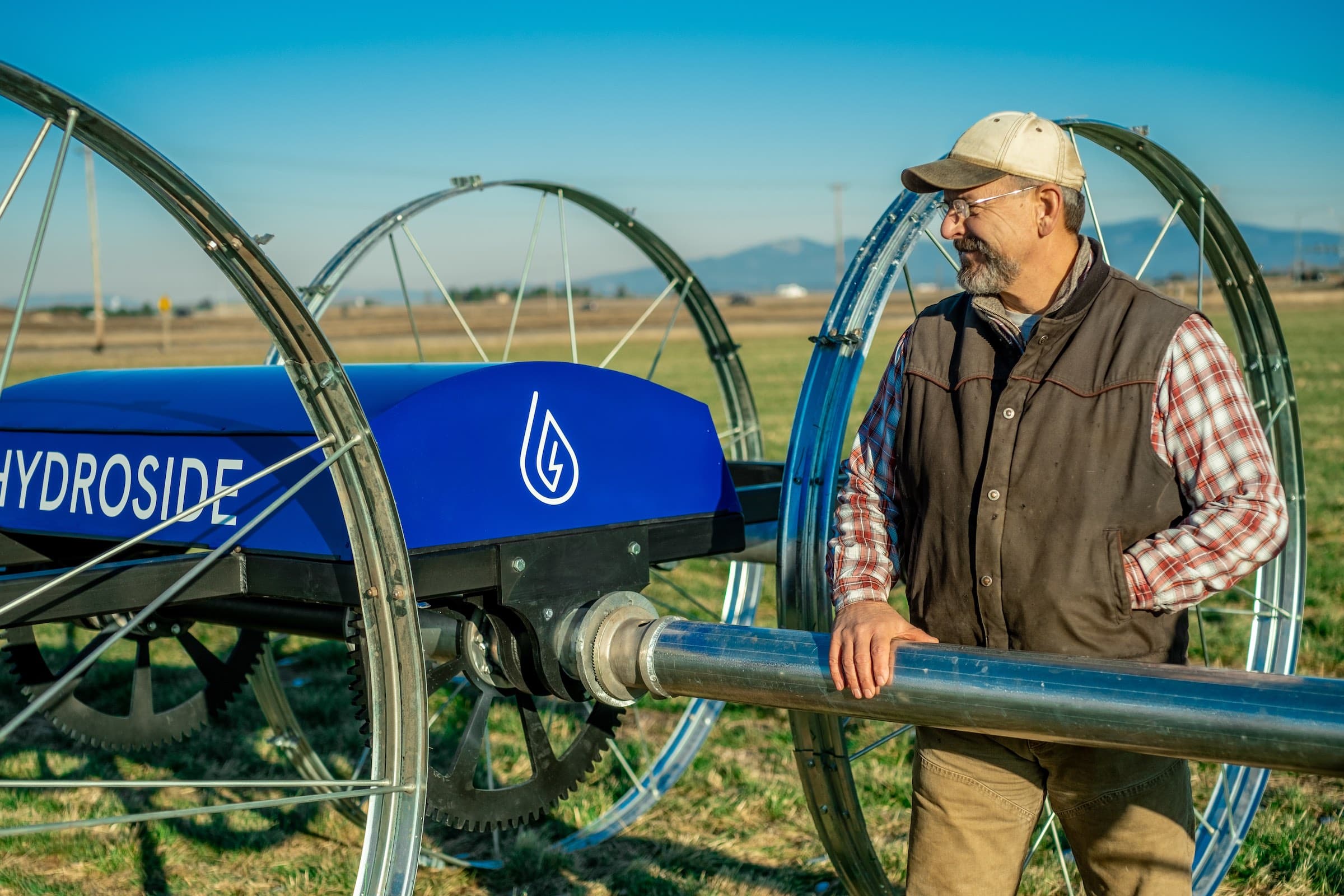
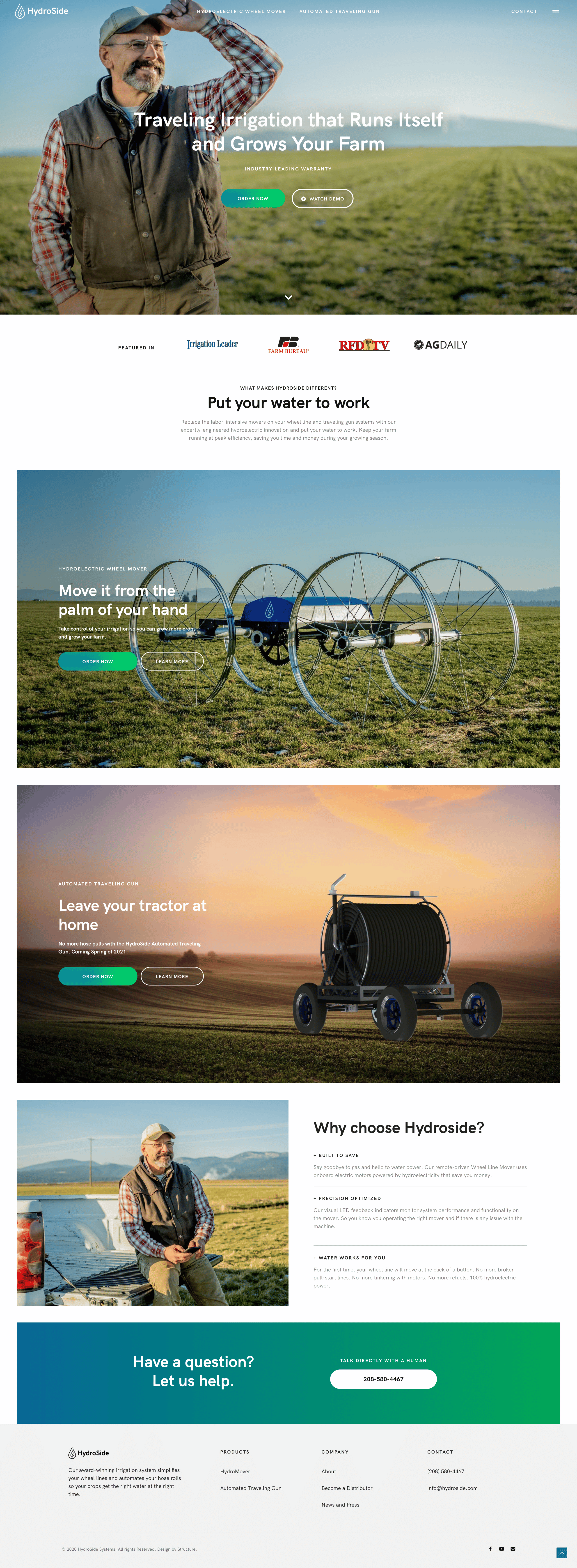
    HydroSide is bringing technology and automation to the irrigation niche of the agriculture industry. As an industry disrupter, HydroSide needed a bold website and digital experience that looked, felt, and smelled less like farm equipment and more like farm technology.

    Challenge

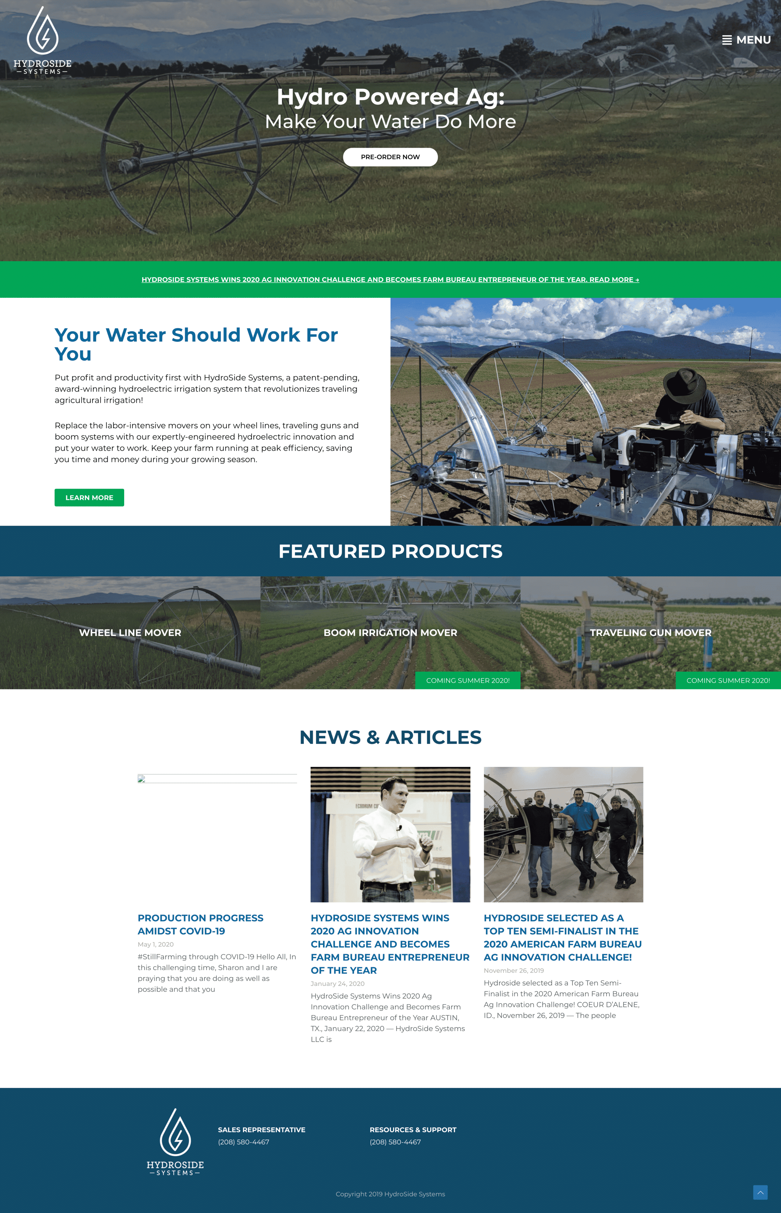
    HydroSide needed a new website that matched its role as a technology disrupter in the marketplace. The efficiency of their product offering was opposed to the confusing user interface customers experienced on their website.

    Solution

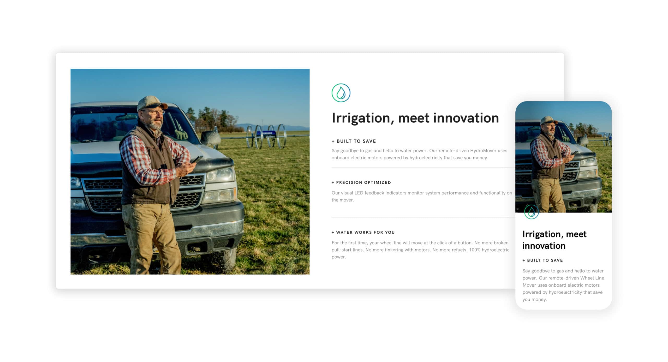
    After a deep dive into their user needs, we uncovered a much deeper story that guided the web strategy and information architecture. With creative copy and a fresh visual design, we could use the client’s existing CMS to transform this website.

    Results

    A website redesigned with a straightforward and more strategic approach to communicating the information growers were looking for.

    Early traction

    HydroSide not only provides a fresh face in their space but delivers a solution to a real problem farmers and growers have across the world.

    Due to their bonafide product-market fit, HydroSide.com gets thousands of new organic visitors each month without much effort. The extra consideration we put into performance, accessibility, and implementing best practices made both Google bots and actual humans happy when they visited the website.

    The back-story

    Our team came-in early as a digital advisor for the HydroSide founders, back in 2018 when the company was mostly just an idea.

    The HydroSide website redesign was a long time coming, but that’s part of what made the project successful. There were years of foundational work together before we redesigned the website. As is often the case, the HydroSide website is more than just a pretty face—it’s an engaging storyteller and an effective sales tool.

    As is often the case, we operated as a true partner and close extension of their marketing team. The relationship with HydroSide continues as we help develop their digital presence and make advanced enhancements to their website to help them both move forward and stay ahead.


    Strategy

    Information Architecture
    Content Strategy
    UX Strategy

    Design

    UI / UX Design
    Visual Design

    Content

    Copywriting
    Art Direction

    Development

    Front-end Development
    Back-end Development
    Quality Assurance
    Consulting

  • EarthCruiser Website Redesign

    EarthCruiser Website Redesign

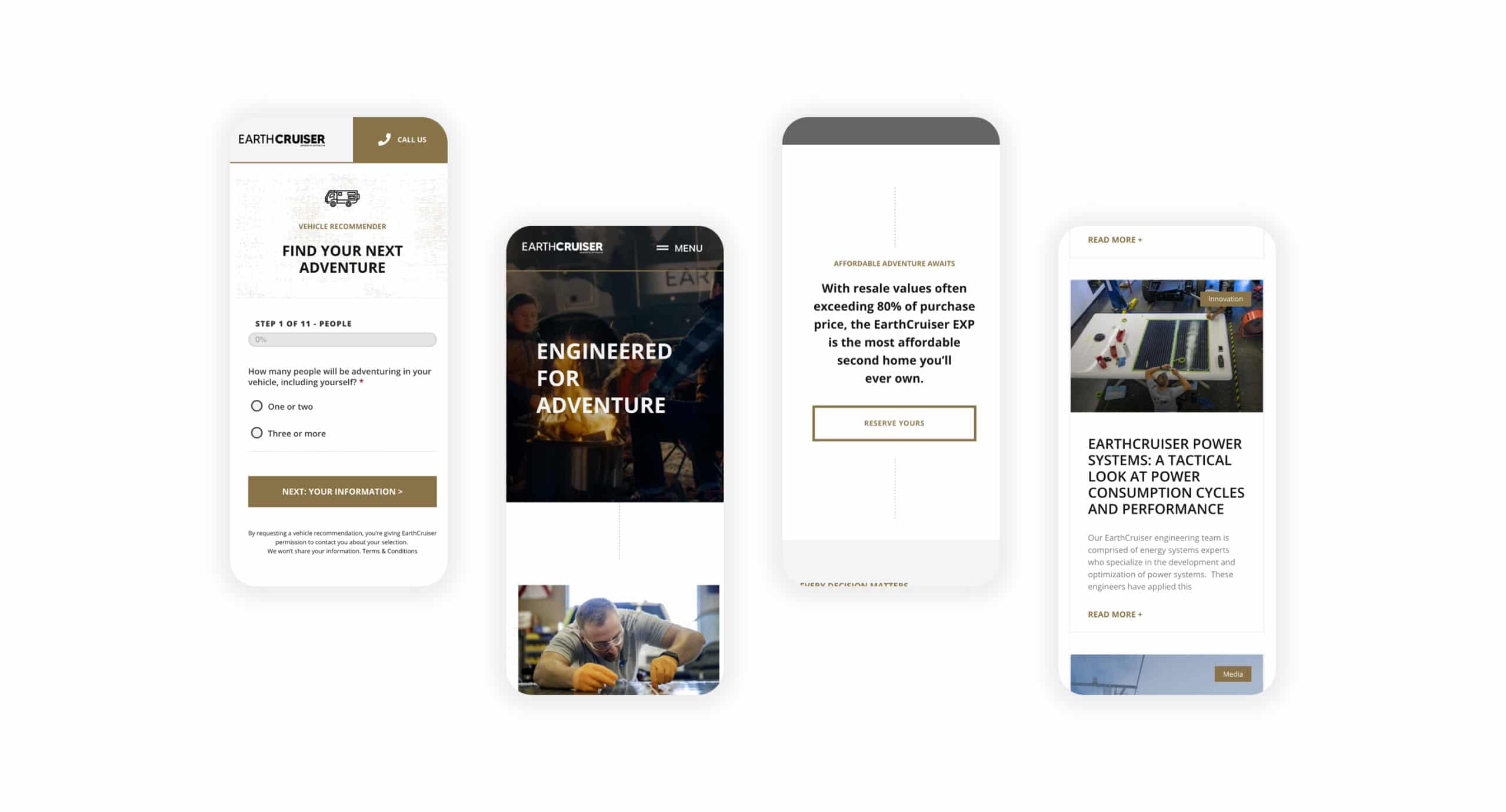
    EarthCruiser manufactures luxury Overlanding vehicles. What began in Australia and made its mark in Bend, Oregon, is now an iconic global brand. To ensure the world saw EarthCruiser as the trustworthy brand they are, we created a website as exciting as the vehicles themselves.

    Challenge

    Any EarthCruiser owner trusts their vehicle can traverse the most challenging terrain without fail—because it will. But EarthCruiser found that potential customers couldn’t navigate, let alone traverse their website without encountering a problem. Not to mention, it didn’t display the quality of the products and services they provide.

    Solution

    The EarthCruiser website was full of generic messaging, dense architecture, and shallow details of what the brand offered. Embracing the creative direction of “Show, Not Tell,” we reimagined the EarthCruiser website from the ground up. With rich media front and center, we unveiled a fresh experience that customers could trust.

    Results

    The transformation is an inspiring responsive website that shows EarthCruiser customers what’s possible wherever life takes them. Furthermore, this project launched the future of the EarthCruiser digital experience, including a custom Vehicle Recommender that dynamically populates product recommendations for customers.

    WordPress Integrations

    The work included integrating the website with many of EarthCruiser’s marketing and sales systems, including HubSpot and MailChimp.

    We set up the Vehicle Recommender so that the sales team could see each user’s recommendation and contact information so they could follow up and have visibility into what the customer is looking for.

    Beyond the Project

    EarthCruiser.com launched without a hitch. Some team members said it was the smoothest website launch they’d ever seen.

    During this website redesign, we operated as a critical extension of their marketing team. Much to the project’s success, we’ve taken over the website’s management and continued working together on additional phases of website work to enhance the user experience further.


    Strategy

    Website Strategy
    Information Architecture
    Content Strategy
    UX Strategy

    Design

    UI / UX Design
    Visual Design
    Website Design

    Content

    Art Direction

    Development

    WordPress Website Development
    Front-end Development
    Back-end Development
    Quality Assurance
    WordPress Website Management

  • Western Interlock Website Redesign

    Western Interlock Website Redesign

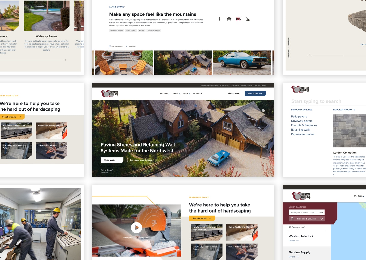
    Western Interlock is a paving stone manufacturing company with state-of-the-art manufacturing facilities in Oregon and Washington. We worked on a website redesign to bring their brand into the present day with a fresh look in a fully optimized digital experience, with lead generation and thought leadership at the center.

    Challenge

    The Western Interlock website needed a new look that better matched the quality of its brand and the products it delivered. It also had to facilitate high-traffic DIY blog content and be easy to navigate.

    Solution

    We stretched their current brand while delivering a simple yet strategic information architecture with simple navigation that was easy for customers and team members.

    Results

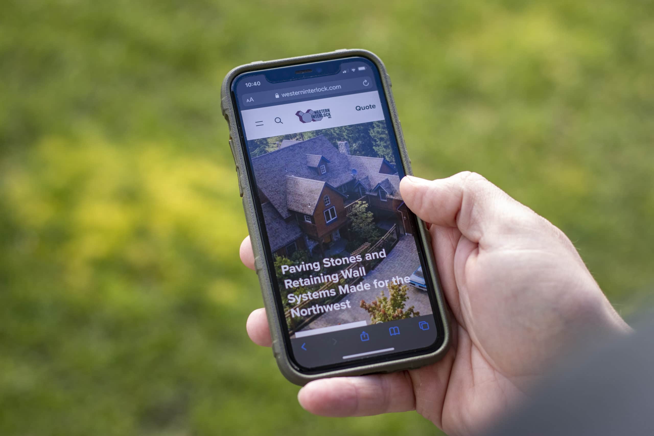
    The result is a beautiful and swift experience for potential buyers that’s optimal for mobile and built for engagement. Within a few days of launch, estimate requests and traffic more than doubled.

    WesternInterlock.com Website Redesign

    Up, up, and up some more

    This website redesign helped potential customers discover and engage with Western Interlock’s highly successful DIY marketing campaign at a much deeper level. As a result, we’re seeing the most significant increase in new users, the lowest bounce rate, most extended session durations the company has ever seen. Not to mention a backlog of sales requests they couldn’t be happier about.

    The following statistics were reported by Google Analytics 30 days after launching the updated website.

    users

    43.8k

    +65.0%
    sessions

    57.7k

    +59.9%
    bounce rate

    77.6%

    -2.9%
    ave session duration

    00:01:24

    +12.1%

    Beyond the project

    Beyond WesternInterlock.com, our work on this website redesign brought about an evolution of digital thinking at Western Interlock—and instituted a more refined approach to branding and marketing moving forward.

    We hope this site ushers in a new era for Western Interlock and the hardscaping industry.


    Strategy

    Website Strategy
    User Testing
    Information Architecture
    Content Strategy
    UX Strategy

    Design

    Website Design
    UI / UX Design
    Visual Design
    Creative Direction
    Motion Design
    Accessibility

    Content

    Copywriting
    Art Direction

    Development

    WordPress Website Development
    Front-end Development
    Back-end Development
    Quality Assurance
    Consulting
    WordPress Website Management

  • Flight Evolved

    Flight Evolved

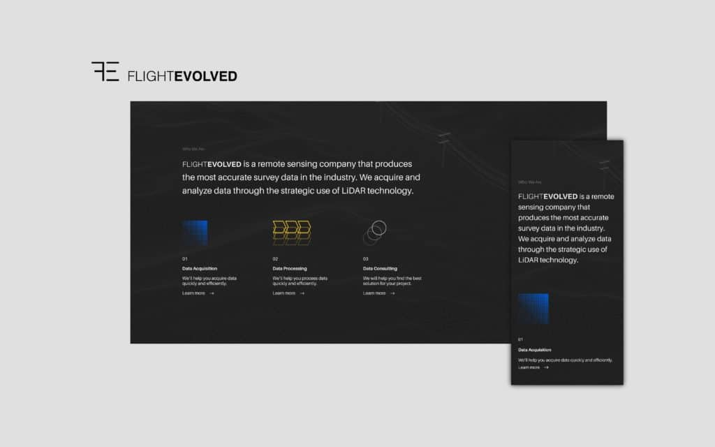
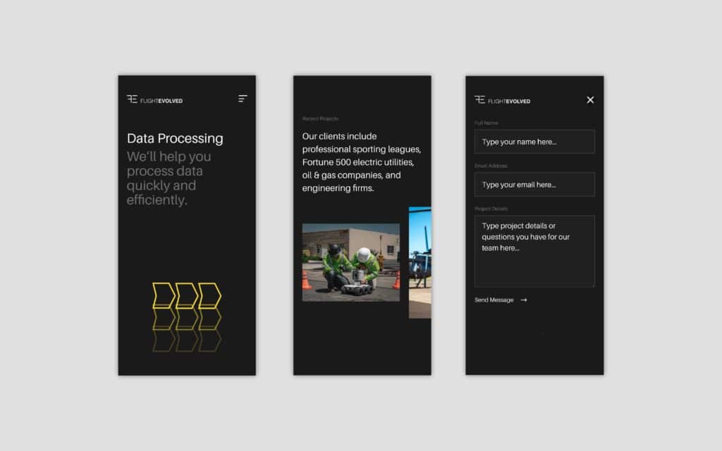
    Flight Evolved is is a remote sensing company in San Diego, CA. Their clients include professional sporting leagues, Fortune 500 electric utilities, oil & gas companies, and engineering firms.

    As their business grew exponentially, they reached out to us to help focus their offering and communicate their value through a custom website.

    Distilling data services

    Leading up to, and during, our partnership with Flight Evolved, the firm was scaling fast. They were adding new clients, bulking up their team, and expanding their service offering to better serve their clients. It was all happening so fast that they had difficulty communicating what they did anymore. 

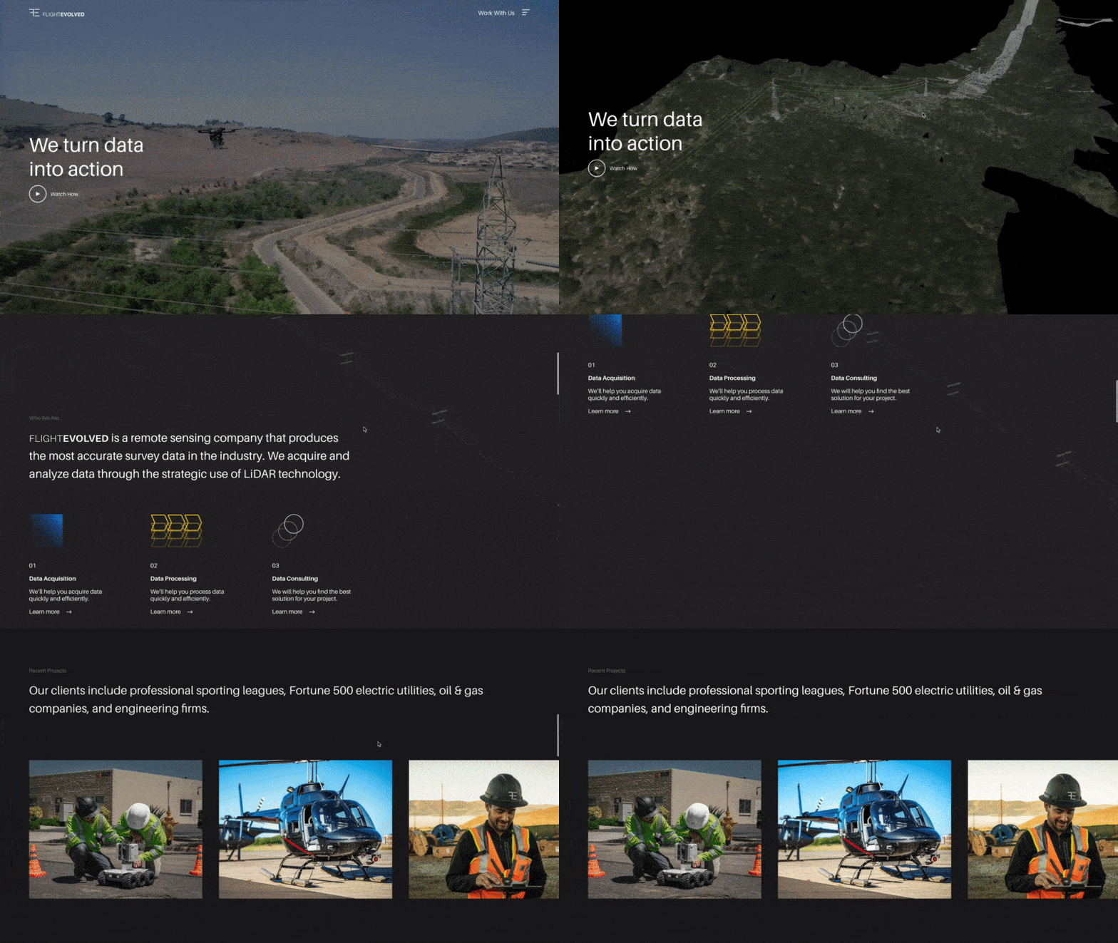
    Flight Evolved Website Home Page

    Through strategic workshops with leadership, we revealed that all their work boiled down to helping their clients do three things: Aquire Data, Process Data, and Understand Data. This process gave us a framework for how to communicate their offering effectively. So we split it up into three related services: Data Acquisition, Data Processing, and Data Consulting.

    Designed to impress

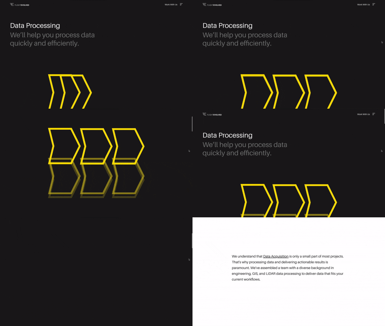
    Embracing Flight Evolved’s sleek brand identity and data-based approach, we designed a website that felt minimal in nature while looking technical in appearance.

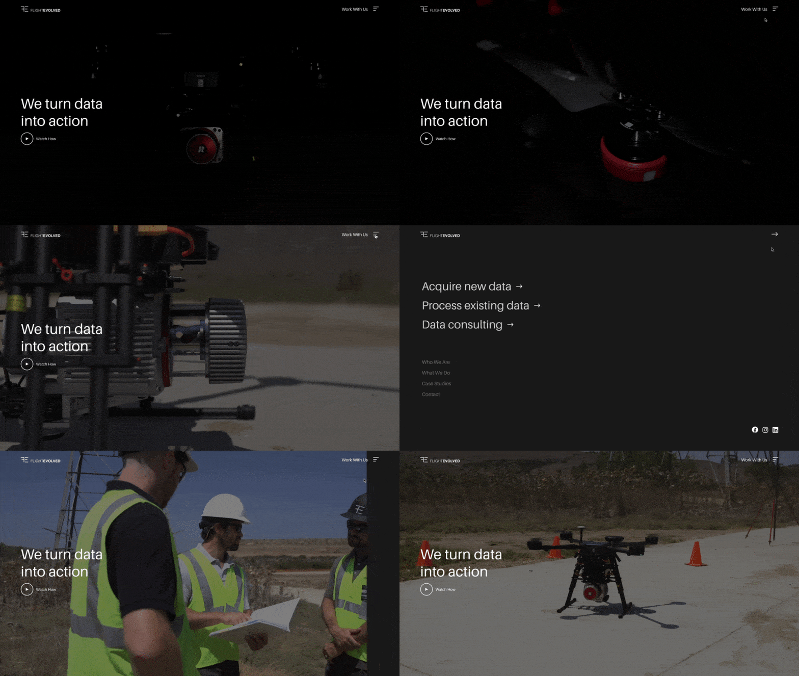
    The details make the difference. That’s why we introduced interactive UI (user interface) elements like a sandwich menu that turns into an arrow—and an overlay menu that slides in from the left.

    UI animation

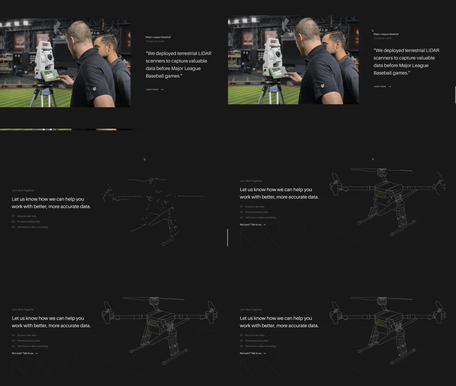
    We also implemented animated line art illustrations of their equipment. We worked directly with their motion design team to prepare an animated drone, rover, and helicopter.

    Animated SVGs

    Using advanced Java, we facilitated smooth background image and video transitions between sections.

    Background fade

    Each service even got an animated illustration. We aimed to communicate Flight Evolved’s minimal yet technical approach.

    Animated service icons; branded services

    Showcase the work

    Historically, Flight Evolved’s website led prospects down various roads, many leading to empty pages and dead ends. Unless you knew what to look for on their website, it was challenging to find what you’re looking for, let alone understand what they did.

    Drip, Sip, Drink website flow

    Working directly with their team, we mapped out a Drip, Sip, Drink user path that would break their services into bite-sized categories and methodically communicate information. The end goal was to prove up every service with a handful of fascinating case studies and, in turn, invite the captivated readers into a sales conversation.

    “Structure had great insight and was very responsive and attentive. Tough to find this level of professionalism and customer service. Would, and have, recommended Structure to help grow your business.”

    David Ilgenfritz, COO at Flight Evolved

    That’s the good news; here’s the bad.

    In the spirit of our firm belief that vulnerability is valuable in every relationship, life, and work, we want to disclose the good and the bad of this project.

    At the end of the project, the leadership team made a few critical business decisions that shifted the company’s direction and prohibited them from launching the website we worked on together for months. To be honest, it sucks.

    In the end, Flight Evolved was a great partner. We felt like a literal extension of their team. I’m confident that, if you asked them, they’d say the same thing.

    If you want to see the work in-action, you can view the fully developed staging website here.


    Strategy

    Brand Strategy
    Content Strategy
    UX Strategy

    Design

    Brand Design
    UX / UI Design
    Creative Direction
    Visual Design

    Content

    Copywriting
    Art Direction

    Engineering

    Front-end Development
    Back-end Development
    Deployment Architecture
    Content Management System
    Quality Assurance