Tag: Web Design

  • How to Create the Perfect, High-Converting Home Page [Free Template]

    How to Create the Perfect, High-Converting Home Page [Free Template]

    Customers aren’t buying on your website? There’s a reason, and I bet it’s your website homepage. Your website’s homepage significantly influences how long visitors will spend on it—and if they engage with your business. Here’s how to make yours great so visitors stay and buy.

    What is a website homepage?

    A website homepage is, often, the first page visitors will see when they land on your website. It’s essential to make a good impression because if potential customers don’t like what they see, they’ll likely leave and never return.

    Think of your website homepage as the front door to your business. It should be welcoming, easy to navigate, and give visitors a snapshot of your offer.

    Your website’s homepage can include multiple sections that help guide users through your website. If the homepage is planned correctly, these sections can keep users engaged with your website for extended periods.
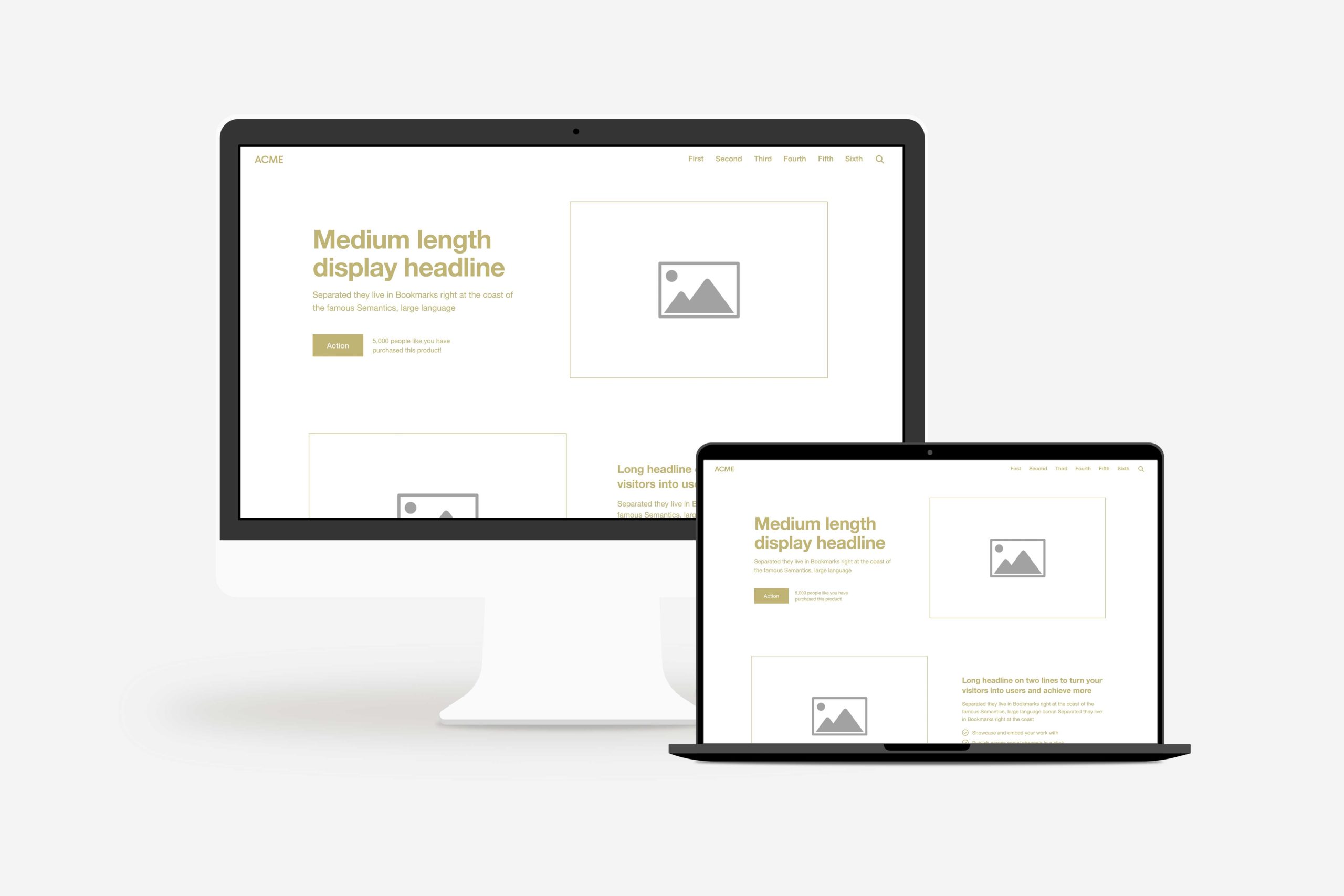
    Website Homepage Template Download
    download the perfect website homepage template

    Why your website home page structure is important

    The Nielsen Norman Group (a UX Research Firm) did a study linking the time spent on a website to something called “Weibull distribution,” which is a mathematical way to figure out when somebody gets frustrated and leaves (or “bounces”) from your homepage.

    In just 10 seconds, visitors will determine whether they want to stay on your website or leave. That’s according to research by Chao Liu and colleagues, who found that 99% of websites have a 10-second window of opportunity.

    Why is that important? Because it means you have 10 seconds to communicate your value. If visitors stay more than 10 seconds, they will continue engaging with your site and visit additional pages. But if you don’t catch their attention within those 10 seconds, you risk them leaving.

    Like most people, you may ask yourself, “Where do I begin?” Here’s our answer.

    Common website homepage problems

    First things first, don’t make these standard website homepage mistakes! Most companies aren’t getting engaged customers on their websites because they are making one of these mistakes. 

    The key to remember is this: if your website homepage has one of these problems, it won’t work even if you follow our homepage formula.

    1. Your homepage is about you

    Your website should center around your customers. How you can improve their life, what they gain from using your product, and how it eases stressors in their daily routine.

    You are not the hero. I know this sounds harsh, but stay with me for a second. This message could be summed up in five words: You Are Not The Hero. Yes, I know you solved their problem and changed their life – but that doesn’t make you the story’s hero. “Your customer has a problem, and then you come along as the solution” is something companies often think about because it’s easy to fall into that perspective…but it makes YOU look pompous and self-serving rather than humble and focused on them (which is much more attractive).

    Why not try something your competition isn’t doing? Instead of always putting yourself in the spotlight, focus on making your customer feel like the hero. They’ll appreciate it more than you think and will likely return to you because you make them feel special. All it takes is a change of messaging and perspective; to act as a guide or helper instead of the main attraction.

    On your home page, instead of saying, “We do this and that,” say, “We can help you do this and that.” Do you see the difference? In the first example, you’re the one doing; in the second, they’re the one doing (and you’re helping). 

    Make your entire website about your customer, and you’ll create raving fans who buy once and keep coming back for more.

    2. Your homepage is overwhelming

    Have you ever been to a website that throws so much information at you all at once? There’s so much there, and it’s all so overwhelming that you don’t even know where to start or what’s important. You have to leave the site altogether.

    Most companies do this: they overwhelm their customers before they’re ready for it, losing them entirely.

    Instead, you should set up your website ​using a framework so that it follows a process called “Drip, Sip, Drink.”

    To begin, give them a drip by providing sections on one page rather than overwhelming them with everything at once under one heading. 

    Each section offers the opportunity for further investigations and product detail – that’s the sip.       

    Then finally, if they’re satisfied with what they see thus far – include stories from customers or case studies as an extra convincing edge – we’ll call that the drink.

    If you use a tried-and-true formula and explain it using the Drip, Sip, Drink method, your potential customers will easily understand what you’re offering. They’ll see why it’s valuable and how to purchase it without issue.

    Doing this will help make sure your website is successful.

    3. Your homepage is confusing

    We think we’re being clear. But in reality, we’re being accurate. We have tunnel vision and only see what’s in front of us. As a result, we usually make one of two mistakes: 

    get too involved with the weeds and tell consumers too much about our goods immediately, confusing or frightening them. 

    We say business jargon phonetically using abbreviations that operate in the corporate environment, but the human on the other end has no clue what you’re talking about.

    If you try to sell too much at once, your customers will become overwhelmed and tune out. They’ll ignore everything you say if they think you don’t understand them or their problems. You need to engage your customers and get them to take action on your website! 

    Keep this in mind: if you confuse, you’ll lose. And make sure that what you’re saying is clear; if it doesn’t make sense, it won’t make money

    4. Your homepage doesn’t call people to action

    It’s incredible how many companies don’t ask for a sale. Don’t be one of them! To make it easy for your customers to buy the transformation, you’ll need to do two things:

    • Make your buy buttons easy to find 
    • Make them easy to understand

    Make your buy button visible in an easy-to-find location like the top right corner of your website. It’s also helpful if the button is a bright color that stands out, like red. You can also include a buy button in your hero section.

    Easy to understand means you’ll want your call to action to be direct. 

    • If you’re a photographer, don’t just say Hire Us. Say, “Schedule a Shoot.”
    • If you’re a painting company, your button should say “Request a Quote.” 
    • If you’re a consulting company, your button should say “Schedule a Call.”
    • If you’re a restaurant, your button should say “Make a Reservation.”
    • If you’re a brewery, your button should say, “Order Beer.” 

    Research demonstrates that hearing something takes an individual eight times to process the information thoroughly. So, if it requires eight repetitions for someone to comprehend hearing something one time, how many times do you need to ask a person to buy from you before they understand that you want them to purchase something?

    Include your CTA button on every page, and make it easy for visitors to take the next step.

    5. Your homepage doesn’t communicate the transformation

    Your homepage should show the success your customer will experience if they use your product or service. 

    Here’s why: your customer has two types of problems: external and internal. Another way of putting it is they have both physical and emotional issues. One problem they experience and one they feel.

    An external problem might be that I have a flat tire. The internal problem is that I can’t make it to work on time—my boss might fire me, and I can’t afford to lose my job.

    Every external problem, whether a flat tire or a leaky roof, manifests an internal problem — frustration, confusion, or even the feeling of “I don’t have what it takes.”

    Don’t be mistaken; your customers buy your products to relieve their internal tension. And when you communicate in a way, using words and pictures that show how you can reduce that tension, your customers will be more likely to seek your expertise.

    If you’ve watched a movie, you know every story ends in victory or tragedy. For your customers, it’s success or failure. They will feel one or the other, and I can guarantee they want to feel successful.

    The perfect homepage structure

    Most people think their website is all art: brand, visual design, beautiful images, etc. There’s certainly a lot of art involved in a website project. However, it’s about 20% art and 80% science.

    In other words, if you want your website to work, follow a formula or framework. Here’s that formula for the taking.

    Want a high-converting homepage?

    1. Header

    The header is the very top section of your website. Your header should include: 

    • Your logo
    • Your menu
    • Your call-to-action

    Let’s look at each of these header items in further detail.

    Logo

    On most websites, the logo is in the top left corner of your header. It’s clickable and takes visitors back to the homepage no matter where they are on the website. The website’s logo is one of the first things people notice when they land on a website, so it’s essential to make sure it’s recognizable, branded, and positioned in a spot where people will see it.

    Menu

    The menu is generally located next to or below the logo and contains links to the different pages on your website. The menu is how visitors will navigate your website, so making sure it’s easy to find and use is essential.

    It’s called a menu for a reason. It’s the place to show what you have to offer. Like a restaurant menu, it tells your customers what they can buy. 

    There are many items you can add to a menu. However, it’s best to include your main offer in your menu, and access any essential pages people might need (or want) to read before buying.

    Call-to-action

    The call-to-action (CTA) is a button or link that encourages visitors to take a specific action. The CTA should be prominently displayed in your header so visitors can’t miss it. It’s most commonly in the top right corner of the website.

    2. Hero
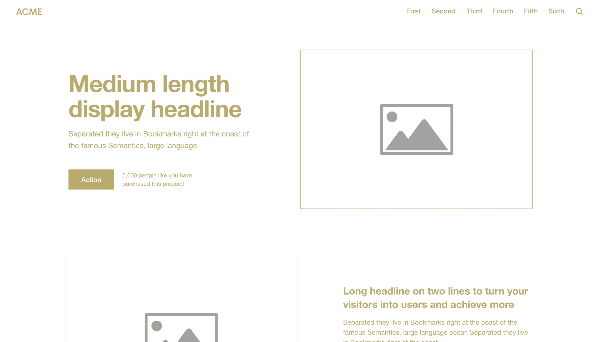
    Website Homepage Template Hero
    Website Homepage Template Hero

    The hero is the first main section of your website homepage.  It’s generally the most significant section on the page and is immediately below the header. 

    The big idea for this section is to show the transformation your customer will experience when they buy from you. The point is to give them a vision of how great life could be like… if they buy from you. 

    To accomplish this goal, the hero should:

    • Have a headline that communicates their aspirational identity
    • A subheadline that tells them what you’re selling
    • Include an image or video that helps explain your offer
    • Have a CTA that encourages visitors to take action 

    Let’s look at each of these hero items in further detail.

    Headline

    Customers see many “first things” when they land on your website homepage. However, the hero headline is usually the “first thing” they read.

    The headline should offer some value—what your product or service does for your customers. Donald Miller from Storybrand recommends using the headline to give customers an aspirational identity they can cling to. An aspirational identity is something that someone wants to become.

    If you can communicate what or who your customer wants to become that your brand can deliver (in five to seven words), you’ll see a massive uptick in engagement on your website.

    Subheadline

    As stated above, the subheadline should tell visitors what you’re selling so they don’t have to guess. It should be straightforward.

    Image or video

    An image or video in the hero can help explain your offer and make it more relatable to your website visitors. The image should be high quality and relevant to your offer.

    For example, if you’re a landscape design company, you might include a picture of a family enjoying their beautiful backyard. If you’re a vineyard, you might include a video of people enjoying your wine while a band plays in the background. 

    Call to action

    Tell them straightforwardly and instructively where they can go with your organization. This will help them take the next step.

    Your website’s CTA should be the same message across your entire site. If you want your customers to use the store locator to find your nearest location, every CTA should read,  “Find a Location.”  

    The CTA should also stand out so it’s easy to find. You can use an accent color or make it a button instead of just a link. 

    3. Problem
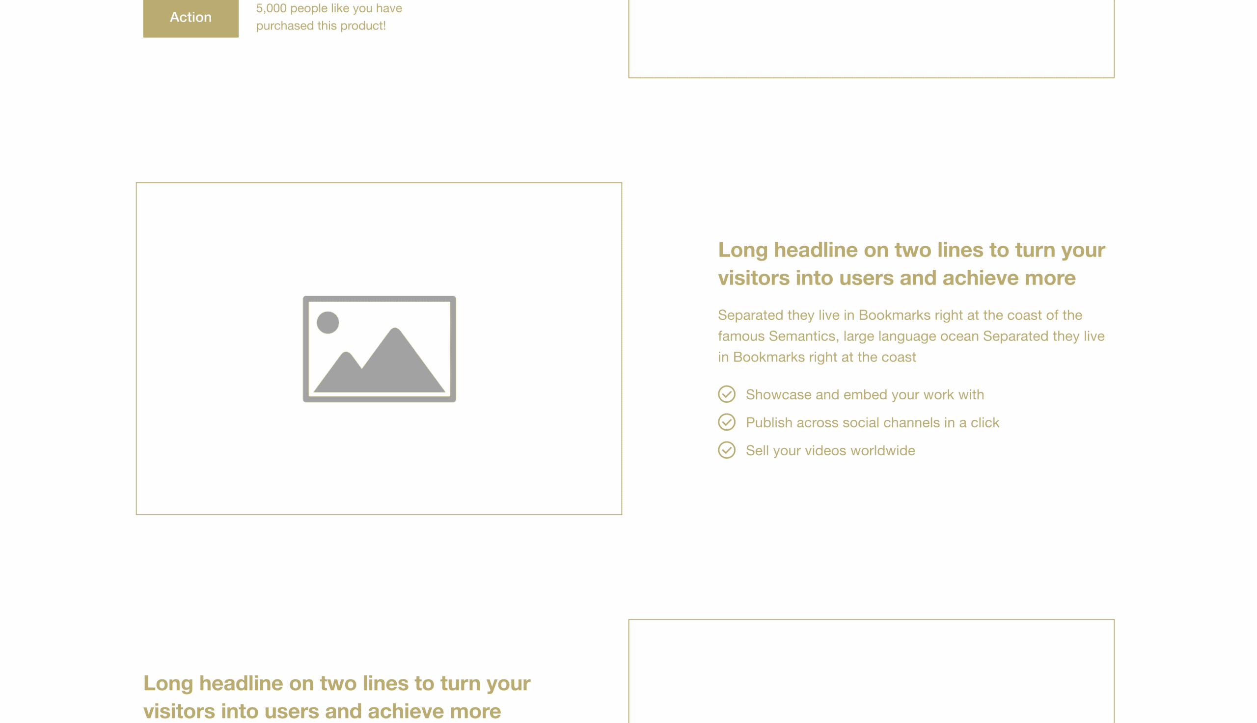
    Website Homepage Template Problem
    Website Homepage Template Problem

    In this section, you take your client on a roller coaster ride from the ultra-high of showing them how wonderful their life could be to the reality they’re in now.

    The problem section should:

    • Include a headline that tells visitors what their main problem is 
    • A subheadline that helps them understand they’re not alone 
    • An image or video that further illustrates the problem  
    • A CTA to encourage visitors to resolve their issues now

    You’ll show them how much they need what you offer and let them know you understand their pain. You’ll also give them a glimmer of hope that their problem can be solved.

    4. Position
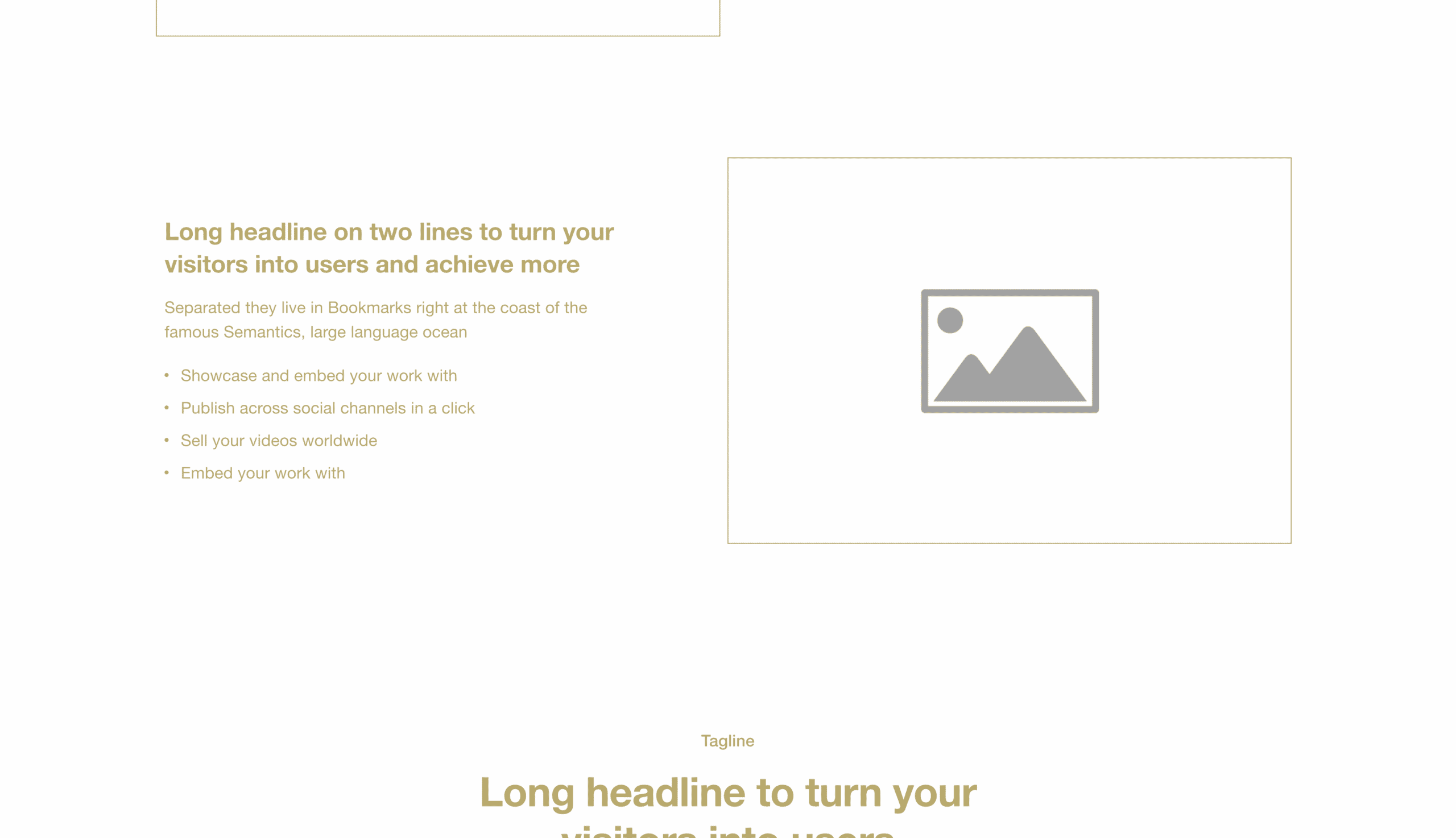
    Website Homepage Template Position
    Website Homepage Template Position

    If they’re still reading, they’re very interested at this point. It’s the perfect time to introduce yourself and how you can help. 

    The position section should:

    • Include a headline that tells visitors that you care
    • A subheadline or bullet point that shows your credentials 
    • An image or video that helps explain your position  
    • A CTA to encourage visitors to take the next step

    Customers want two things when you ask for a sale: Empathy and authority. They want to know that you care. That’s why most of our clients hire us—they say we care more than the other web agency. I think it’s true!

    Additionally, your customer needs to know you have the credentials to follow through on your promise. For example, you don’t just hire a doctor that cares. They need to have been to and passed medical school. Even more, you might want to know your doctor has healed a few people before you, and you’re not just his first test case.

    This is where you provide both empathy and authority. The headline that tells them you care is empathy. The points that show your credentials are the authority.

    What kind of points do you put in the authority area? You can put many things in this area, but testimonials from past customers are the best. Testimonials reinforce empathy, authority, and trust.

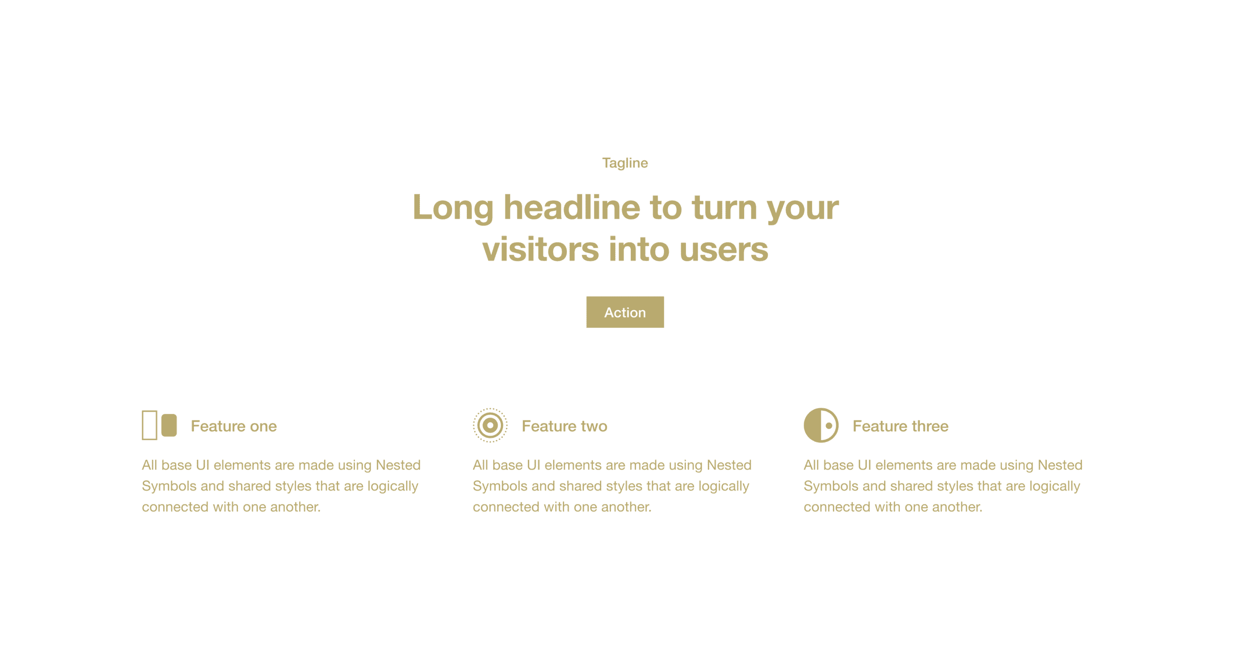
    5. Solution
    Website Homepage Template Solution
    Website Homepage Template Solution

    This is where most homepages go wrong. They start selling too early. They present a solution without ever establishing the problem or gaining trust.

    If you place your solution right here, you’ll ensure your website’s homepage walks visitors through a sales process that makes them fully aware of their need for an answer. Here’s where your solution (products or services) enters the scene. At this point, your customers are primed and ready. 

    • They have a vision.
    • They feel the pain.
    • They trust you.

    This section lists your core offerings, best-sellers, or top-performing product categories. Include a title and an image or video for each item. You should also include a CTA that encourages visitors to buy that item (or at least learn more about it).

    6. Success
    Website Homepage Template Success
    Website Homepage Template Success

    I’ll illustrate the success section with a story. My family recently went on a hike where we had to cross a muddy creek. I had my four young children with me, and there was no way I was about to allow them to cross the creek without ensuring they would make it across successfully or turn back quickly.

    Lucky for us, someone before us had cut or placed tree stumps in a perfectly-paced path across the creek. This step-by-step path reduced my fear and gave me confidence that we could all cross—or turn back—at any point. We felt great crossing because there was nothing to lose!

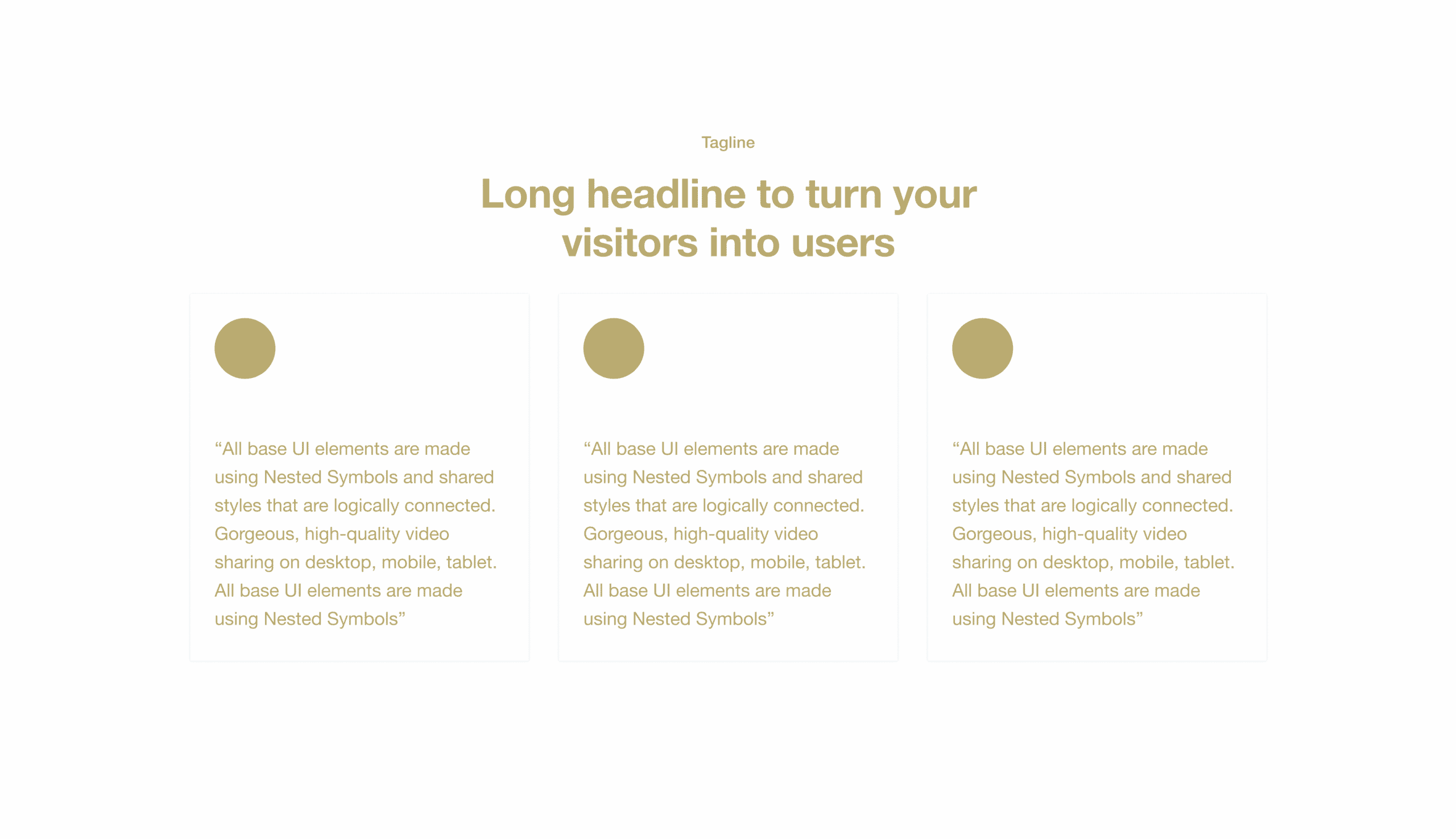
    Now, that’s what this section does for your customers. You might as well call it the Crossing the Creek section. This is where you give your customers a step-by-step plan so they feel confident crossing the creek with you.

    Specifically, you want to give them three steps to success. 

    1. First step
    2. Major milestone
    3. Result

    First Step

    Usually, the first step is the immediate next thing you want them to do on your website. In my illustration, it would be “Step on the Stumps.” Structure’s core offering is “Take the WebsiteBuilder Quiz.” 

    Major Milestone

    The second step is a significant milestone that will mark their journey. While crossing the creek, it would be, Enjoy the Adventure.” For Structure, it’s “Launch Your Website.” 

    Result

    Lastly, you want to communicate the result, or feeling, of accomplishing the journey. In our hike, it would be something like, “You’ll Want to Do It Again.” For Structure, “Your Website Works & Makes You Proud.”

    7. Call to action
    Website Homepage Template Call to Action
    Website Homepage Template Call to Action

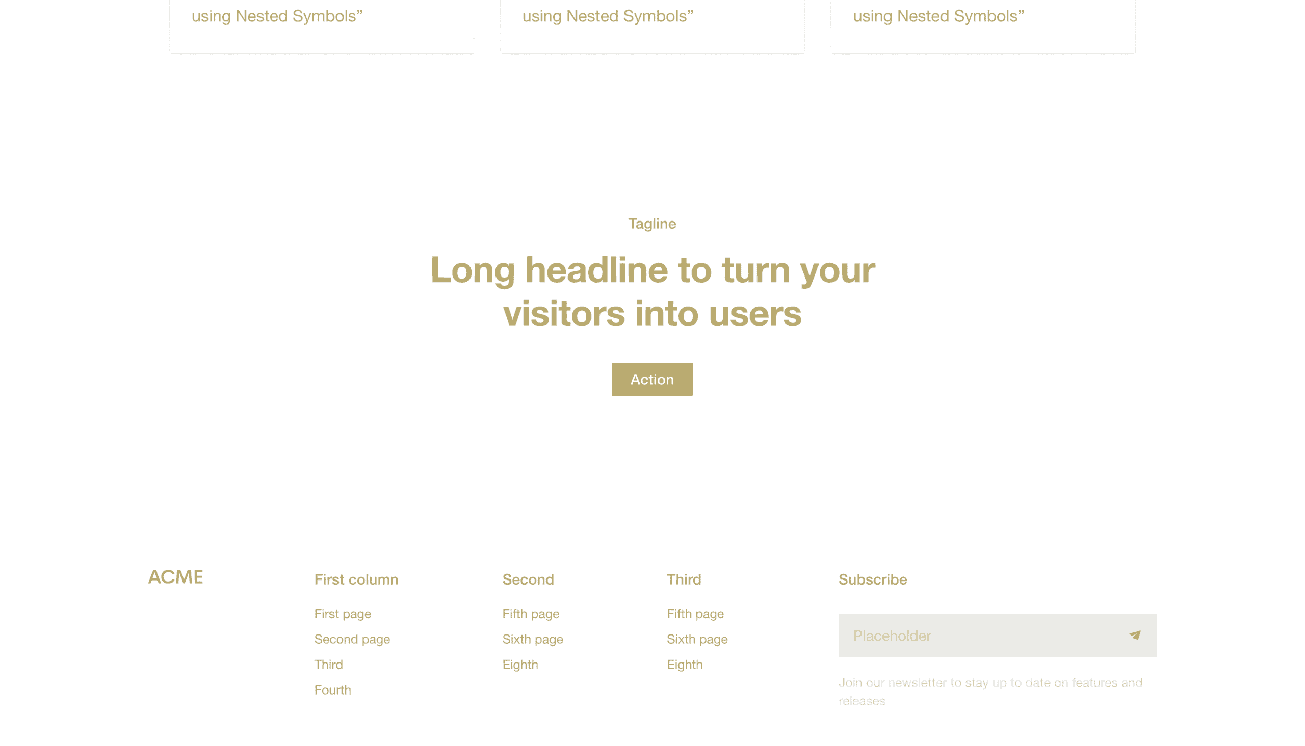
    You’ll want to cut the clutter and ask for the sale in the call-to-action section. Be very clear about what you wish to your website visitors to do. Your CTA section can include a variety of content items, but the most effective ones only have three parts:

    • Headline
    • Description
    • Button

    Headline

    The headline is a statement closely related to the solution you presented earlier. It should be clear, Concise, and actionable. 

    Description

    The description is a brief sentence that gives website visitors more information about what they’ll get by taking the desired action. 

    Button

    Lastly, the button should say something like “Buy Now,” “Add to Cart,” or “Sign Up.” And it should stand out from everything else on the page so website visitors can’t help but click it. 

    8. Footer

    Lastly, there’s your footer. This isn’t technically a part of the homepage specifically, but it’s on the page. Think of your Footer as the Junk Drawer of your homepage—you put everything that you thought was important but doesn’t fit into one of these sections.

    Use it to link to your Contact Us page, Careers page, blog posts, etc. Many companies use it as a place to put their newsletter sign-up form (which is a great idea)!

    Ultimately, following this formula (from header to footer) will ensure your website’s homepage is designed to guide visitors through a process that makes them fully aware of their need for your solution. By following the simple website template I’ve outlined here, you can build a website that works.

    Want a high-converting homepage?

    Three great website homepage examples

    Here are three well-structured website homepage examples that follow this formula. I want to point out that these three companies are in vastly different industries. Yet, they’re all following the same formula because it works regardless of your industry.

    Yardzen
    Yardzen Website Homepage

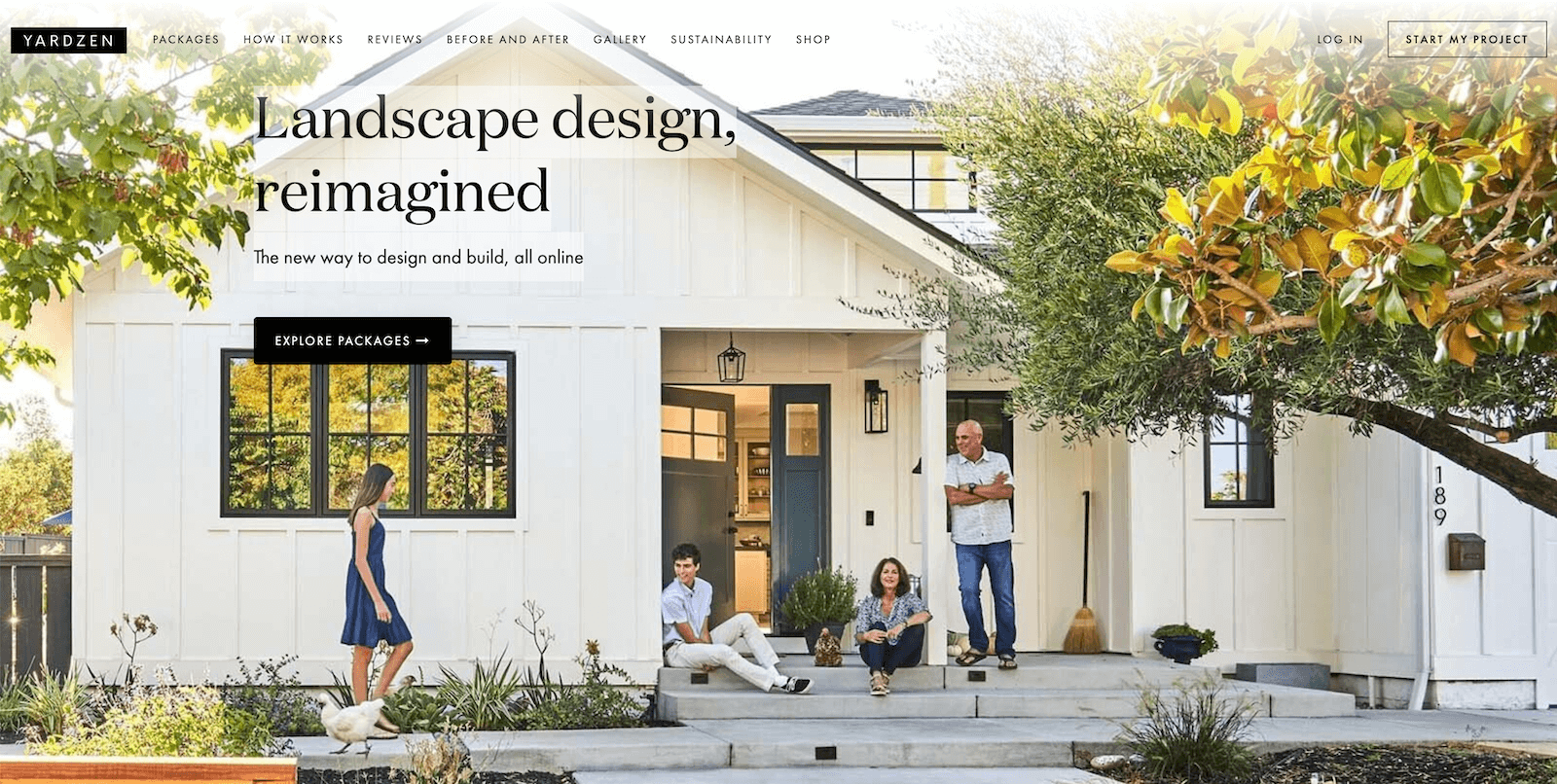
    Yardzen is an online landscape design service in California. They bridge the gap between local landscape designers and sleek technology companies. Their website homepage is lengthy and includes additional content, such as social media feeds, sustainability information, and a newsletter section. 

    Homepage structure

    Here’s how Yardzen structures its homepage:

    1. Header
    2. Hero
    3. Overview
    4. Success
    5. Call to action
    6. Social Media Feed
    7. Solution
    8. Testimonials
    9. Position
    10. Sustainability
    11. Position
    12. Blog Posts
    13. Call to action
    14. Newsletter
    15. Footer

    Homepage insights

    You’ll notice that they repeat several sections, like position and call to action. They include a few sections that could likely go in the footer and condense their homepage to the most vital sections. 

    Without any insight into how their homepage performs, I would recommend that they make the following changes.

    • Communicate the problem you’re solving earlier and clearer (ideally in replacement of Section 3: Overview)
    • Remove Section 6: Social Media Feed or move it below your final call-to-action
    • Remove Sustainability, Newsletter, and Blog Posts as they’re accessible in the header and footer

    Either way, Yardzen is an excellent example of a well-structured website homepage that follows our formula loosely. Their homepage would likely perform even better with a few minor tweaks.

    Shasta Power
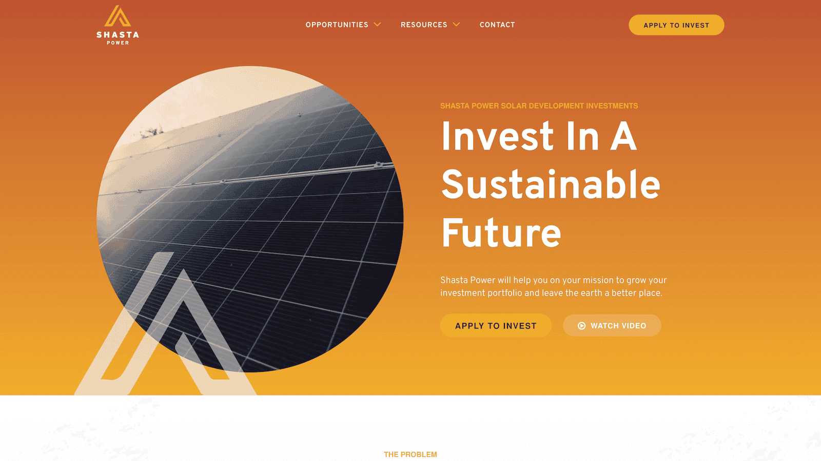
    Shasta Power Website Homepage

    Shasta Power is a solar development investment fund in Oregon. We’re biased here because we did the website design, development, and management. However, it’s still fun to analyze!

    Their website homepage is medium length and follows the formula loosely as well. Although, it does include the top three sections in order, which is very important.

    Homepage structure

    Here’s how Shasta Power structures its homepage:

    1. Header
    2. Hero
    3. Problem
    4. Solution
    5. Position
    6. Success
    7. Content Offer
    8. Blog Posts
    9. Call-to-action
    10. Footer

    Homepage insights

    Shasta Power follows the homepage structure much closer to Yardzen. However, testing a few tweaks and re-organizations would be worth testing to see if it was more effective.

    • Switch the Solution & Position the order
    • Move the Blog Posts below the Call-to-action

    That said, the Shasta Power homepage is a great one that we’re proud of—and we know they are too!

    Jasper
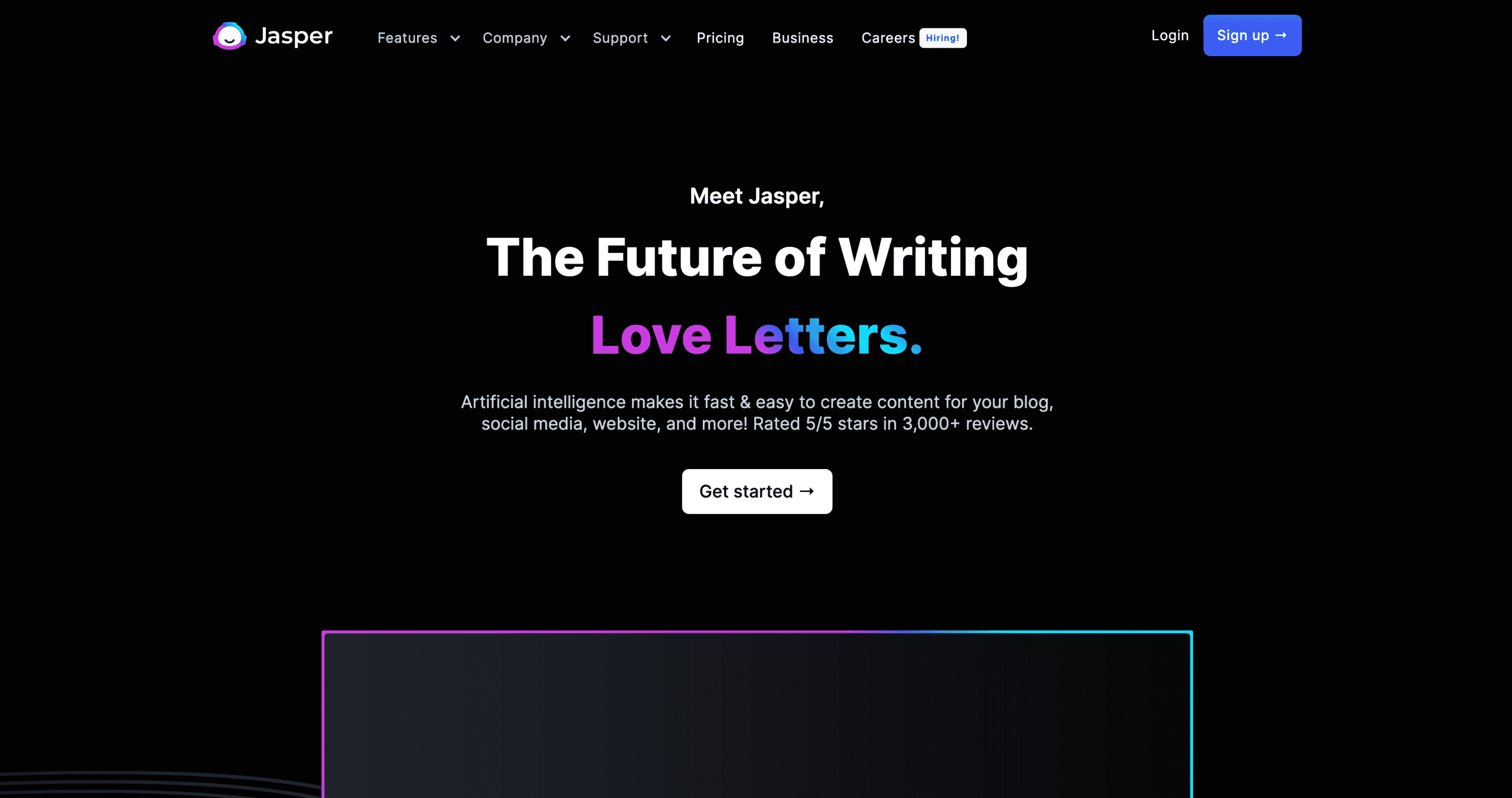
    Jasper Website Homepage

    Jasper is an AI technology SaaS company in Texas. Their homepage convinced us (we use their tool to aid our copywriting and editing), and we think it does a great job. However, you’ll notice that it has some formula elements, but not all. There’s always room for improvement!

    Homepage structure

    Here’s how Jasper structures their homepage:

    1. Header
    2. Hero
    3. Overview
    4. Position
    5. Solution
    6. Product Announcement
    7. Position
    8. Call to action
    9. Footer

    Homepage insights

    The shortest homepage of these examples still includes many elements required for a great homepage. Here are a few recommendations I’d make.

    • Dedicate a section to the problem you’re solving (replace it with the Overview section)
    • Replace Section 6: Product Announcement with a Success section to show users the steps they need to experience your product

    Common questions about the website homepage template

    Do you have to follow this formula exactly to get results?

    You do not have to follow this formula exactly to get results. There’s room for creative liberty and optimization. We recommend using this formula as a starting point, especially if you’re not getting the results you want from your website or don’t have data to inform how customers use your current website.

    Once you implement this formula, we recommend tracking how users interact with your website homepage and making adjustments based on the data you’re receiving. You might need to move one section of your website down in your specific industry or with your specific customers because it’s losing interest. You might need to move another one up because it gets a lot of interaction, but it’s near the bottom of your page (and you want more people to see it).

    However, this is a proven formula that works for almost all companies in all industries, and it’s a great place to start when you’re redesigning, optimizing, or improving your homepage.

    What if we have other content that we want to include?

    Add it between the CTA and the footer after the success section. Whatever you do, don’t add it before the problem because that disrupts the flow.

    What if we want to include a video on our website homepage?

    Great question! A video can go in any section as some of the content for that section. 

    For example, in the hero, you might want to use a background video showing someone using your product instead of an image. Or, in the success section, you might want to use a customer testimonial video instead of written quotes. These enhancements will only improve the experience your customers have with your website.

    You can get creative with where you put your videos but make sure they’re adding value to that specific section, and website visitors will appreciate it.

    Will this template work for our company?

    Yes, this website homepage template will work for companies of all sizes in all industries, whether you’re B2B or B2C. If you want more website traffic, leads, and sales, this is the template for you.

    Note that these are the main building blocks, but you can rearrange them and be creative with how you fill in each section.

  • Website Design Planning: Our Simple, 3-Step  Process [Free Template]

    Website Design Planning: Our Simple, 3-Step Process [Free Template]

    Website design planning will set you up for success in every project stage, whether you do it yourself or hire help. Learn how to plan a website that attracts and converts visitors.

    Imagine if your website delivered as many leads, sales, and opportunities as you wanted.

    Imagine if your website looked impressive, and you were proud to use it to represent your business.

    What if it connected with all your business systems and automatically processed data, so you didn’t have to do it manually?

    A well-planned website can do all these things.

    That’s why the top-performing, highest-converting, most beautiful websites didn’t get built haphazardly—they were designed with a plan. 

    Free Website Design Planning Template

    Download the Structure Website Design Planner and use it to define and design your website!

    Maybe you just finished a brand overhaul.

    Or you’re launching a new product or service. Perhaps you’re even preparing for a new level of growth.

    Whatever your reason, a website design or redesign project can be a huge success or a colossal failure. 

    A strong plan creates a smooth process.

    Fear not! After designing our first website in 2010, I can confidently say that a strong web design plan creates a smooth web design process.

    That’s worth repeating. A strong website design plan creates a smooth website design process.

    In this article, we will pull back the curtain and share the Structure website design planning process, end-to-end.

    This is the same process we use to create $50,000+ websites that look amazing and generate more business than you believe. Let’s start!

    Structure Website Design Planning Template

    Website Design Planning Sucks

    Most websites we’ve redesigned never started with a plan, so we were hired to redesign them!

    Of course, our website redesign process includes planning, but most people don’t start there.

    Instead, they start at a random point in the process and hope they don’t skip over anything with too many downstream effects.

    I’m giving most folks a hard rap, but the truth is, I understand entirely. Website design planning sucks (most of the time) for a few reasons.

    Structure Website Design Planning Template
    Structure can help your team with website design planning

    1. Planning a website design takes time

    Let’s be honest.

    Most business leaders, marketing leaders, and entrepreneurs are busy. They want to accomplish work quickly.

    Planning in general (and website planning in specific) is the last thing we want to slow down to do.

    We all love a good plan’s clarity, calmness, and conclusion. However, it is tricky to block out the time on your calendar and prioritize the thinking time to do it.

    The website builder platforms (like Wix, Squarespace, Duda, GoDaddy, Weebly, etc.) know this.

    That’s why, when you sign up to build a DIY website, you start by picking a template and jump right into the building. They skip the planning, assuming you already did or will never do it.

    The good news is that website planning doesn’t have to take as much time as you’d think.

    By following the planning process we share in this article and utilizing our free Website Design Planning Guide, you’ll save lots of time because you’ll know what to do.

    2. Website planning takes knowledge

    It’s true.

    Website planning takes a basic understanding and knowledge of a website, how it works, and its role in your business.

    Therefore, when you go to “plan” a website, you may not know where to start or what to do. That’s okay; it’s another reason why having a Website Design Planning Guide can help. 

    If this is you, consider watching our (free) training on your website’s role in your business and how it affects each part of your marketing. It will help you better understand your website before you start the planning process. You can check it out HERE.

    3. Web design planning is uninteresting

    When most people think about a website design (or redesign), they think first about the art aspect of the website.

    They think about the website’s appearance: the logo, colors, fonts, and images.

    We like to look at beautiful things.

    However, most people don’t realize a website is 25% art and 75% science.

    In some ways, a website is like an iceberg. The art is the tip—the piece that stands out that everyone can see.

    However, most of what goes into a website happens behind the scenes. 

    We tell our clients this: great websites are much more FORMULAIC than most people think. Our website design planning process is a formula that will give you results if you follow it.

    4. The work to define a website requires alignment

    Now, it’s time to face the music.

    One of the biggest reasons website planning sucks is that your team has to define, align, and make decisions.

    That can be a challenge for any team, whether you’re website design planning or strategic planning.

    However, alignment is one of the biggest reasons organizations don’t define their website—and if they do, it’s an insanely painful process.

    Our Website Design Planning Guide helps organizations find alignment easier because the planning process isn’t ambiguous or random.

    You can work through the website planning process in just a few short meetings.

    Free Website Design Planning Template

    Download the Structure Website Design Planning Guide and use it to define and design your website!

    How You Can Do Website Design Planning Right

    The Structure Website Design Planning Process starts with the Define Phase, which takes four work sessions in our Website Planning Workshop, utilizing different worksheets in each work session.

    • Session 1: Strategy
    • Session 2: Shape
    • Session 3: Systems
    • Session 4: Schedule

    Let’s start by digging into the first item.

    1. Strategy Worksession

    This work session serves as the kickoff point for the planning process.

    In this session, you won’t think about your website or user needs as much as your business needs.

    This session includes the following worksheets:

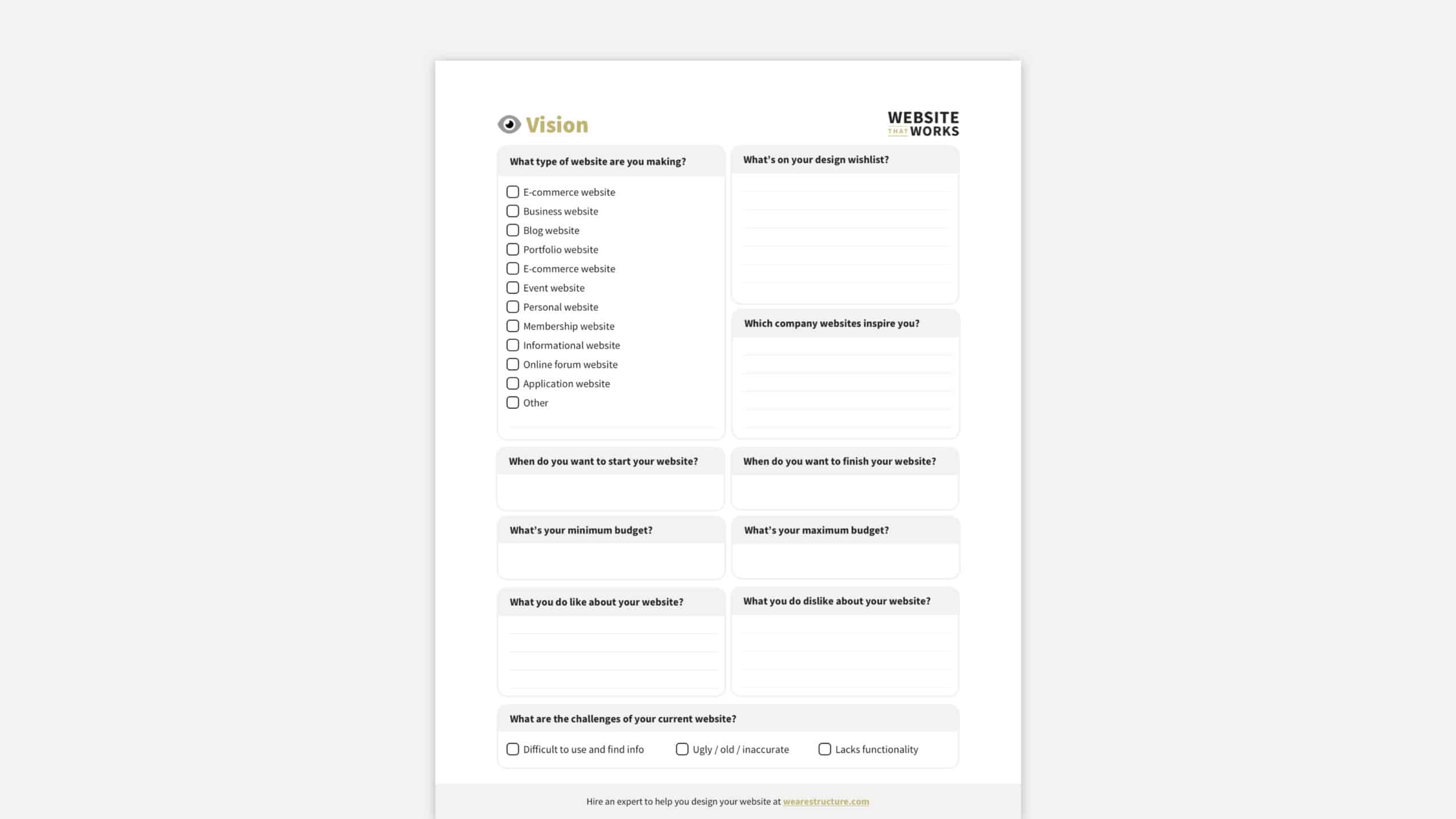
    Vision Worksheet

    The vision worksheet helps you document what you’re hoping to create.

    It won’t help you create a lofty, unrealistic vision for something you can’t afford. It’s intended to stay practical and specific.

    DOWNLOAD THE FREE WEBSITE DESIGN PLANNING GUIDE TO GET THIS WORKSHEET

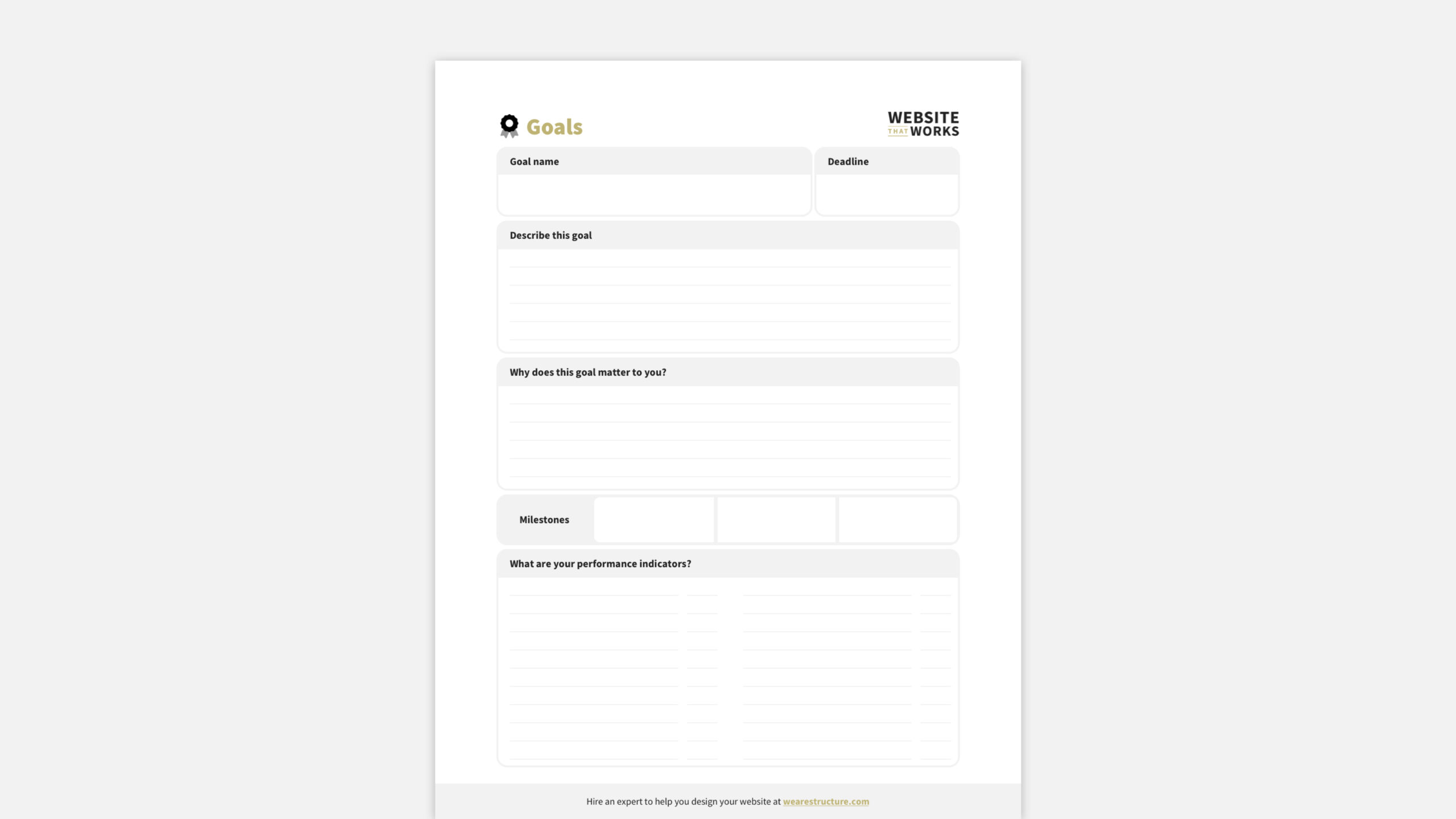
    Goals Worksheet

    The goals worksheet aims to align your team around your website project’s purpose.

    It also clarifies your website’s goals and how to know if it delivers the desired results.

    DOWNLOAD THE FREE WEBSITE DESIGN PLANNING GUIDE TO GET THIS WORKSHEET

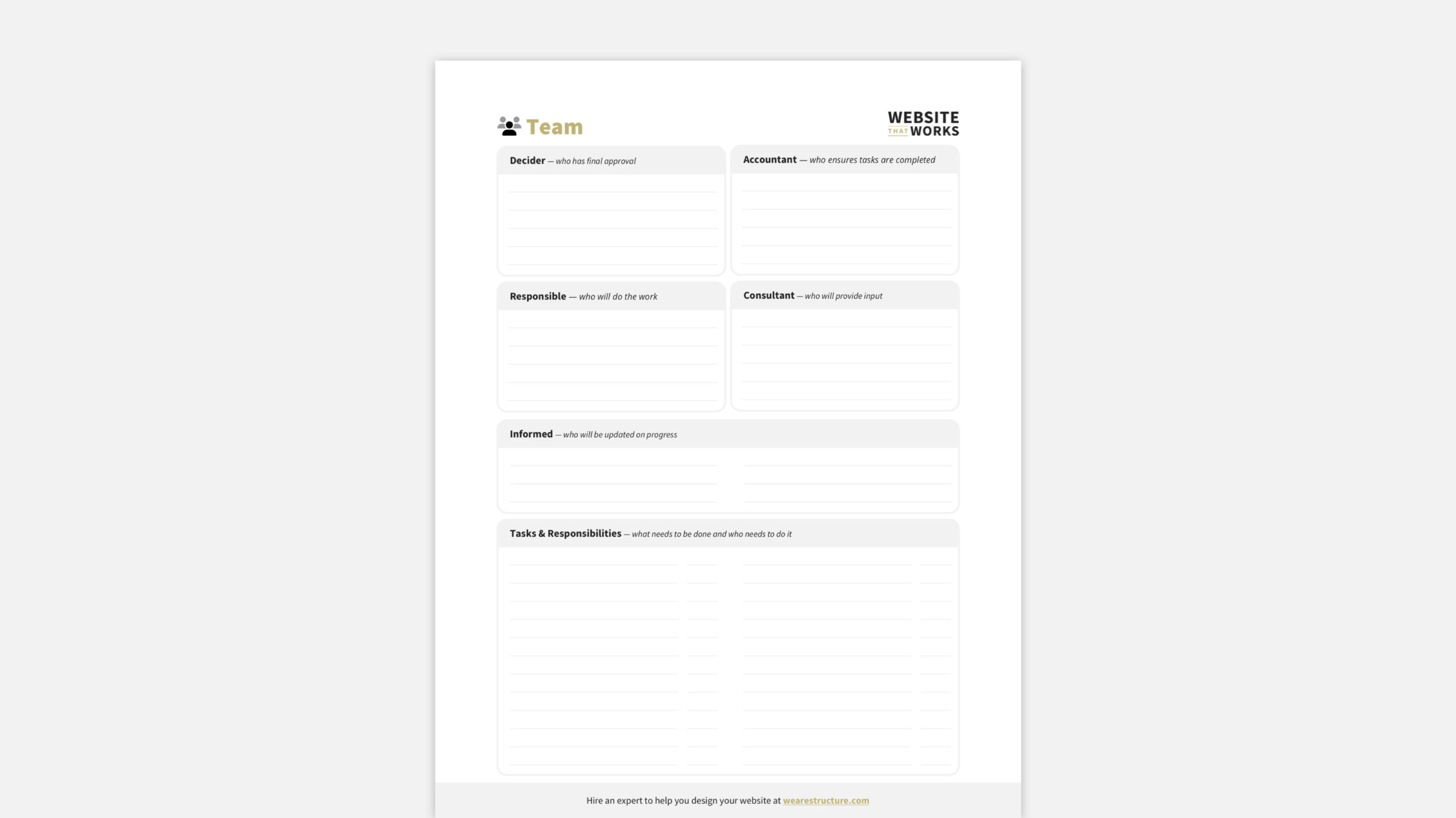
    Team Worksheet 

    The team worksheet uses the DARCI Framework to define roles and responsibilities for your team.

    This helps you know your strengths and weaknesses and ensures you aren’t stepping on each other’s toes.

    2. Shape Worksession

    This work session is the second of three.

    It builds on your website strategy to define the systems that will make your website work for your business—and create an exceptional experience for your customers, too!

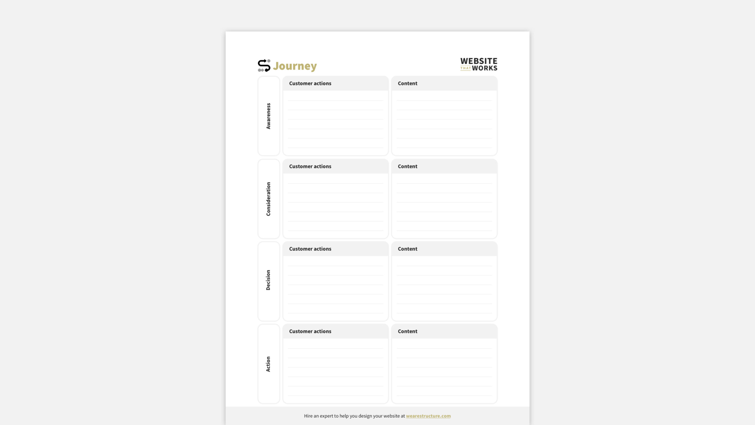
    Customer Journey Worksheet

    The customer journey worksheet helps you document how your customers buy from you. It lets you know your customers’ touchpoints with your website—which is a pivotal factor in knowing which pages are vital to the website.

    DOWNLOAD THE FREE WEBSITE DESIGN PLANNING GUIDE TO GET THIS WORKSHEET

    But most importantly, the Customer Journey worksheet lays the foundation for your website’s information architecture.

    If you’re not familiar with this term, it essentially means:

    • What information is included on your website
    • How that information is laid out
    • Where it has the most impact

    Diving into information architecture is worth another blog post in itself and is something that you’ll lean on a UI (user interface) and a UX (user experience) website designer to help you with.

    They’ll structure the information and lay out the visual elements to guide your customers through the perfect journey.

    More on this after the website planning process is complete.

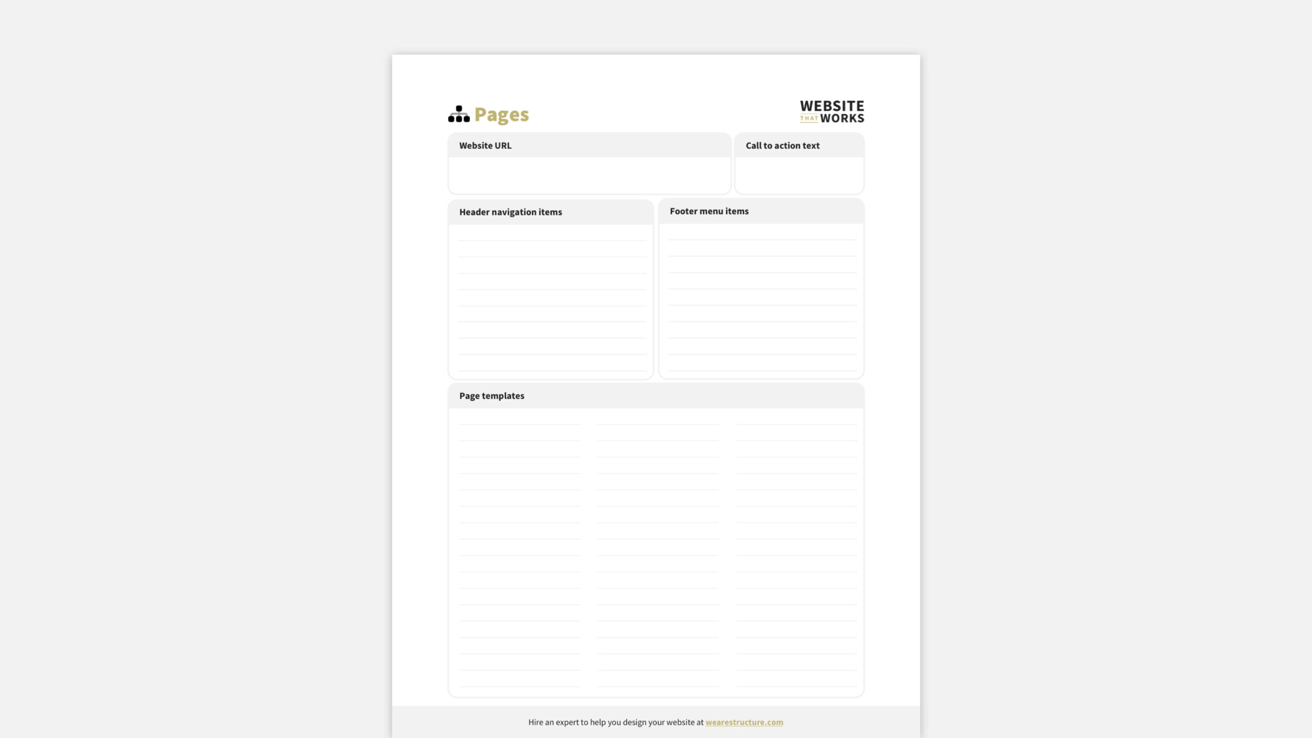
    Sitemap Worksheet

    The sitemap worksheet helps you assess your website’s current pages and, in conjunction with the Customer Journey Worksheet, enables you to define the pages needed on your new website.

    You can also determine which pages to link in your header and footer navigation.

    DOWNLOAD THE FREE WEBSITE DESIGN PLANNING GUIDE TO GET THIS WORKSHEET

    3. Systems Worksession

    The third website design planning work session looks at how your website interacts with all functions in your business.

    You see, many think that the website is only a marketing and sales function. But that’s not true!

    It can be a tremendous resource for other functions like Administration, Finance and Human Resources, Operations, and more.

    Spend this time planning how your website systematically can save time and money through digital automation.

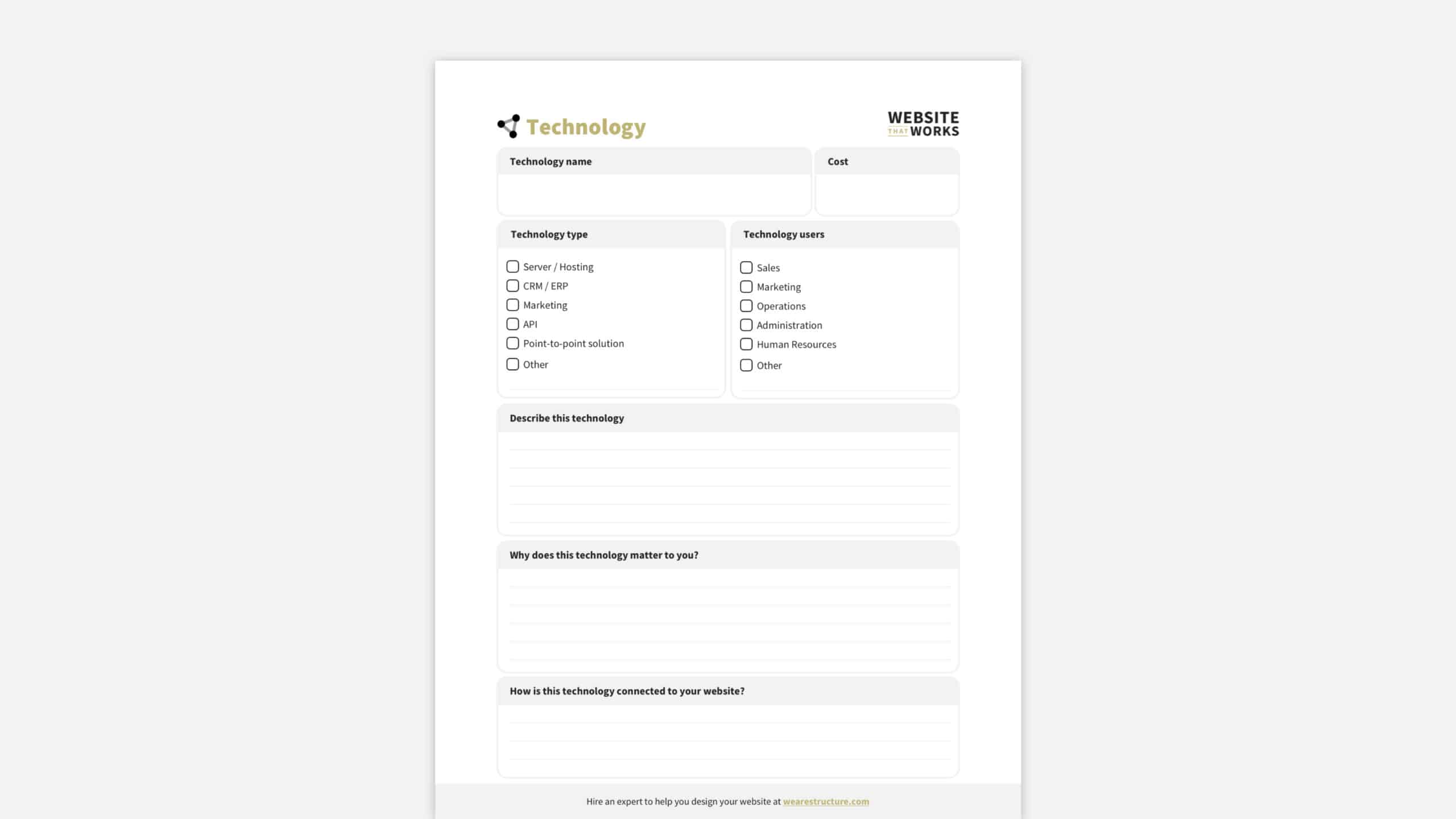
    Business Systems Worksheet

    The last worksheet in this session is the business systems worksheet.

    This helps your team become aware of the business systems you’re currently integrating with your website. Additionally, it helps facilitate any changes or upgrades needed before you get too far down the road.

    DOWNLOAD THE FREE WEBSITE DESIGN PLANNING GUIDE TO GET THIS WORKSHEET

    4. Schedule Worksession

    This final session includes one worksheet intended to set the stage for the design process by bridging the gap between your plans and visual design. Everything you’ve done so far in the planning process will be summarized in your wireframe worksheet.

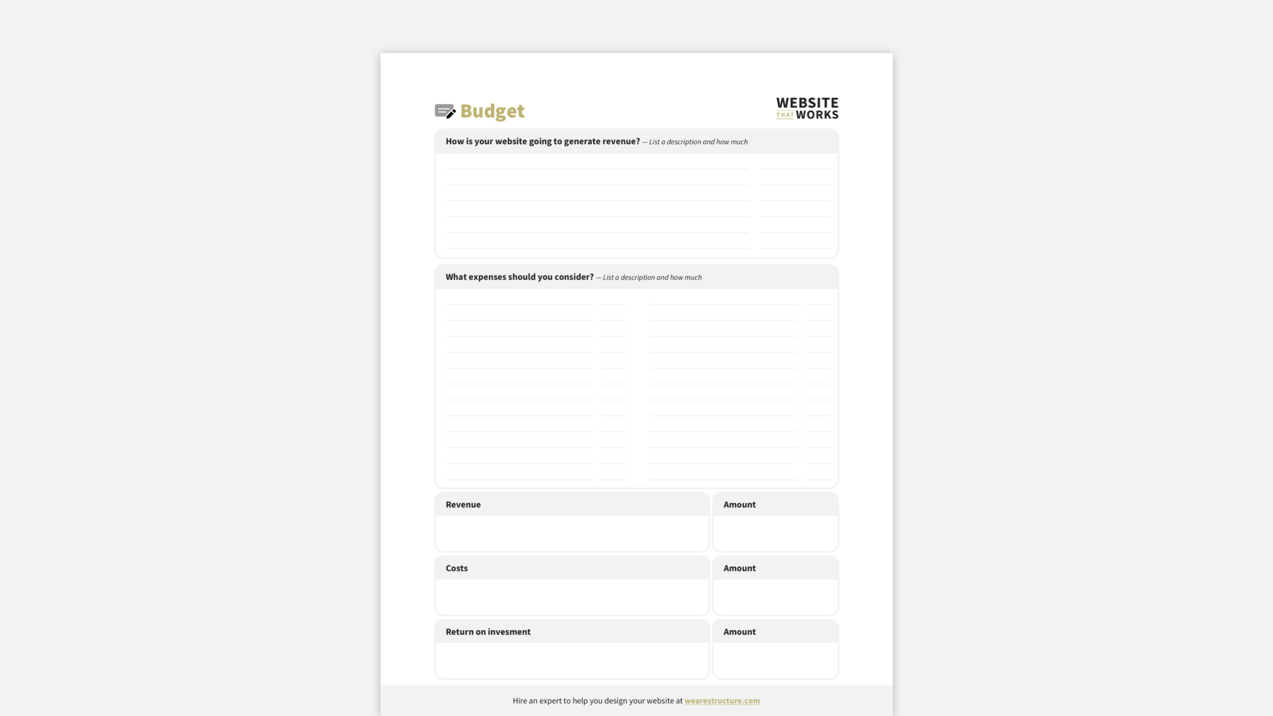
    Budget Worksheet

    The budget worksheet is intended to help you estimate the value of your website.

    Most website budget worksheets only focus on the cost—ours take a more value-based approach and looks at the Return on Investment (ROI).

    We help you list how your website will generate revenue and what expenses should be considered. The goal is to answer this question: Revenue – Costs = ROI.

    DOWNLOAD THE FREE WEBSITE DESIGN PLANNING GUIDE TO GET THIS WORKSHEET

    How Structure Can Help with Website Design Planning

    So, that’s how we do website design planning at Structure.

    It’s a process, no doubt!

    However, I hope you can see that you’ll walk away with a comprehensive website plan by breaking down the planning process into three focused sessions with a few worksheets.

    You can guarantee your upcoming website is already stepping ahead of your competition.

    1. Download the Free Website Design Planner

    If you’d like to use our process for your website planning, go ahead! Get each worksheet for free when you download the Website Design Planning Guide.

    2. Register for a Structure Website Strategy Workshop

    Spend a few days with Structure to plan your website, and we’ll save you a few months of mistakes trying to figure it out independently.

    3. Watch Our Free Website Training

    We’ve put together an excellent training on your website’s role in your business and how it affects each part of your marketing.

    It’s called How to Build a Really Attractive, High-Converting Website That Makes You Proud.

    It will help you better understand your website and set you up perfectly for the planning process.

    4. Learn How Our Process Works

    Now that you know the Structure website design planning process, you might wonder how the other steps work.

    • When do we start the design?
    • Where does development fit into the process?
    • What steps do you need to take in which order?

    Check out our website’s How It Works page for the step-by-step breakdown.

    5. Take Our WebsiteBuilder Quiz

    If you’re considering hiring a Structure to help with your website design or redesign and want to know what it would cost, take our quick Website Design Quiz.

    It lets you tell us about your business, website goals, and timeline and will recommend a design package to get you started.

    6. Schedule a Free, 30-minute Consult Call

    We’re excited to help!

    You can take the call yourself or bring your team (the more, the merrier). Schedule a call if you’re ready to talk to one of our experts about your website.

    We’ll discuss your website, you’ll get free advice and guidance, and we’ll recommend a personalized package that fits your unique needs.

    Learn how to plan and a website design

    Website Design Planning FAQs

    What is website design planning?

    The first step of a website redesign is web design planning.

    Planning entails determining and documenting the type of and how exactly your firm wants to create a website and why or what the goals are.

    Website design planning is also known as Website Strategy.

    This step is crucial because it allows everyone on the project to be on the same page about what needs to be accomplished with the new or redesigned website.

    A well-crafted website strategy will answer five key questions:

    1. Who are we designing this website for? (Hint: It’s not just “anyone who visits the site.”)
    2. What do we want them to do when they get there? 
    3. What content will be most useful/relevant/engaging for this audience? 
    4. What are our business goals for this website? 
    5. Who is responsible for content creation and maintaining the website content?

    You must return to the drawing board if you can’t answer these five questions. Trying to build a website without a clear strategy is like playing darts in the dark—you might eventually hit the target, but it will take much longer (and be much less fun) than if you turned on the lights first.

    Does every website need website design planning?

    The answer is yes… if you want your website to accomplish clear goals—such as generating leads, taking orders, or communicating with your target audience.

    We strongly recommend doing some strategy work for most websites before diving into design and development. Trust us; it will save you time (and money) in the long run.

    However, there’s always an exception; not every website needs formal design planning.

    For example, a website for a personal blog or small business that’s just getting started, for example, may not need the same level of strategic thinking as a large enterprise website or an ecommerce site.

    In these cases, “Yes, informally may be a sufficient answer. You should consider the five website strategy questions in the above answer from a high level. 

    Who is website design planning for?

    While the planning process is crucial for everyone involved in creating or redesigning a website, it’s essential for two groups of people: 

    1. The project stakeholders, who are responsible for approving the budget and timeline for the project plan 
    2. The project team who will be doing the actual work of designing and building the website

    Project stakeholders are often high-level decision-makers, such as the CEO, CFO, or CIO.

    Often, for our clients, it’s the CEO, VP of Marketing, and Marketing Director. Some may not be intimately familiar with all the project details, but they must understand enough to make informed decisions about allocating resources.

    On the other hand, the project team will be deeply involved in every step of the process, from researching the competition to writing content to designing and coding the website.

    They must understand the project goals to do their jobs effectively and clearly.

    Both groups need to be involved in the website design planning process.

    Stakeholders need to provide input on the website’s overall purpose and goals, while the project team can offer insights on how best to achieve those goals.

    What are the benefits of website design planning?

    There are many benefits to taking the time to do formal website design planning, including: 

    1. A more precise understanding of the project goals 
    2. Improved communication between stakeholders and the project team 
    3. A more efficient and effective design and development process 
    4. A website that’s more likely to meet the needs of its users 
    5. Improved ROI for the business

    When done correctly, website design planning can help everyone understand what needs to do and why. This, in turn, leads to better communication, a smoother design and development process, and a final product that’s more likely to achieve its goals.

    What are the steps I need to take to plan a website?

    No one-size-fits-all answer to this question exists; every team will do it differently. Our team, however, uses the three-step process outlined in this article’s body. 

    1. Strategy Worksession
    2. System Worksession
    3. Shape Worksession

    We’ve found that this approach leads to the best results, but you may need to adjust it to fit the specific needs of your project.

    The planning process doesn’t have to be complicated or time-consuming.

    By taking a structured approach and involving all the key stakeholders, you can ensure everyone is on the same page. You will save time and money in the long run, and it will help you build a better website structure.

    Where can I find a website design planning template?

    Right here!

    Download the Structure Website Design Planning Guide for your website project’s A to Z roadmap.

    Furthermore, this is the same website planning template we use to create $50,000+ websites that look amazing and generate more business than you believe.

    How important is website design planning?

    Website design planning is the most critical part of a website design.

    Period.

    Unquestionably, there’s nothing more vital that you can do for your future website than starting with a plan.

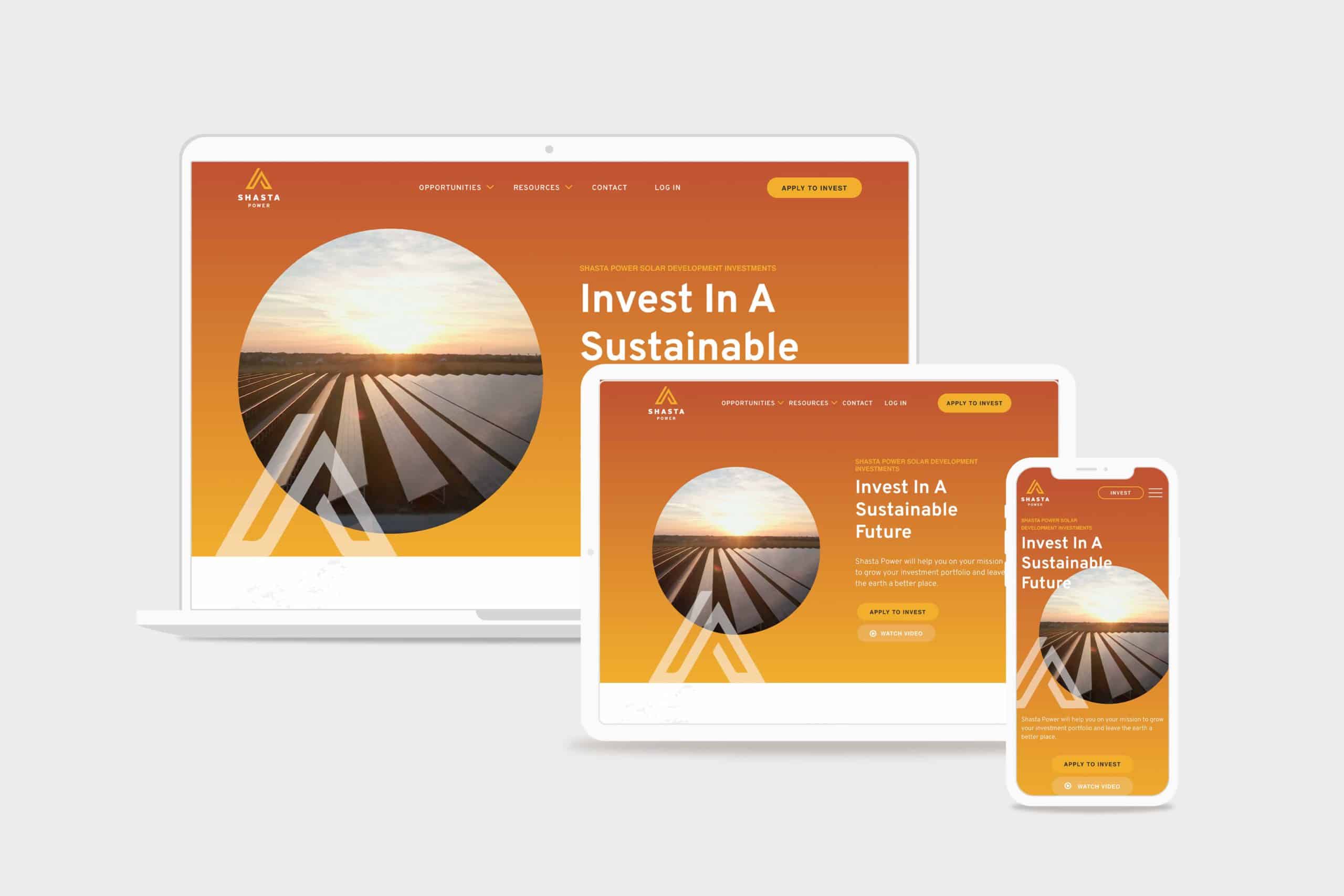
  • Shasta Power Website Redesign

    Shasta Power Website Redesign

    Shasta Power came to us with an outdated, confusing website that didn’t represent their offering well. So we helped them revise their visual identity and message—culminating in an impactful website redesign.

    Shasta Power Website Redesign Hero
    shasta power hero

    Challenge

    Shasta Power built its first website on a budget. It was time to invest in a professional website, but the other website design and development firms Shasta Power spoke to wanted to throw them into a box. They didn’t listen or care about the business or user’s needs.

    Solution

    We took Shasta Power through our Website Process, starting with understanding the website goals. We then did a brand refresh and designed a custom, responsive website. The website development was on WordPress and integrated its business systems with the website

    Results

    Awareness metrics have risen across the board, including new followers and site visitors, up over 600% and 200%, respectively. We worked quickly against a short timeline while maintaining an impressive quality standard for the brand.

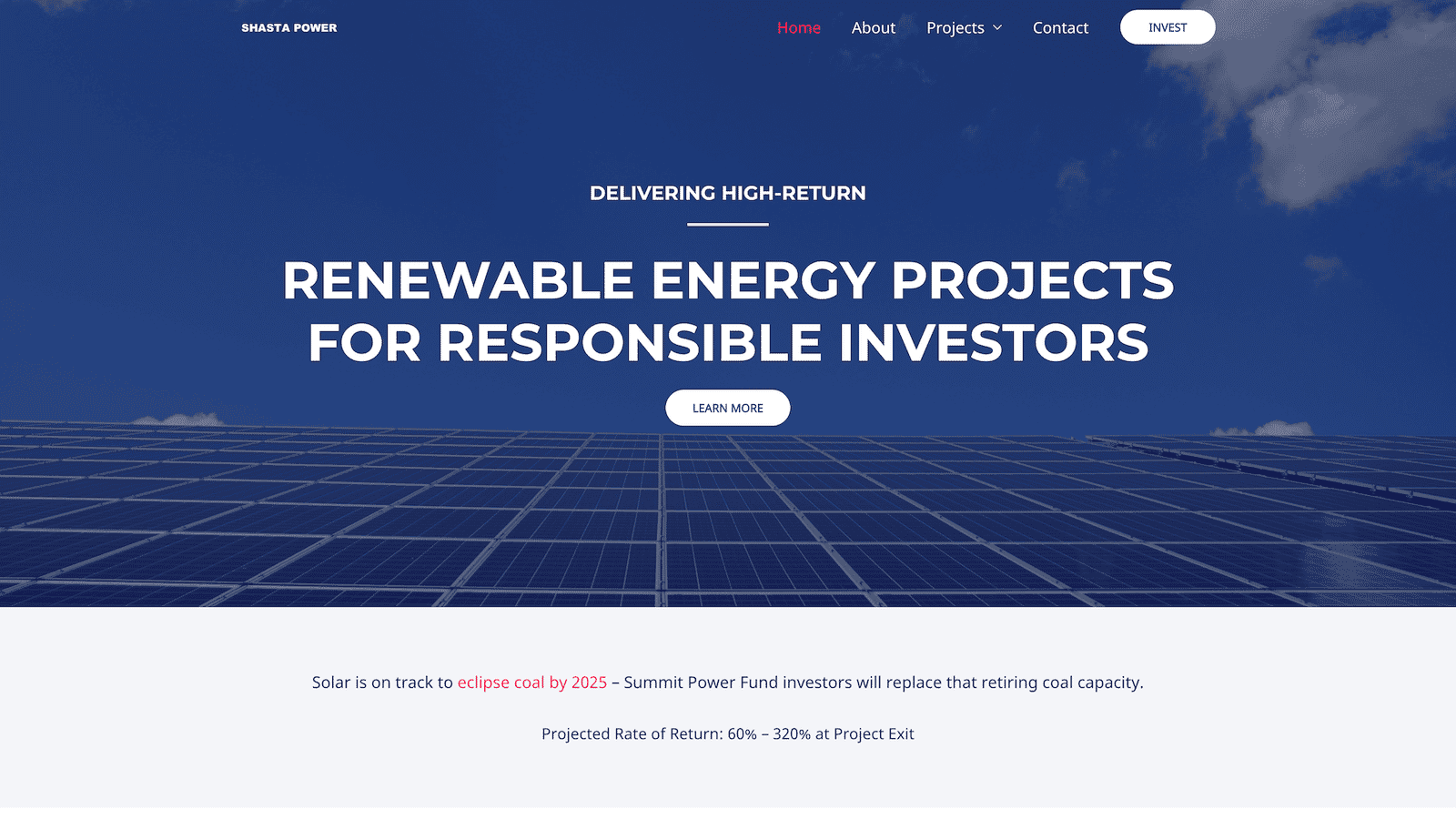
    Shasta Power Website Redesign Before
    shastapower.com before
    Shasta Power Website Redesign After
    shastapower.com after

    If I had to boil it down to one thing, I would say their integrity is their best quality. I get a sense of honesty and quality from them; they take their work seriously and do it in a professional manner.

    max roe, partner
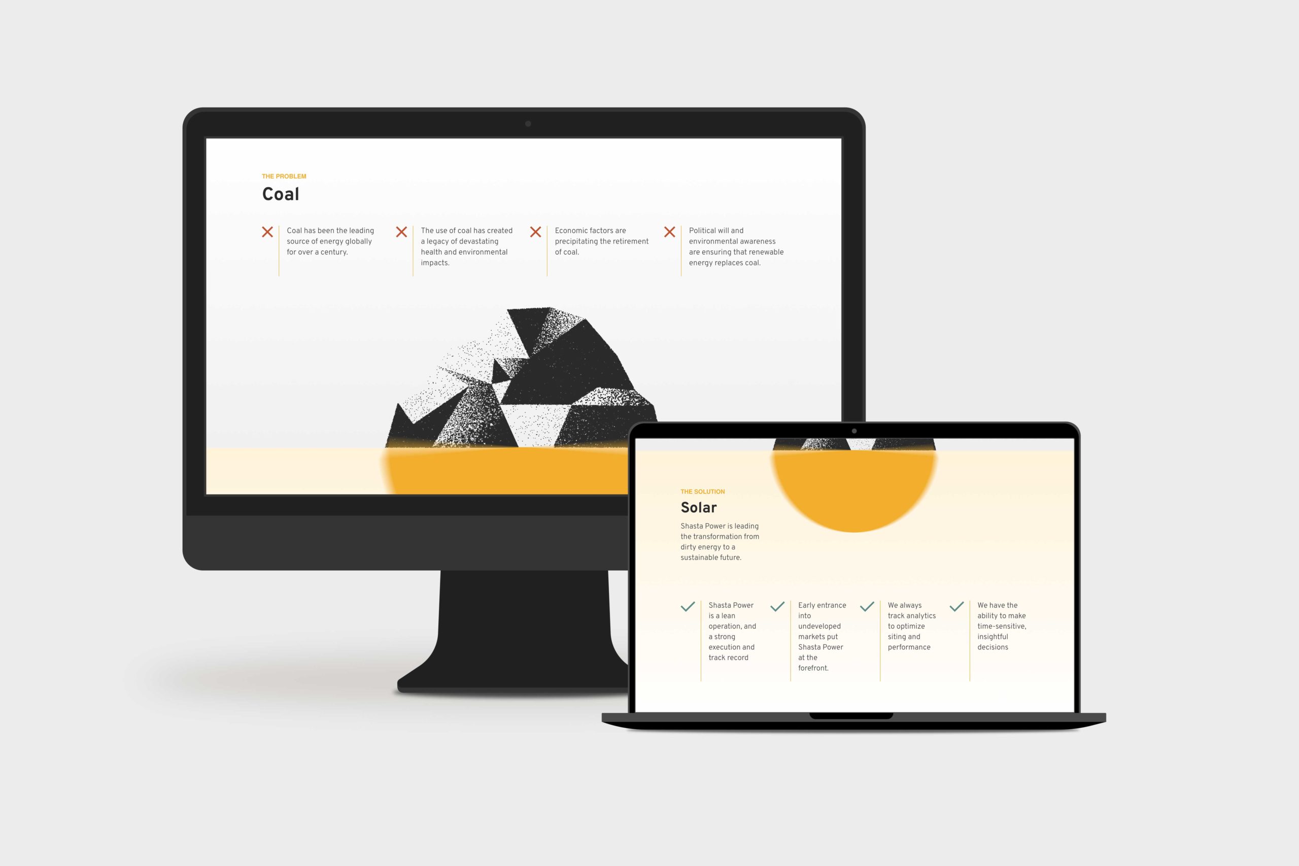
    Shasta Power Website Redesign Product Page
    summit power fund product page

    Logo Design

    When Shasta Power came to us, they didn’t have an official logo. So the first thing we did was explore logo options for their new website design. We delivered a handful of comps, ideas, and styles for them to review. After a few iterations, we landed on a logo that was strong, confident and represented Mount Shasta—the symbol behind the brand.

    Similarly, Shasta Power didn’t have any colors representing its product or mission. As a company as a solar investment firm, we developed a pallet that represented the earthy nature of their work. We lead with a solid orange and yellow gradient, with supporting blue, green, and clay colors representing the environments they develop in.

    Website Design

    As with all website design, you can’t have a great beautiful site that makes no sense. So we invested heavily in information architecture, wireframing, and content development. This strategic process helped ensure the site helped users progress through the content and was simple and easy to understand—all the while representing Shasta Power in its best light. Once we had the blueprint down, we applied the brand, and it turned out beautifully.

    Shasta Power wanted to use its website to generate leads, so we built a custom webinar registration flow. This included a landing page template they could use and replicate for any webinars they host for marketing or customer engagement. Additionally, it had a registration form and a webinar video page where they could embed their live content for users to engage with.

    Website Development

    Shasta power was familiar with WordPress CMS, which we love to build with. So we built their new site in a very similar way to their old site using a custom theme and Advanced Custom Fields content editing fields. This kept the entire experience familiar and allows them to swap out photos and make copy changes when they want to without worrying they’re going to break anything.

    On the front end, Shasta Power added an Animation Package so that the content fades smoothly as a user scrolls down the site. This small addition makes a massive difference for the user and helps them stay focused on the contact right in front of them while guiding them through the site.

    Website Management

    Shasta Power took advantage of our Startup Website Management Package, so they didn’t have to worry about regularly updating WordPress core, theme, or plug-ins. They also appreciated being able to reach out to us here and there to update content on the site or ask questions without starting a new project.

    Moreover, Shasta power has trusted us as an ongoing partner to help them grow their website through additional digital marketing initiatives.

  • DryFireMag eCommerce Website Redesign

    DryFireMag eCommerce Website Redesign

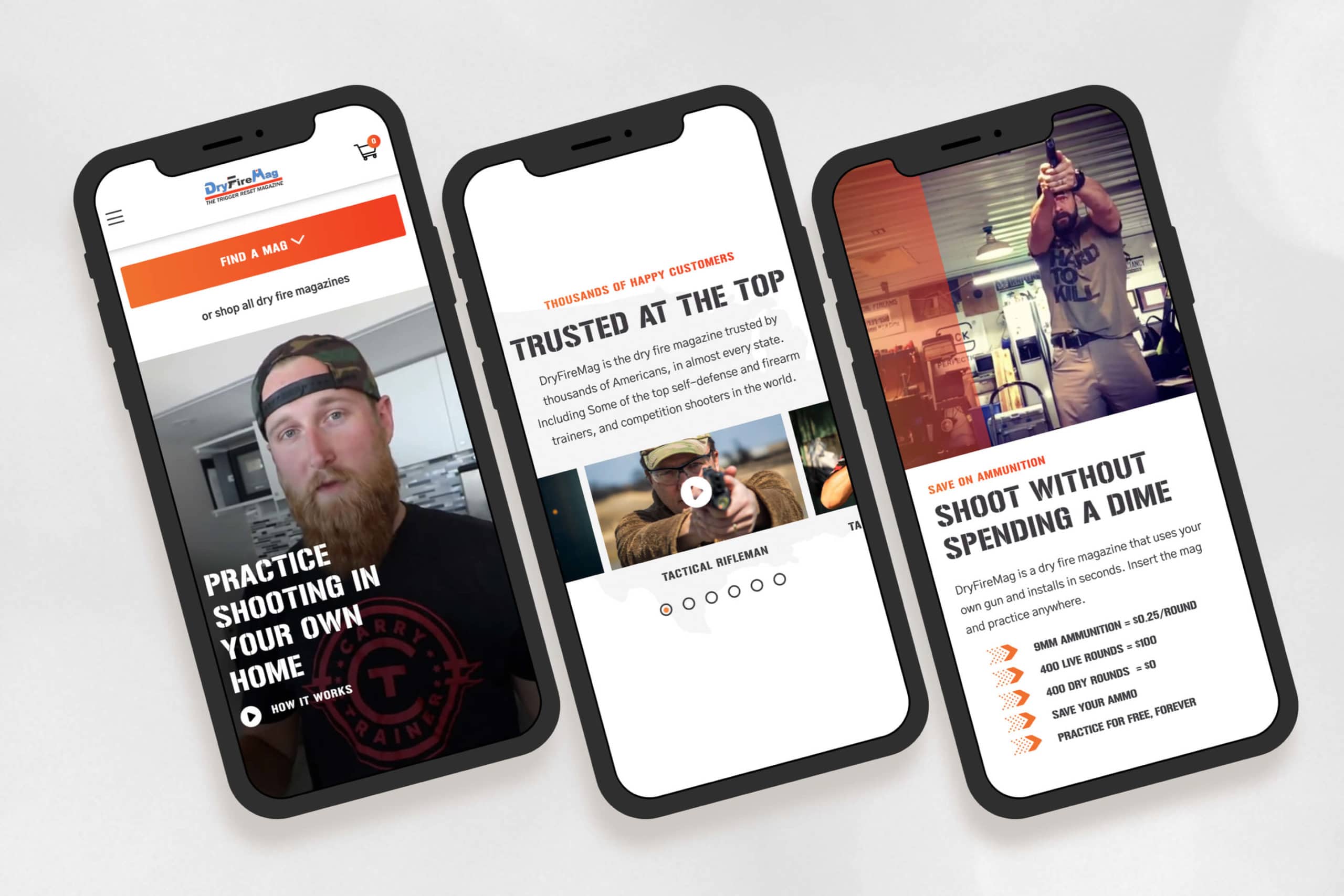
    DryFireMag is a fast-growing firearms safety company in Idaho that primarily sells its products on its e-commerce store. We helped them increase their conversion rate and redesign their website so customers could find and purchase products more efficiently.

    DryFireMag E-commerce Website Redesign mobile mockups

    Challenge

    Their website was never what they hoped it would be. It was cumbersome and did not help customers find what they needed—in fact, it did the opposite. DryFireMag saw sales decreasing and needed a resolution.

    Solution

    We analyzed how customers used their website using heatmaps and user testing. Then, we designed the website from the ground up so customers could quickly find what they were looking for.

    Results

    The result is a high-converting site that has only grown in traffic, traction, and sales for DryFireMag since we launched. The success has put them in a new position to open up to international sales.

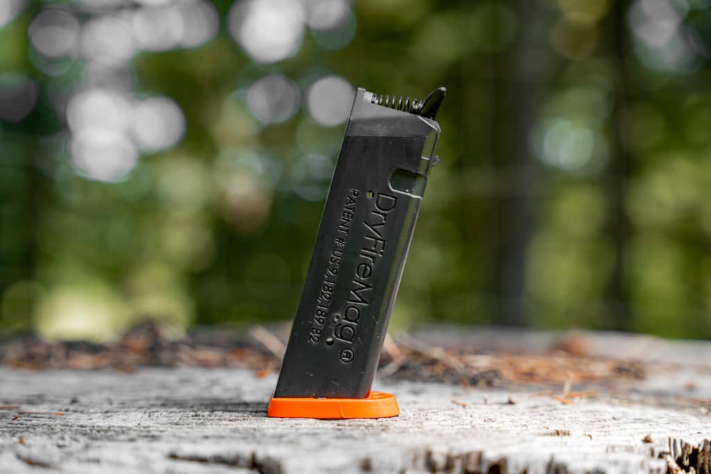
    DryFiremag in a Glock 22
    DryFiremag in a Glock 22
    dryfiremag for small frame glocks
    dryfiremag for small frame Glocks

    “Structure was the most professional, responsive and personal of them all.”

    John Seigler, head of product

    Website Strategy

    The website strategy was one of the most significant issues with the old DryFireMag site.

    As the business grew, they felt they needed to communicate more things to their customers on their website: product information, shipping notices, and marketing announcements.

    The site became cluttered, and we helped them get back to the basics—and figure out a way to organize the content, so it supported customers during the checkout flow instead of distracting them.

    Brand Design

    The DryFireMag brand was severely underdeveloped.

    While the DryFireMag didn’t want to invest in a rebranding or brand strategy process, we were able to bring out the best of the brand as-is and bring in some new elements that helped the website feel more exciting and align a bit better with its target audience.

    Beautiful, functional web design

    Another challenge was helping customers find the right mag for their pistol.

    The DryFireMag team received dozens of support calls and returns daily from customers who had purchased the wrong product. Finding a solution would result in happier customers, less overhead, and more profit for the business.

    We designed and built a fun product quiz right in the navigation so that customers could select their pistol and get redirected to the perfect product.

    Web Development

    Since their e-commerce store was already live and bustling (with a sizeable shipping and logistics team behind it), we took great care to retain the integrity of their integrations, business systems, and customer data.

    The site already used WordPress CMS with WooCommerce e-commerce functionality, so there was no reason to reinvent the wheel; however, ensuring customer data didn’t get lost or changed was a challenge. Luckily, this wasn’t our first rodeo, and the launch went off without a hitch.


    Strategy

    User Testing
    Conversion Rate Optimization
    Information Architecture
    Content Strategy
    UX Strategy

    Design

    UI / UX Design
    Visual Design
    Creative Direction
    Animation Design

    Content

    Copywriting
    Photography
    Art Direction

    Development

    Front-end Development
    Back-end Development
    E-Commerce Development
    Quality Assurance
    Consulting

  • How to Find (and Hire) a Good Web Design Agency

    How to Find (and Hire) a Good Web Design Agency

    The problem is apparent. Your customers spend significantly more time online daily (thank you, COVID-19). Therefore, the distant dream of redesigning your website someday is no longer just important—it’s urgent. You need a web design agency to help.

    You’re smart—and you know that if customers can’t find your business online, they’re finding your competition. You need a website that works.

    So you’ve started looking for a web designer or web design company to help. But what you find is discouraging at best.

    • Most web design agencies are constantly chasing new clients (because they can’t keep the ones they have).
    • Most web design agencies keep their best ideas to themselves (because they’re afraid they’ll be mocked if it’s dumb).
    • Most web design agencies create distance in their client relationships (to protect themselves from being hurt when things go south).

    Ironically, these flaws are why so many people have bad experiences with web design agencies in the first place.

    These flaws hurt a web agency’s ability to forge a long-term relationship with their clients—and do great work! Because it causes them to avoid the problematic things that produce results.

    Does that sound like the kind of web design partner you want to hire?

    3 things to look for before you hire a web design agency

    1. They do good work

    This could go without saying, but your web design company needs a portfolio of work proving their capability.

    They don’t need a huge portfolio or even a portfolio of work with big clients like Google and Airbnb. What you should be looking for are website projects like yours. Their projects should have a style you like. Their projects should function how you like.

    2. They make time to understand you

    A lot of web design companies solve problems that don’t exist. In other words, they slap on a solution that doesn’t solve anything. A good web design company starts a relationship by understanding your face. If they don’t, they don’t care.

    This means that your web design team should give first. They should give their time, money, and effort to understand you and try to win you over. This often takes the form of a discovery conversation or pilot project so they can dig into what you’re up against.

    3. They’re not too expensive or too cheap

    Too many people spend too much or too little on a website. They either hire an agency with too much baggage and drama, so it’s costly, or they hire a freelancer on Upwork who does a crappy job and hardly costs anything.

    Think of your website as a car, truck, or boat. It’s a machine that you buy to give you what you want. A good car, truck, or boat gives you fun, comfort, or safety.

    If you were buying one today, you wouldn’t buy the most luxurious option because it would probably be way more than you need. You also wouldn’t buy the cheap crap because it wouldn’t be as fun, comfortable, or safe.

    You’d look for a car, truck, or boat that will be a good investment and will give you what you want. You should be willing to pay enough to ensure you get what you want.

    Don’t settle for cheap, easy, or sleazy

    If you’ve been in business for any time (or watched The Godfather), you’ve heard the phrase, “It’s just business. It’s not personal.” That’s just a lie web design companies tell to preserve their ego and self-confidence.

    We believe business is personal.
    This changes everything.

    At Structure, we live and work by this code. Business is personal. This belief means we embrace uncommon levels of humility, selflessness, and transparency for the good of our clients.

    We make everything about the client. Here’s what that means . . .

    We’re not salesmen, we’re agency consultants

    Our primary goal isn’t to sell you into a big project or an ongoing retainer. We’re here to help. We know hiring us will be a breeze if we do that well.

    We start every relationship with a free discovery call or pilot project.

    Instead of protecting the business, we protect our clients

    This means we’re not afraid of losing money on a client or a project. Our clients are our business, so the only way to stay in business is to take exceptional care of our clients.

    This is why we have a proven web design process that we’ve time-tested repeatedly. It ensures you get the best care and your project goes on without a hitch.

    Instead of getting everything we can out of the relationship, we give everything we can to the relationship

    We’re here to give, not take. When you provide a gift for someone, you want them to love it, use it, and be proud of it. Why? Because you’re proud of it. We want you to feel the same about our work. This means we take extreme ownership of everything we do and make it great for you.

    This is precisely why our agency has a website guarantee.

    Are you ready to hire a web design agency?

    At the end of the day, if your web design team can demonstrate vulnerability, you will experience a more profitable relationship and feel more inspired by the work they do for you.

    If you’ve made it this far, you’re probably thinking, “I need someone like this to build my website for me.” We’d love to help. Here’s where to start.

    Schedule a web design agency discovery call

    Scheduling a discovery call is excellent if you’re unsure of what you need and want to chat. We mostly chat for about an hour to dig deep and understand what you and your business are all about.

  • HydroSide Website Redesign

    HydroSide Website Redesign

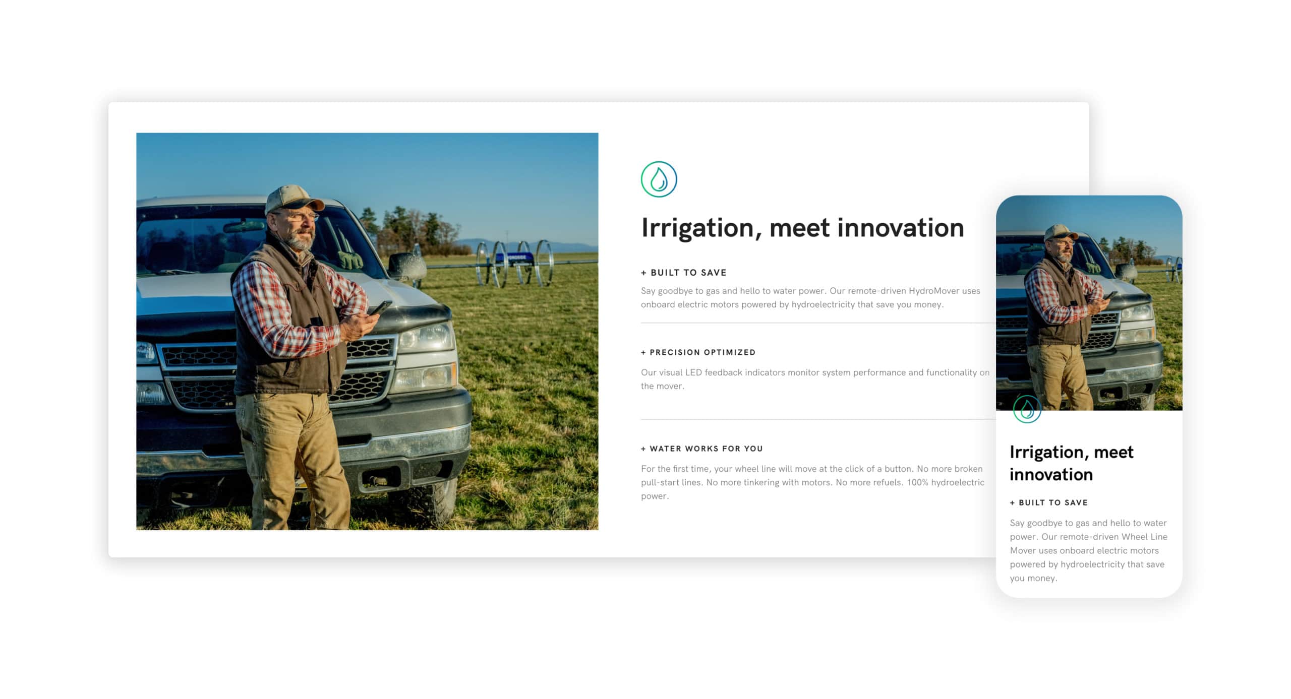
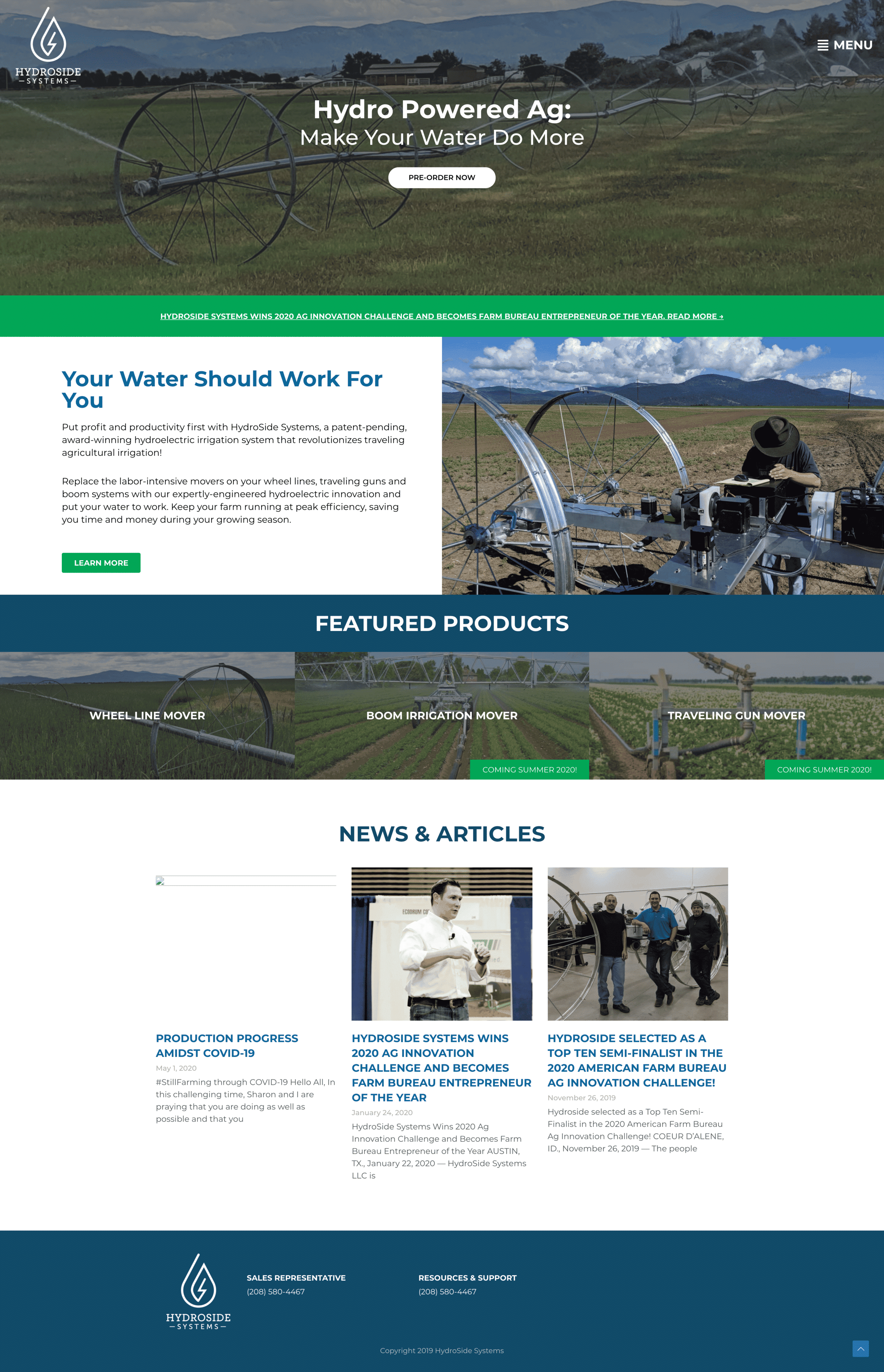
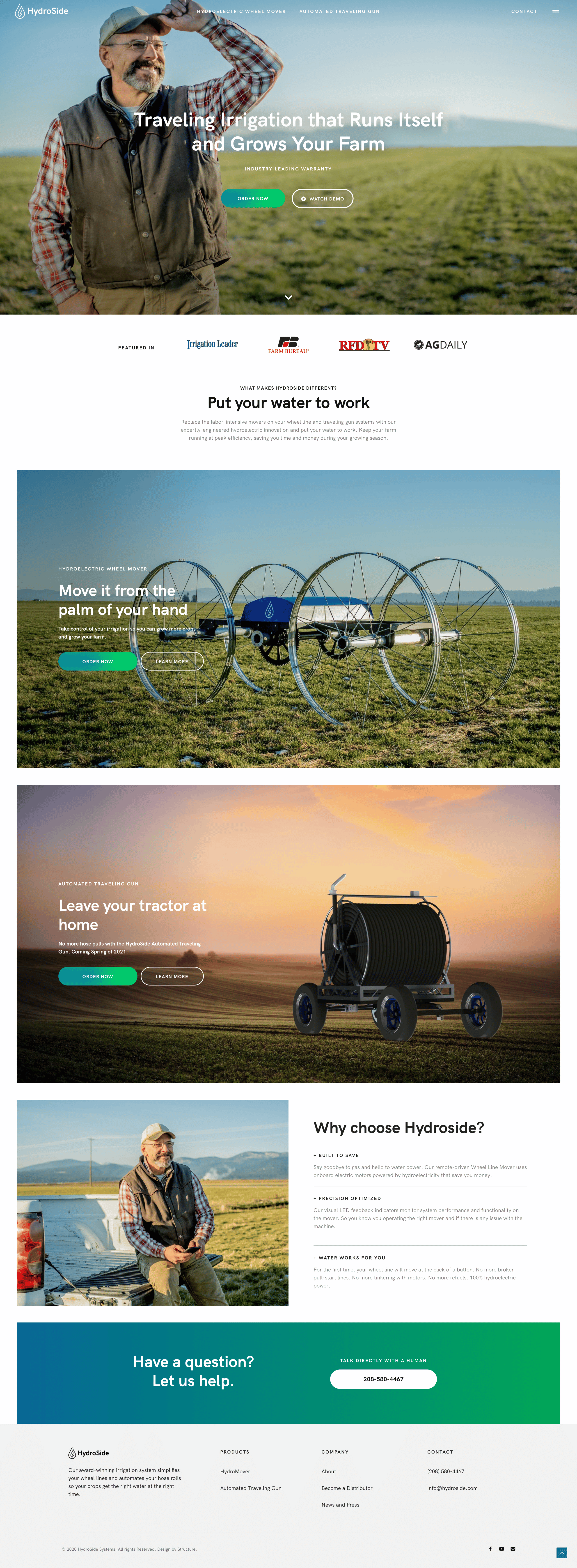
    HydroSide is bringing technology and automation to the irrigation niche of the agriculture industry. As an industry disrupter, HydroSide needed a bold website and digital experience that looked, felt, and smelled less like farm equipment and more like farm technology.

    Challenge

    HydroSide needed a new website that matched its role as a technology disrupter in the marketplace. The efficiency of their product offering was opposed to the confusing user interface customers experienced on their website.

    Solution

    After a deep dive into their user needs, we uncovered a much deeper story that guided the web strategy and information architecture. With creative copy and a fresh visual design, we could use the client’s existing CMS to transform this website.

    Results

    A website redesigned with a straightforward and more strategic approach to communicating the information growers were looking for.

    Early traction

    HydroSide not only provides a fresh face in their space but delivers a solution to a real problem farmers and growers have across the world.

    Due to their bonafide product-market fit, HydroSide.com gets thousands of new organic visitors each month without much effort. The extra consideration we put into performance, accessibility, and implementing best practices made both Google bots and actual humans happy when they visited the website.

    The back-story

    Our team came-in early as a digital advisor for the HydroSide founders, back in 2018 when the company was mostly just an idea.

    The HydroSide website redesign was a long time coming, but that’s part of what made the project successful. There were years of foundational work together before we redesigned the website. As is often the case, the HydroSide website is more than just a pretty face—it’s an engaging storyteller and an effective sales tool.

    As is often the case, we operated as a true partner and close extension of their marketing team. The relationship with HydroSide continues as we help develop their digital presence and make advanced enhancements to their website to help them both move forward and stay ahead.


    Strategy

    Information Architecture
    Content Strategy
    UX Strategy

    Design

    UI / UX Design
    Visual Design

    Content

    Copywriting
    Art Direction

    Development

    Front-end Development
    Back-end Development
    Quality Assurance
    Consulting