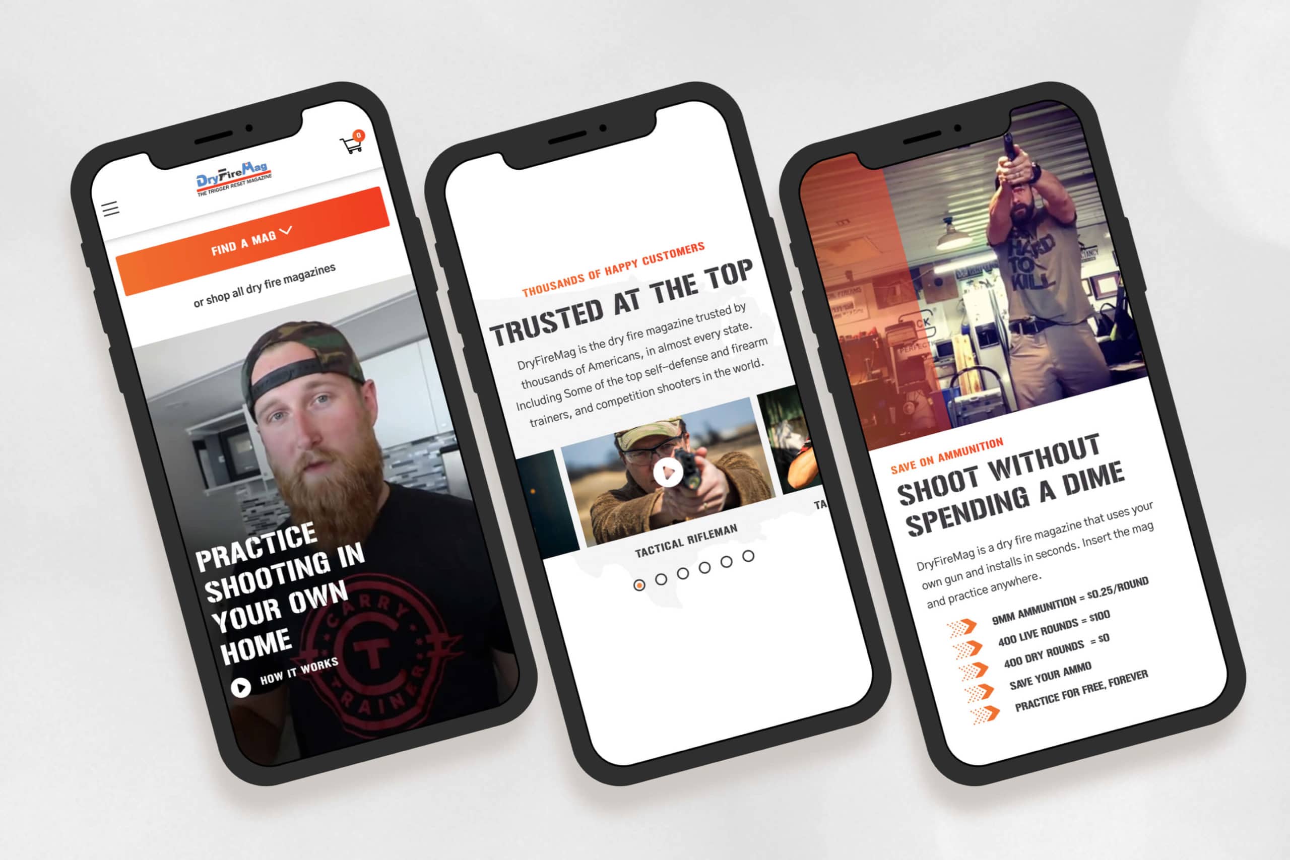
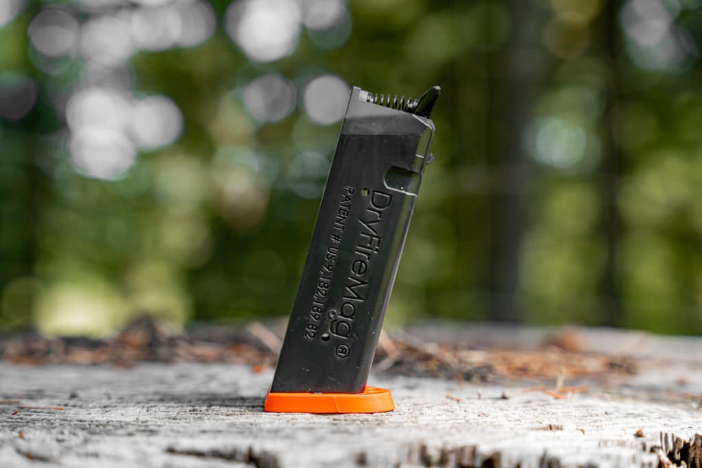
DryFireMag is a fast-growing firearms safety company in Idaho that primarily sells its products on its e-commerce store. We helped them increase their conversion rate and redesign their website so customers could find and purchase products more efficiently.

Challenge
Their website was never what they hoped it would be. It was cumbersome and did not help customers find what they needed—in fact, it did the opposite. DryFireMag saw sales decreasing and needed a resolution.
Solution
We analyzed how customers used their website using heatmaps and user testing. Then, we designed the website from the ground up so customers could quickly find what they were looking for.
Results
The result is a high-converting site that has only grown in traffic, traction, and sales for DryFireMag since we launched. The success has put them in a new position to open up to international sales.


“Structure was the most professional, responsive and personal of them all.”
John Seigler, head of product
Website Strategy
The website strategy was one of the most significant issues with the old DryFireMag site.
As the business grew, they felt they needed to communicate more things to their customers on their website: product information, shipping notices, and marketing announcements.
The site became cluttered, and we helped them get back to the basics—and figure out a way to organize the content, so it supported customers during the checkout flow instead of distracting them.
Brand Design
The DryFireMag brand was severely underdeveloped.
While the DryFireMag didn’t want to invest in a rebranding or brand strategy process, we were able to bring out the best of the brand as-is and bring in some new elements that helped the website feel more exciting and align a bit better with its target audience.
Beautiful, functional web design
Another challenge was helping customers find the right mag for their pistol.
The DryFireMag team received dozens of support calls and returns daily from customers who had purchased the wrong product. Finding a solution would result in happier customers, less overhead, and more profit for the business.
We designed and built a fun product quiz right in the navigation so that customers could select their pistol and get redirected to the perfect product.
Web Development
Since their e-commerce store was already live and bustling (with a sizeable shipping and logistics team behind it), we took great care to retain the integrity of their integrations, business systems, and customer data.
The site already used WordPress CMS with WooCommerce e-commerce functionality, so there was no reason to reinvent the wheel; however, ensuring customer data didn’t get lost or changed was a challenge. Luckily, this wasn’t our first rodeo, and the launch went off without a hitch.
Strategy
User Testing
Conversion Rate Optimization
Information Architecture
Content Strategy
UX Strategy
Design
UI / UX Design
Visual Design
Creative Direction
Animation Design
Content
Copywriting
Photography
Art Direction
Development
Front-end Development
Back-end Development
E-Commerce Development
Quality Assurance
Consulting

