Customers aren’t buying on your website? There’s a reason, and I bet it’s your website homepage. Your website’s homepage significantly influences how long visitors will spend on it—and if they engage with your business. Here’s how to make yours great so visitors stay and buy.
What is a website homepage?
A website homepage is, often, the first page visitors will see when they land on your website. It’s essential to make a good impression because if potential customers don’t like what they see, they’ll likely leave and never return.
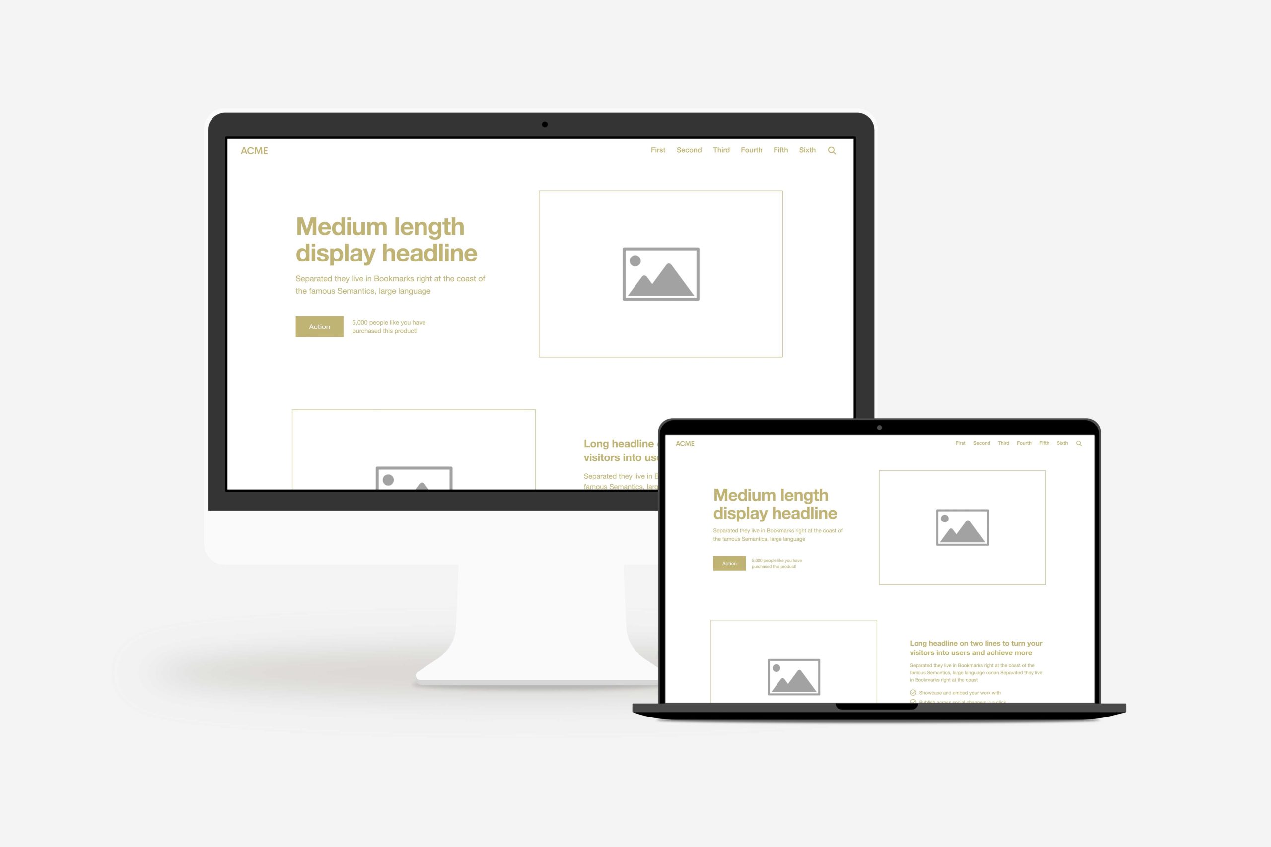
Think of your website homepage as the front door to your business. It should be welcoming, easy to navigate, and give visitors a snapshot of your offer.
Your website’s homepage can include multiple sections that help guide users through your website. If the homepage is planned correctly, these sections can keep users engaged with your website for extended periods.
Why your website home page structure is important
The Nielsen Norman Group (a UX Research Firm) did a study linking the time spent on a website to something called “Weibull distribution,” which is a mathematical way to figure out when somebody gets frustrated and leaves (or “bounces”) from your homepage.
In just 10 seconds, visitors will determine whether they want to stay on your website or leave. That’s according to research by Chao Liu and colleagues, who found that 99% of websites have a 10-second window of opportunity.
Why is that important? Because it means you have 10 seconds to communicate your value. If visitors stay more than 10 seconds, they will continue engaging with your site and visit additional pages. But if you don’t catch their attention within those 10 seconds, you risk them leaving.
Like most people, you may ask yourself, “Where do I begin?” Here’s our answer.
Common website homepage problems
First things first, don’t make these standard website homepage mistakes! Most companies aren’t getting engaged customers on their websites because they are making one of these mistakes.
The key to remember is this: if your website homepage has one of these problems, it won’t work even if you follow our homepage formula.
1. Your homepage is about you
Your website should center around your customers. How you can improve their life, what they gain from using your product, and how it eases stressors in their daily routine.
You are not the hero. I know this sounds harsh, but stay with me for a second. This message could be summed up in five words: You Are Not The Hero. Yes, I know you solved their problem and changed their life – but that doesn’t make you the story’s hero. “Your customer has a problem, and then you come along as the solution” is something companies often think about because it’s easy to fall into that perspective…but it makes YOU look pompous and self-serving rather than humble and focused on them (which is much more attractive).
Why not try something your competition isn’t doing? Instead of always putting yourself in the spotlight, focus on making your customer feel like the hero. They’ll appreciate it more than you think and will likely return to you because you make them feel special. All it takes is a change of messaging and perspective; to act as a guide or helper instead of the main attraction.
On your home page, instead of saying, “We do this and that,” say, “We can help you do this and that.” Do you see the difference? In the first example, you’re the one doing; in the second, they’re the one doing (and you’re helping).
Make your entire website about your customer, and you’ll create raving fans who buy once and keep coming back for more.
2. Your homepage is overwhelming
Have you ever been to a website that throws so much information at you all at once? There’s so much there, and it’s all so overwhelming that you don’t even know where to start or what’s important. You have to leave the site altogether.
Most companies do this: they overwhelm their customers before they’re ready for it, losing them entirely.
Instead, you should set up your website using a framework so that it follows a process called “Drip, Sip, Drink.”
To begin, give them a drip by providing sections on one page rather than overwhelming them with everything at once under one heading.
Each section offers the opportunity for further investigations and product detail – that’s the sip.
Then finally, if they’re satisfied with what they see thus far – include stories from customers or case studies as an extra convincing edge – we’ll call that the drink.
If you use a tried-and-true formula and explain it using the Drip, Sip, Drink method, your potential customers will easily understand what you’re offering. They’ll see why it’s valuable and how to purchase it without issue.
Doing this will help make sure your website is successful.
3. Your homepage is confusing
We think we’re being clear. But in reality, we’re being accurate. We have tunnel vision and only see what’s in front of us. As a result, we usually make one of two mistakes:
get too involved with the weeds and tell consumers too much about our goods immediately, confusing or frightening them.
We say business jargon phonetically using abbreviations that operate in the corporate environment, but the human on the other end has no clue what you’re talking about.
If you try to sell too much at once, your customers will become overwhelmed and tune out. They’ll ignore everything you say if they think you don’t understand them or their problems. You need to engage your customers and get them to take action on your website!
Keep this in mind: if you confuse, you’ll lose. And make sure that what you’re saying is clear; if it doesn’t make sense, it won’t make money
4. Your homepage doesn’t call people to action
It’s incredible how many companies don’t ask for a sale. Don’t be one of them! To make it easy for your customers to buy the transformation, you’ll need to do two things:
- Make your buy buttons easy to find
- Make them easy to understand
Make your buy button visible in an easy-to-find location like the top right corner of your website. It’s also helpful if the button is a bright color that stands out, like red. You can also include a buy button in your hero section.
Easy to understand means you’ll want your call to action to be direct.
- If you’re a photographer, don’t just say Hire Us. Say, “Schedule a Shoot.”
- If you’re a painting company, your button should say “Request a Quote.”
- If you’re a consulting company, your button should say “Schedule a Call.”
- If you’re a restaurant, your button should say “Make a Reservation.”
- If you’re a brewery, your button should say, “Order Beer.”
Research demonstrates that hearing something takes an individual eight times to process the information thoroughly. So, if it requires eight repetitions for someone to comprehend hearing something one time, how many times do you need to ask a person to buy from you before they understand that you want them to purchase something?
Include your CTA button on every page, and make it easy for visitors to take the next step.
5. Your homepage doesn’t communicate the transformation
Your homepage should show the success your customer will experience if they use your product or service.
Here’s why: your customer has two types of problems: external and internal. Another way of putting it is they have both physical and emotional issues. One problem they experience and one they feel.
An external problem might be that I have a flat tire. The internal problem is that I can’t make it to work on time—my boss might fire me, and I can’t afford to lose my job.
Every external problem, whether a flat tire or a leaky roof, manifests an internal problem — frustration, confusion, or even the feeling of “I don’t have what it takes.”
Don’t be mistaken; your customers buy your products to relieve their internal tension. And when you communicate in a way, using words and pictures that show how you can reduce that tension, your customers will be more likely to seek your expertise.
If you’ve watched a movie, you know every story ends in victory or tragedy. For your customers, it’s success or failure. They will feel one or the other, and I can guarantee they want to feel successful.
The perfect homepage structure
Most people think their website is all art: brand, visual design, beautiful images, etc. There’s certainly a lot of art involved in a website project. However, it’s about 20% art and 80% science.
In other words, if you want your website to work, follow a formula or framework. Here’s that formula for the taking.
Want a high-converting homepage?
1. Header
The header is the very top section of your website. Your header should include:
- Your logo
- Your menu
- Your call-to-action
Let’s look at each of these header items in further detail.
Logo
On most websites, the logo is in the top left corner of your header. It’s clickable and takes visitors back to the homepage no matter where they are on the website. The website’s logo is one of the first things people notice when they land on a website, so it’s essential to make sure it’s recognizable, branded, and positioned in a spot where people will see it.
Menu
The menu is generally located next to or below the logo and contains links to the different pages on your website. The menu is how visitors will navigate your website, so making sure it’s easy to find and use is essential.
It’s called a menu for a reason. It’s the place to show what you have to offer. Like a restaurant menu, it tells your customers what they can buy.
There are many items you can add to a menu. However, it’s best to include your main offer in your menu, and access any essential pages people might need (or want) to read before buying.
Call-to-action
The call-to-action (CTA) is a button or link that encourages visitors to take a specific action. The CTA should be prominently displayed in your header so visitors can’t miss it. It’s most commonly in the top right corner of the website.
2. Hero
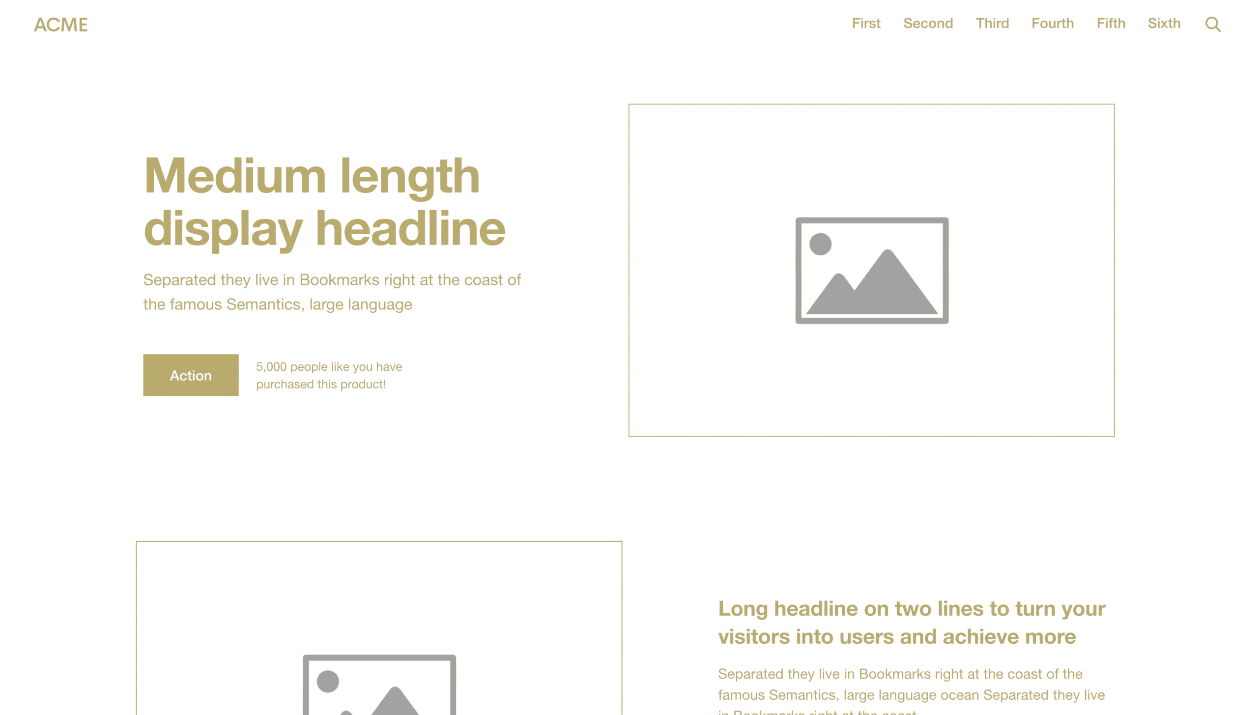
The hero is the first main section of your website homepage. It’s generally the most significant section on the page and is immediately below the header.
The big idea for this section is to show the transformation your customer will experience when they buy from you. The point is to give them a vision of how great life could be like… if they buy from you.
To accomplish this goal, the hero should:
- Have a headline that communicates their aspirational identity
- A subheadline that tells them what you’re selling
- Include an image or video that helps explain your offer
- Have a CTA that encourages visitors to take action
Let’s look at each of these hero items in further detail.
Headline
Customers see many “first things” when they land on your website homepage. However, the hero headline is usually the “first thing” they read.
The headline should offer some value—what your product or service does for your customers. Donald Miller from Storybrand recommends using the headline to give customers an aspirational identity they can cling to. An aspirational identity is something that someone wants to become.
If you can communicate what or who your customer wants to become that your brand can deliver (in five to seven words), you’ll see a massive uptick in engagement on your website.
Subheadline
As stated above, the subheadline should tell visitors what you’re selling so they don’t have to guess. It should be straightforward.
Image or video
An image or video in the hero can help explain your offer and make it more relatable to your website visitors. The image should be high quality and relevant to your offer.
For example, if you’re a landscape design company, you might include a picture of a family enjoying their beautiful backyard. If you’re a vineyard, you might include a video of people enjoying your wine while a band plays in the background.
Call to action
Tell them straightforwardly and instructively where they can go with your organization. This will help them take the next step.
Your website’s CTA should be the same message across your entire site. If you want your customers to use the store locator to find your nearest location, every CTA should read, “Find a Location.”
The CTA should also stand out so it’s easy to find. You can use an accent color or make it a button instead of just a link.
3. Problem
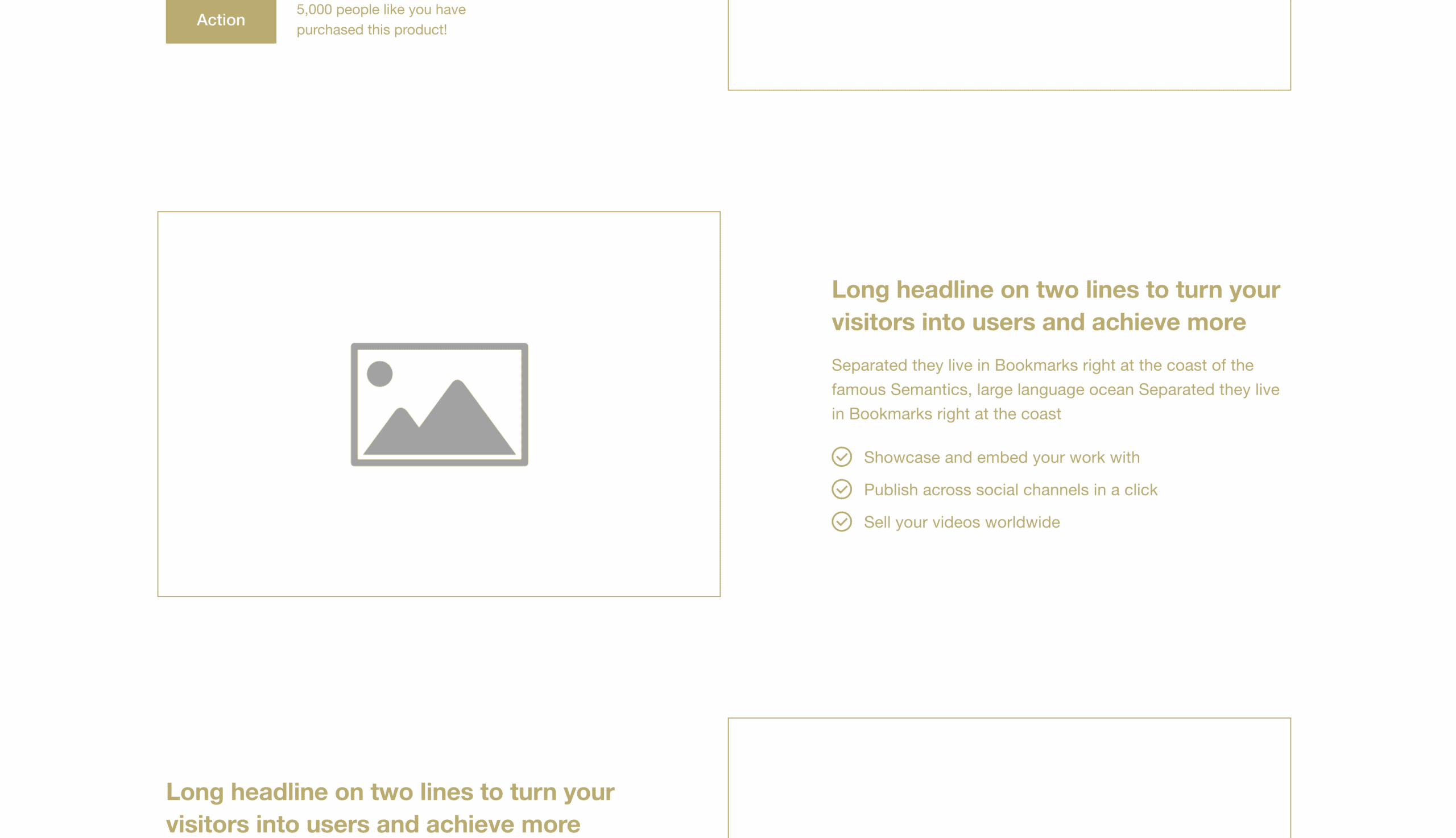
In this section, you take your client on a roller coaster ride from the ultra-high of showing them how wonderful their life could be to the reality they’re in now.
The problem section should:
- Include a headline that tells visitors what their main problem is
- A subheadline that helps them understand they’re not alone
- An image or video that further illustrates the problem
- A CTA to encourage visitors to resolve their issues now
You’ll show them how much they need what you offer and let them know you understand their pain. You’ll also give them a glimmer of hope that their problem can be solved.
4. Position
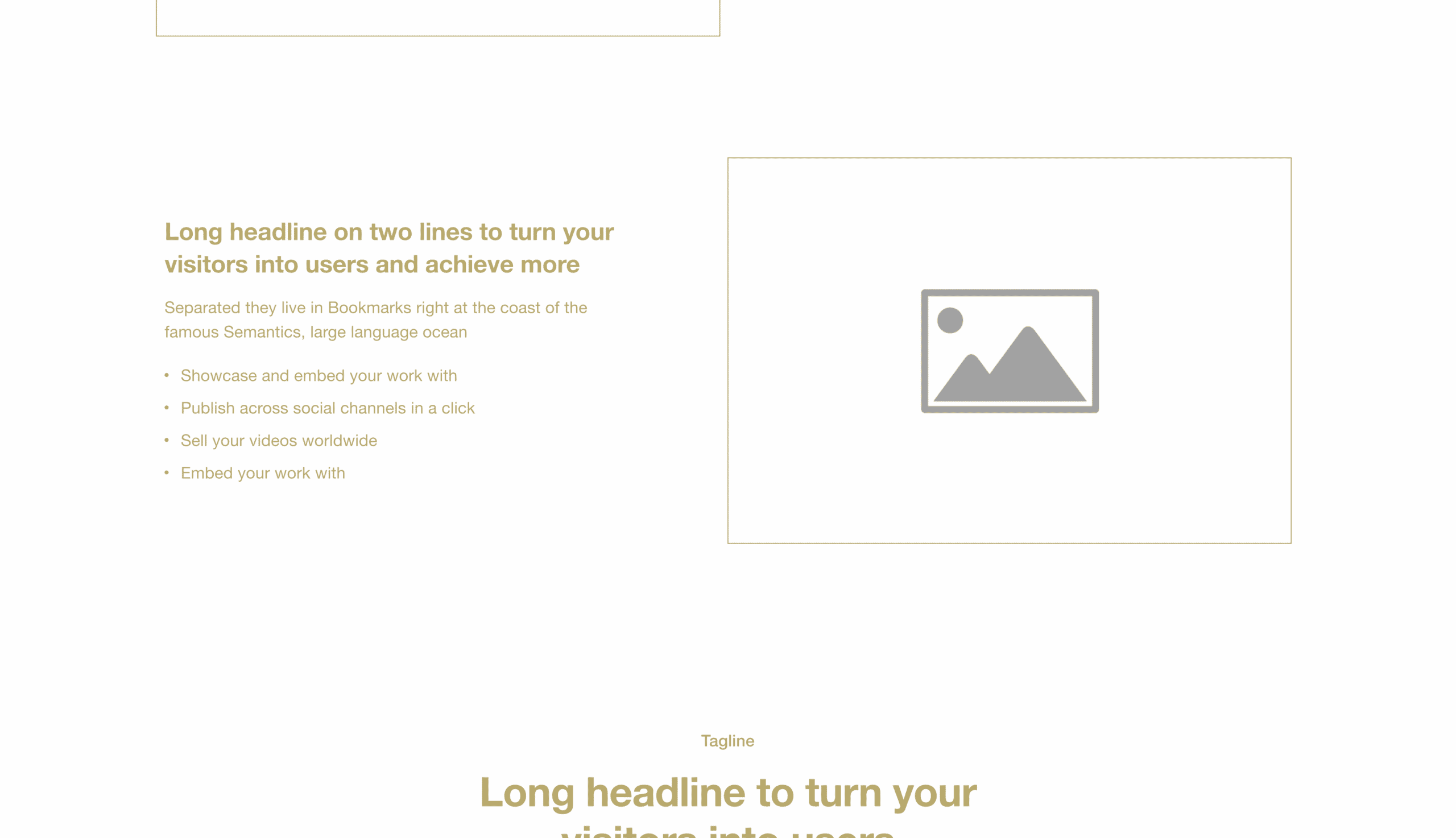
If they’re still reading, they’re very interested at this point. It’s the perfect time to introduce yourself and how you can help.
The position section should:
- Include a headline that tells visitors that you care
- A subheadline or bullet point that shows your credentials
- An image or video that helps explain your position
- A CTA to encourage visitors to take the next step
Customers want two things when you ask for a sale: Empathy and authority. They want to know that you care. That’s why most of our clients hire us—they say we care more than the other web agency. I think it’s true!
Additionally, your customer needs to know you have the credentials to follow through on your promise. For example, you don’t just hire a doctor that cares. They need to have been to and passed medical school. Even more, you might want to know your doctor has healed a few people before you, and you’re not just his first test case.
This is where you provide both empathy and authority. The headline that tells them you care is empathy. The points that show your credentials are the authority.
What kind of points do you put in the authority area? You can put many things in this area, but testimonials from past customers are the best. Testimonials reinforce empathy, authority, and trust.
5. Solution
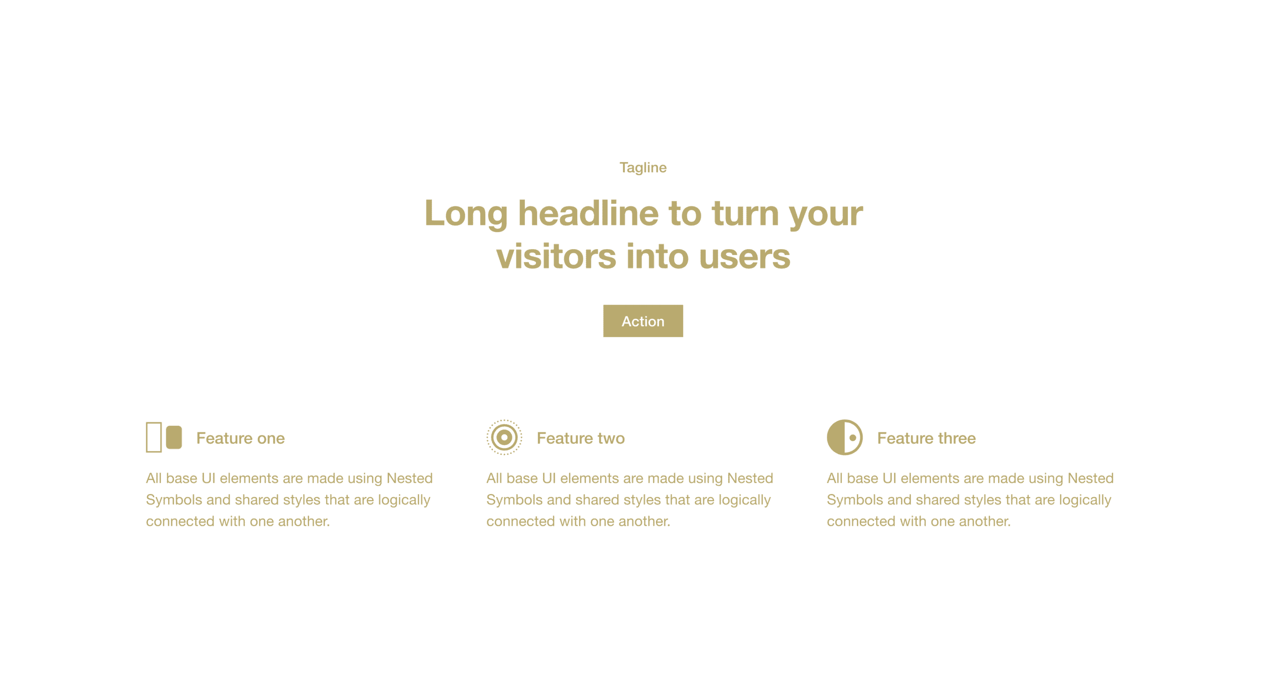
This is where most homepages go wrong. They start selling too early. They present a solution without ever establishing the problem or gaining trust.
If you place your solution right here, you’ll ensure your website’s homepage walks visitors through a sales process that makes them fully aware of their need for an answer. Here’s where your solution (products or services) enters the scene. At this point, your customers are primed and ready.
- They have a vision.
- They feel the pain.
- They trust you.
This section lists your core offerings, best-sellers, or top-performing product categories. Include a title and an image or video for each item. You should also include a CTA that encourages visitors to buy that item (or at least learn more about it).
6. Success
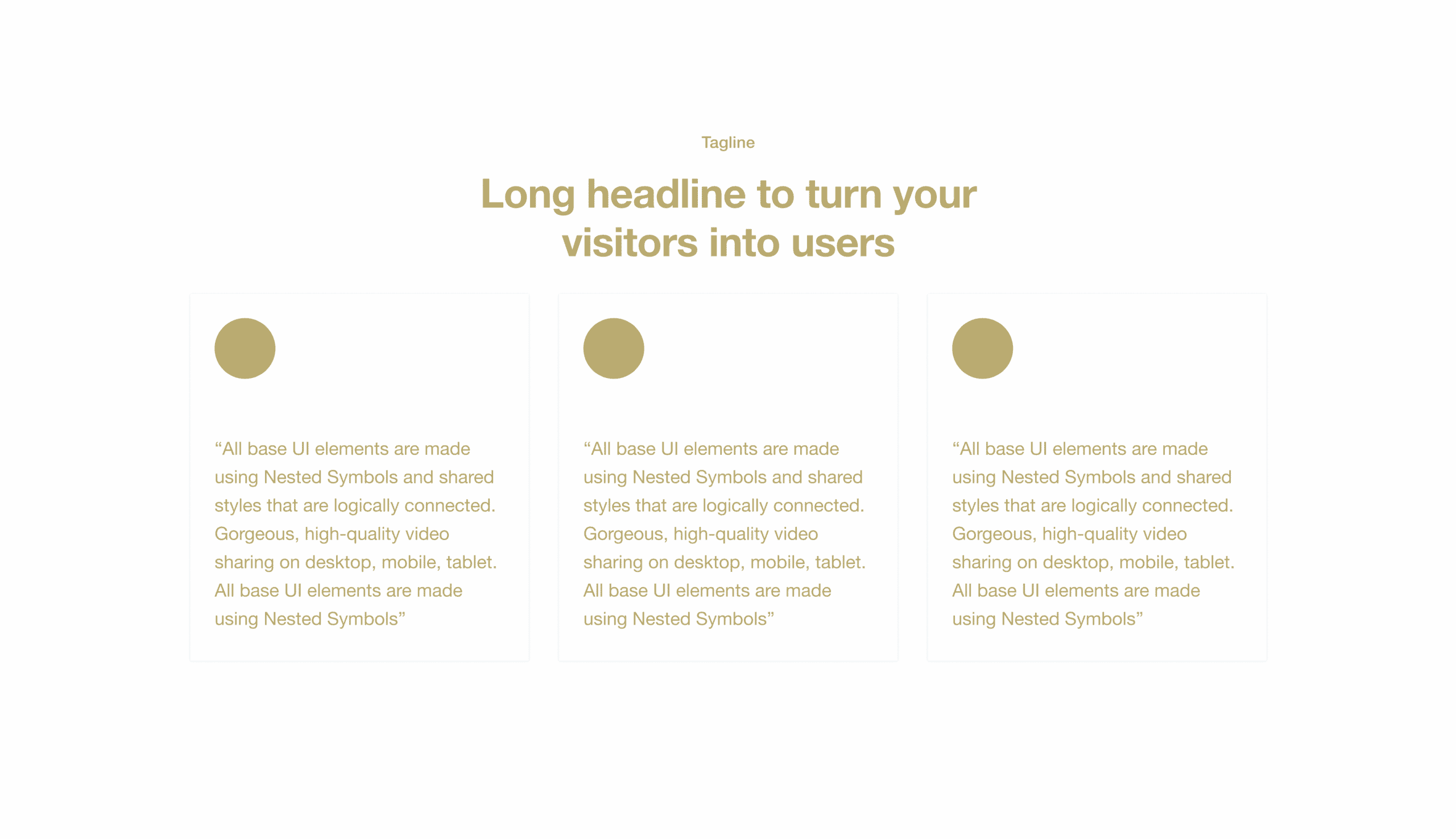
I’ll illustrate the success section with a story. My family recently went on a hike where we had to cross a muddy creek. I had my four young children with me, and there was no way I was about to allow them to cross the creek without ensuring they would make it across successfully or turn back quickly.
Lucky for us, someone before us had cut or placed tree stumps in a perfectly-paced path across the creek. This step-by-step path reduced my fear and gave me confidence that we could all cross—or turn back—at any point. We felt great crossing because there was nothing to lose!
Now, that’s what this section does for your customers. You might as well call it the Crossing the Creek section. This is where you give your customers a step-by-step plan so they feel confident crossing the creek with you.
Specifically, you want to give them three steps to success.
- First step
- Major milestone
- Result
First Step
Usually, the first step is the immediate next thing you want them to do on your website. In my illustration, it would be “Step on the Stumps.” Structure’s core offering is “Take the WebsiteBuilder Quiz.”
Major Milestone
The second step is a significant milestone that will mark their journey. While crossing the creek, it would be, Enjoy the Adventure.” For Structure, it’s “Launch Your Website.”
Result
Lastly, you want to communicate the result, or feeling, of accomplishing the journey. In our hike, it would be something like, “You’ll Want to Do It Again.” For Structure, “Your Website Works & Makes You Proud.”
7. Call to action
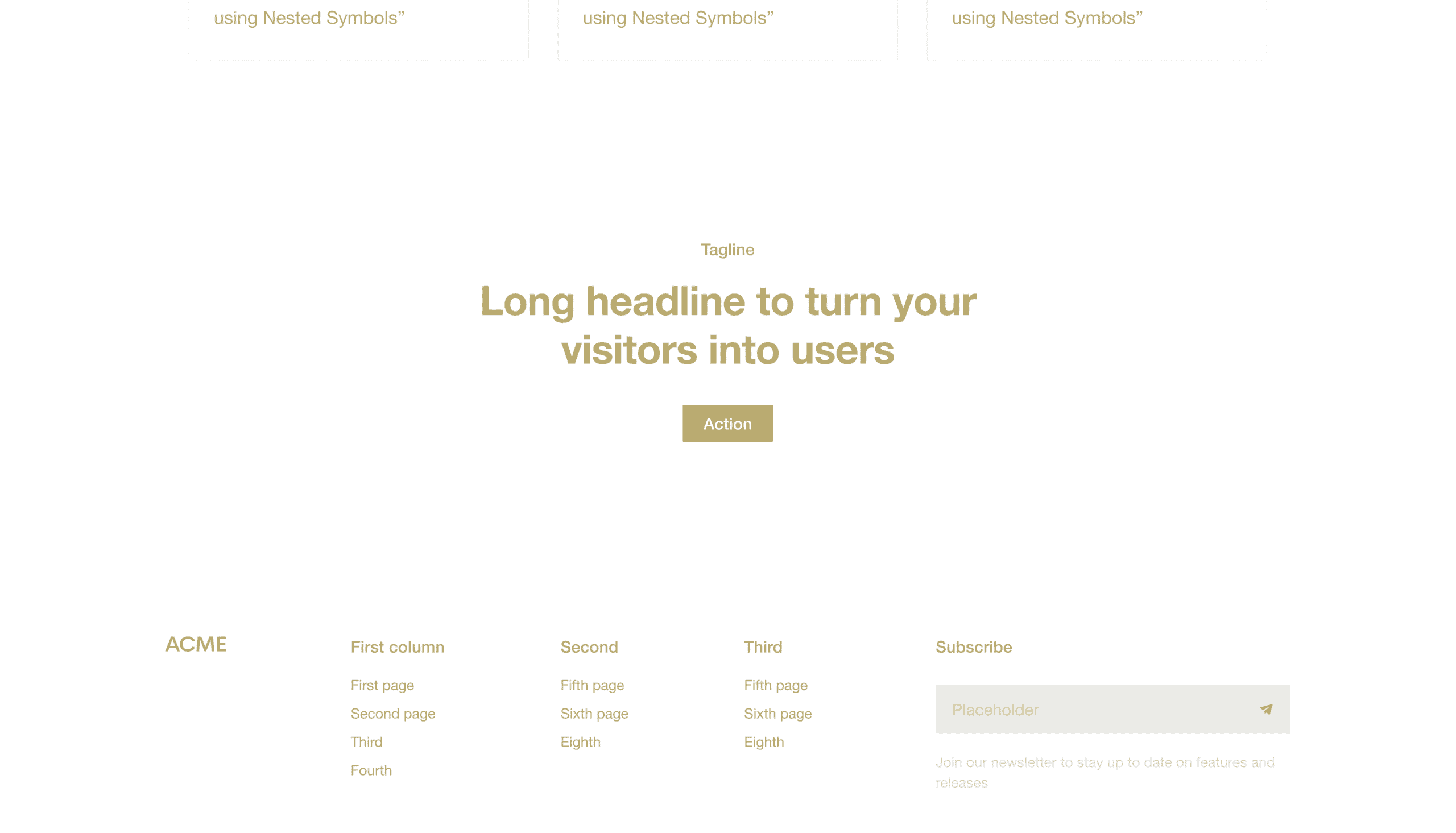
You’ll want to cut the clutter and ask for the sale in the call-to-action section. Be very clear about what you wish to your website visitors to do. Your CTA section can include a variety of content items, but the most effective ones only have three parts:
- Headline
- Description
- Button
Headline
The headline is a statement closely related to the solution you presented earlier. It should be clear, Concise, and actionable.
Description
The description is a brief sentence that gives website visitors more information about what they’ll get by taking the desired action.
Button
Lastly, the button should say something like “Buy Now,” “Add to Cart,” or “Sign Up.” And it should stand out from everything else on the page so website visitors can’t help but click it.
8. Footer
Lastly, there’s your footer. This isn’t technically a part of the homepage specifically, but it’s on the page. Think of your Footer as the Junk Drawer of your homepage—you put everything that you thought was important but doesn’t fit into one of these sections.
Use it to link to your Contact Us page, Careers page, blog posts, etc. Many companies use it as a place to put their newsletter sign-up form (which is a great idea)!
Ultimately, following this formula (from header to footer) will ensure your website’s homepage is designed to guide visitors through a process that makes them fully aware of their need for your solution. By following the simple website template I’ve outlined here, you can build a website that works.
Want a high-converting homepage?
Three great website homepage examples
Here are three well-structured website homepage examples that follow this formula. I want to point out that these three companies are in vastly different industries. Yet, they’re all following the same formula because it works regardless of your industry.
Yardzen
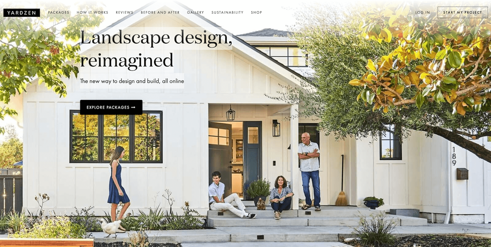
Yardzen is an online landscape design service in California. They bridge the gap between local landscape designers and sleek technology companies. Their website homepage is lengthy and includes additional content, such as social media feeds, sustainability information, and a newsletter section.
Homepage structure
Here’s how Yardzen structures its homepage:
- Header
- Hero
- Overview
- Success
- Call to action
- Social Media Feed
- Solution
- Testimonials
- Position
- Sustainability
- Position
- Blog Posts
- Call to action
- Newsletter
- Footer
Homepage insights
You’ll notice that they repeat several sections, like position and call to action. They include a few sections that could likely go in the footer and condense their homepage to the most vital sections.
Without any insight into how their homepage performs, I would recommend that they make the following changes.
- Communicate the problem you’re solving earlier and clearer (ideally in replacement of Section 3: Overview)
- Remove Section 6: Social Media Feed or move it below your final call-to-action
- Remove Sustainability, Newsletter, and Blog Posts as they’re accessible in the header and footer
Either way, Yardzen is an excellent example of a well-structured website homepage that follows our formula loosely. Their homepage would likely perform even better with a few minor tweaks.
Shasta Power
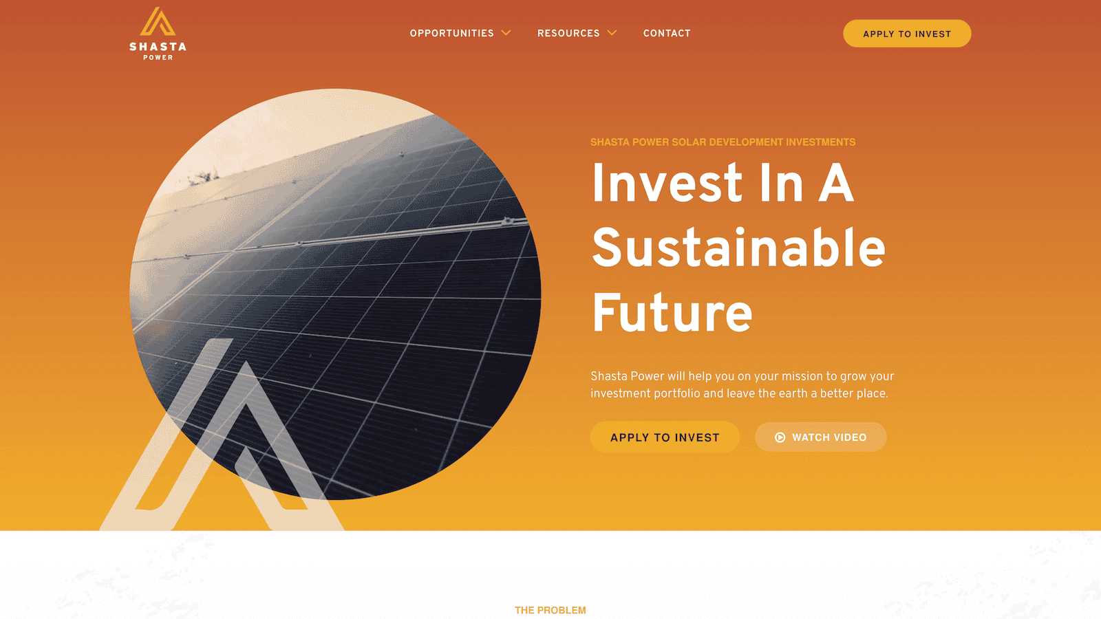
Shasta Power is a solar development investment fund in Oregon. We’re biased here because we did the website design, development, and management. However, it’s still fun to analyze!
Their website homepage is medium length and follows the formula loosely as well. Although, it does include the top three sections in order, which is very important.
Homepage structure
Here’s how Shasta Power structures its homepage:
- Header
- Hero
- Problem
- Solution
- Position
- Success
- Content Offer
- Blog Posts
- Call-to-action
- Footer
Homepage insights
Shasta Power follows the homepage structure much closer to Yardzen. However, testing a few tweaks and re-organizations would be worth testing to see if it was more effective.
- Switch the Solution & Position the order
- Move the Blog Posts below the Call-to-action
That said, the Shasta Power homepage is a great one that we’re proud of—and we know they are too!
Jasper
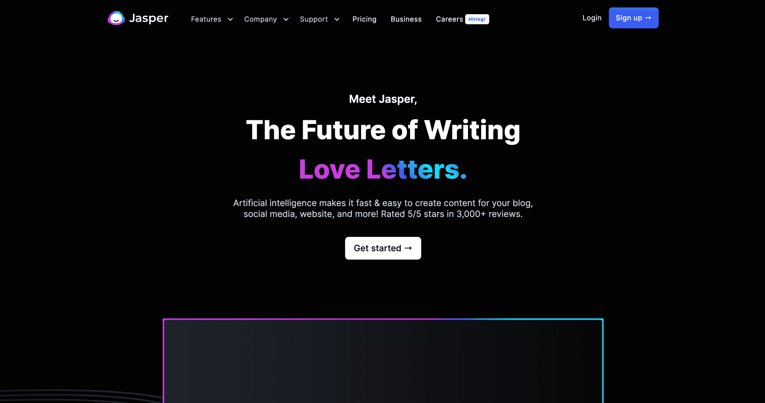
Jasper is an AI technology SaaS company in Texas. Their homepage convinced us (we use their tool to aid our copywriting and editing), and we think it does a great job. However, you’ll notice that it has some formula elements, but not all. There’s always room for improvement!
Homepage structure
Here’s how Jasper structures their homepage:
- Header
- Hero
- Overview
- Position
- Solution
- Product Announcement
- Position
- Call to action
- Footer
Homepage insights
The shortest homepage of these examples still includes many elements required for a great homepage. Here are a few recommendations I’d make.
- Dedicate a section to the problem you’re solving (replace it with the Overview section)
- Replace Section 6: Product Announcement with a Success section to show users the steps they need to experience your product
Common questions about the website homepage template
Do you have to follow this formula exactly to get results?
You do not have to follow this formula exactly to get results. There’s room for creative liberty and optimization. We recommend using this formula as a starting point, especially if you’re not getting the results you want from your website or don’t have data to inform how customers use your current website.
Once you implement this formula, we recommend tracking how users interact with your website homepage and making adjustments based on the data you’re receiving. You might need to move one section of your website down in your specific industry or with your specific customers because it’s losing interest. You might need to move another one up because it gets a lot of interaction, but it’s near the bottom of your page (and you want more people to see it).
However, this is a proven formula that works for almost all companies in all industries, and it’s a great place to start when you’re redesigning, optimizing, or improving your homepage.
What if we have other content that we want to include?
Add it between the CTA and the footer after the success section. Whatever you do, don’t add it before the problem because that disrupts the flow.
What if we want to include a video on our website homepage?
Great question! A video can go in any section as some of the content for that section.
For example, in the hero, you might want to use a background video showing someone using your product instead of an image. Or, in the success section, you might want to use a customer testimonial video instead of written quotes. These enhancements will only improve the experience your customers have with your website.
You can get creative with where you put your videos but make sure they’re adding value to that specific section, and website visitors will appreciate it.
Will this template work for our company?
Yes, this website homepage template will work for companies of all sizes in all industries, whether you’re B2B or B2C. If you want more website traffic, leads, and sales, this is the template for you.
Note that these are the main building blocks, but you can rearrange them and be creative with how you fill in each section.

