Blog

  • 3 Reasons to Redesign Your Website

    3 Reasons to Redesign Your Website

    If you’re considering a website redesign, this article is for you…

    You see, most business leaders are embarrassed by their websites.

    • Bad photos don’t show how great your product or service is.
    • Old content makes your brand seem irrelevant.
    • Your website doesn’t even work like it was supposed to

    People typically hire a creative agency to redesign their website for $5,000–$10,000. You think a beautiful new website would ease your fears, make you proud AND increase business, right? 

    Wrong! 90% of the time, someone redesigns their website—they feel better for a moment until—they realize that sales have stayed the same (or even declined). 

    Every day they head into their office and refresh, refresh, refresh. Days and weeks go by, and nothing. Nobody knows, and nobody cares.

    The Problem with a Website Redesign

    The main problem with a website redesign is this: pretty websites don’t necessarily sell things.

    Clear communication sells things. A simple offer sells things. A sales funnel sells things.

    Friend, if you’re embarrassed by your website or it isn’t working like you hoped it would, it’s probably not only your website that’s the problem. It’s how you’re using it.

    What’s better than padding your pride with a beautiful website that doesn’t work is padding your pockets with one that does. 

    Because, let’s be honest, if your website doubled, tripled, or quadrupled revenue, you wouldn’t care what it looked like.

    So, if you’re reading this, I assume you might be about to redesign your website.

    I don’t want to stop you if it’s what you need.

    I want to save you from wasting your time and money if it’s not. Your website should be your most profitable asset, not your most painful one.

    So I want to help you understand some good reasons to redesign your website, followed by a few not-so-good reasons… and what to do instead.

    Why and When You Should Redesign Your Website

    So, if you walked into my office today and asked me to work on your website, the first question I’d ask is, “Why?” I’d ask, “Why do you need to redesign your website?” If you answered one of the following three reasons, I’d say you should do it!

    1. Your website is broken 

    For example, maybe your website isn’t viewable on mobile devices. This will take some intentionality to fix and would be a great reason to redo the website. It’s also likely that if your website is old enough not to be mobile responsive, some issues on the desktop version make it hard to use. 

    Believe it or not, I had a client who had this problem last year. Because her website was so antiquated, the best solution was to start over. So we helped her redesign her site, and now she’s quadrupled sales for her business.

    2. Your website doesn’t handle your business needs 

    I had a friend with an e-commerce business, and he was using Squarespace. As his company grew into the millions, he realized that Squarespace, as he was using it, wasn’t built to handle the kind of site he needed to serve his customers. He switched to Shopify because it could handle the traffic and complexity he wanted on his website. He sure didn’t have to redesign, but since he was moving over all his content, it was a no-brainer opportunity to update his design and make some strategic adjustments so his customers would find it easier to buy his product.

    3. Your website is visually outdated 

    This is you if your website it’s 10 or 20 years old and doesn’t reflect the quality of work you do anymore. The branding is old, the colors have changed, and you can’t showcase your product or service as well as your competitors. This is a great reason to redesign your website, as it directly reflects who you are and how you want your customers to see you. They have to be able to trust you, and how your website looks does matter. 

    We recently redesigned a website for a client who was in this situation. It had been 10-15 years since they updated their website, and it no longer reflected how their customers saw them. Additionally, the framework was having difficulty scaling to serve the current needs of the business. We brought them into the current day, and they loved it.

    Why and When You Shouldn’t Redesign Your Website

    Here are a few reasons not to redesign or rebuild your website…

    1. You feel like your current website isn’t good enough

    We do this as humans, solving problems that don’t exist. Or maybe I should rephrase that. We solve the most visible and easy-to-identify problems that exist. Like a website. It’s the most prominent piece of marketing to blame when something doesn’t work.  

    So, if this is how you feel about your website, let me ask another question in the same line of thinking: “why isn’t your website good enough?” Is it because you saw another website today that made you feel like yours was crap? By the way, I’ve done that. Or because you conducted user testing, and the majority gave feedback that they didn’t buy because your website was a mess and they couldn’t find the buy button?

    Just remember this: feelings are fleeting, and facts are stubborn. If it’s a feeling like my website isn’t good enough, you might wake up tomorrow feeling differently. A redesign may be in order if it’s based on facts like people can’t figure out how to buy.

    So be honest with yourself regarding your motivation. Getting clear on the actual problems reveals whether you need to redesign your website or your design is acceptable. Still, your offer, messaging, marketing strategy, or sales funnel is the real problem.

    2. You want to keep yourself or your employees “busy.” Aka, You don’t know what else to do

    Staying busy is never a good reason for anything. If you’re working on your website to kill time or because you don’t know what else to do, there’s a deeper problem—and probably something else you need to do. 

    I’m guilty of this, and you might be too. Your website is essential, but let’s be strategic, think through a marketing plan and a sales strategy, and figure out where your website fits. Then, decide where working on your website fits in the priority list. 

    3. You’re not getting the leads or sales you want from your website 

    If this happens, you may need to redesign your website, but unless your website is a complete disaster, you likely don’t need a total redesign. You probably need to work on your offer, messaging, and marketing. 

    You’d be surprised at how much difference it makes when you show the right words to the right people. As I mentioned, a pretty website isn’t the key to selling more. 

    What you need to do next when you’re unsure if you need a website redesign

    So if you’re still reading, you may be asking yourself . . . do I or don’t I need a redesign? If I don’t need a redesign, what do I need instead? 

    Great question. I want to help you figure that out. I’ll share a little secret: most websites don’t work because the people behind them follow old rules for a new game. 

    To get your website to work, you have to transition from the old way of thinking about your website as a multi-tool that holds a bunch of different information about your business, product, or service and is something people want to click around and explore, to a machete that does one job and it does it well.

    In the new way where your website isn’t about you, it’s about your customers, and you use your one-liner to guide them to the one thing you want them to do: buy your product, book an appointment, schedule a call, or work with you in some measurable way.

    Watch our free video training on How to Build a Really Attractive, High-Converting Website That Makes You Proud.

    I’ll guide you through a simple process that will help turn your website into a sales machine because you remove the obstacles that are stopping people from buying from you and implement automated and sustainable sales systems that could DOUBLE or TRIPLE your revenue.


  • 5 Reasons Your Manufacturing Website Doesn’t Work (and What to Do About It)

    5 Reasons Your Manufacturing Website Doesn’t Work (and What to Do About It)

    You know it already, but I’ll spell it out: Your website needs work. You know it. I know it. Your customers know it.

    I’m not talking about whether it’s broken or offline. If it is completely down, that’s another issue entirely.

    What I’m talking about is this:

    • It’s old and outdated
    • It doesn’t give you any leads or sales
    • The competition is passing you by

    Meanwhile, you do no know who to turn to or how to improve it. You have enough going on as it is.

    In the next few minutes, I’ll explain five reasons most manufacturing websites don’t function or work very well, along with practical changes you can make RIGHT NOW to make it work.

    1. Your manufacturing website is about you

    Your website should be all about your customers. What they get, how you can help improve their lives, and what jobs you or your products help them do.

    This principle could be summed up in five short words: you are not the hero. Let me say that again; you are not the hero.

    You see, what a lot of companies do is they think they’re the hero of their customer’s stories. After all, they have the problem, and you’re coming up with the solution. So you’re the hero. Right? You solved their problem. You changed their life. Except, while every story does have a hero, in your customer’s story, it’s not you. It’s them.

    If you do what your competition isn’t and make your customers feel like the hero they want to be, they’ll come back to you because you’re the only one they know who makes them feel like you do.

    So, how do you do that, you ask? You do a 180-degree shift in your messaging and reposition yourself as the guide, the helper.

    Even your About page needs to reflect this principle. Your About page isn’t about you; it’s about your customers, how they struggle, and how you can help them. Unless people are hiring you for your team, they’re not coming to you looking for long lists of team members or company history. They want to know if you can fix THEIR problem.

    On your home page, instead of saying, “We do this and that,” say, “We can help you do this and that.” Do you see the difference? In the first example, you’re the one doing; in the second, they’re the one doing (and you’re helping). 

    Make your entire website about your customer, and you’ll create raving fans who buy once and keep coming back for more.

    2. Your manufacturing website is overwhelming

    Have you ever been to a website that bombarded you with tons of information immediately? There was so much there you didn’t know what was necessary or what to look at next. It was just so overwhelming you had to leave. 

    Most companies drown their customers in information before they’re ready for it. 

    Instead, you need to set up your website to facilitate a process called “Drip, Sip, Drink.”

    Here’s what I mean. The first section on your homepage should have your easy-to-understand tagline where you say what you sell and give them a clear call to action.

    Then in the sections below, you should talk about the different jobs your products or services do for your customers so they can look at everything from a distance – in other words, you give them a drip. And don’t put it all into one section; break it down into one section per job.

    If they like the drip, they’ll go deeper and find your product page that gives them more information about your product – that’s the sip. 

    Then, if they like your product, they’ll read your case study or customer story – that’s the drink. 

    Suppose you break your offering into bite-sized categories and communicate it using the Drip, Sip, Drink process. In that case, it’ll be much easier for customers to understand what you’re offering, why it’s essential, and how to buy it.

    Do this, and your website will work.

    3. Your manufacturing website is confusing

    As business owners, we think we’re being clear. But in reality, we’re being precise. We have tunnel vision. We only see what’s right in front of us.

    Because of that, we usually make one of two mistakes: we either get way too into the weeds and tell customers too much about our products too soon and we confuse them or scare them away, or we say generic, jargony, business things using acronyms that work in the business world but the human on the other end has no idea what you’re talking about.

    This is why fixing our first two problems is so important. If all you do is talk about yourself and your business and bombard your customers with information, they will be confused and leave.

    There are a few studies that show how our brain does one of two things when it receives new information: 

    It either makes sense of it by turning it into a story or, if it can’t make sense of it, it ignores it. 

    You don’t want customers doing either of those things on your website: zoning out or ignoring everything you have to say. 

    No, you want them to engage and take action!

    But they can’t if your website is just another thing bombarding them with more information that they don’t know what to do with.

    I want you to remember this: if you confuse, you’ll lose.

    People should be able to go to your website and understand what you offer and if it’s for them within five seconds. If it takes them longer than five seconds, you’re losing sales. Ask yourself, are you being clear? Because if it doesn’t make sense, it won’t make money.

    4. Your manufacturing website doesn’t call people to action

    You’d be surprised how many customers have difficulty figuring out how to buy your product.

    Your website should include an easy call to action. That means a button that says, “buy now, schedule a call, Register today; those are clear calls to action.” Learn more and get started aren’t clear. If you don’t have this, you’re losing out.

    You’re not going to scare people away by being obvious. You’re helping them buy from you so they can get what they need, and you can get paid.

    Let me give you a story. I like to hunt. Recently I was hunting for turkey with my brother-in-law. We had been in the woods since 4:30a before the sun came up. It was so dark I didn’t even know what I was sitting on; I just knew it wasn’t my bed. Anyway, we made calls and sat still for a few hours until, around 7:30a, we heard a turkey. It kept gobbling our way. We typically text back and forth when we hear something that might be a turkey. So I sent him a text to tell him which direction the turkey was coming from so we could go home with a turkey instead of going home empty-handed. 

    Here’s what I text him. Gobbler at 3:00. I told him exactly where it was coming from so he could see it and shoot it. If I had said turkey to the right, he would’ve been looking everywhere and may have missed it! But because I was clear with where the turkey was, he knew where to look.

    The good news is that call-to-action buttons can’t wander away as turkeys can. If you’re clear, they’ll work. The bad news is that the turkey wandered away from us, and we didn’t come home with anything.

    So don’t miss this one. Make it easy for customers to buy by being transparent with your calls to action.

    5. Your manufacturing website doesn’t communicate transformation

    Your website should visually display the success your client will experience if they use your product or service. 

    Here’s why: your customer has two types of problems: external and internal. Another way of putting it is physical and emotional. One problem they experience and one they feel.

    An external problem might be that I have a flat tire. The internal problem is that I can’t make it to work on time, my boss might fire me, and I can’t afford to lose my job.

    Every external problem, whether a flat tire or a leaky roof, manifests an internal problem — frustration, confusion, or even the feeling of “I don’t have what it takes.”

    Please don’t be mistaken; your customers buy your products to relieve their internal tension. And when you communicate in a way, using words and pictures that show how you can relieve that tension, your customers will be more likely to seek your expertise.

    If you’ve watched a movie, you know every story ends in victory or tragedy. For your customers, it’s success or failure. They will feel one or the other, and I can guarantee they want to feel successful.

    Make your website work

    Okay, very good! There are five reasons your website doesn’t work and how to fix them.

    1. Your website is about you
    2. Your website isn’t emotional
    3. Your website is confusing
    4. Your website doesn’t call people to action
    5. Your website doesn’t communicate transformation

    So, you may ask yourself, where do I go from here? If you took notes, you probably have some excellent action steps. If not, I’ve got a few for you.

    First, facts are stubborn things. If your website isn’t getting you sales, there’s a reason. Look at your current website and see if it follows any principles I shared today. 

    If you’re following all five, you’re a pro. 

    If you’re following three of the five, you’re in a good spot where a few minor changes will make a big difference. Take them one step at a time and get to work.

    You’ve got some work if you do not follow these principles. But I understand you might be overwhelmed by all this. It’s okay, start with principle one and make your way through the list, one at a time.

    If you’re ready for the next step, I invite you to watch our free video training on How to Build a Really Attractive, High-Converting Website That Makes You Proud.

    I’ll guide you through a simple process that will help turn your website into a sales machine because you remove the obstacles stopping people from buying from you and implement automated and sustainable sales systems that could DOUBLE or TRIPLE your revenue.
  • Flight Evolved

    Flight Evolved

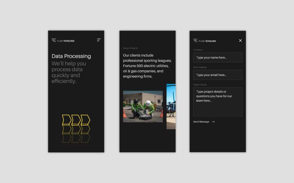
    Flight Evolved is is a remote sensing company in San Diego, CA. Their clients include professional sporting leagues, Fortune 500 electric utilities, oil & gas companies, and engineering firms.

    As their business grew exponentially, they reached out to us to help focus their offering and communicate their value through a custom website.

    Distilling data services

    Leading up to, and during, our partnership with Flight Evolved, the firm was scaling fast. They were adding new clients, bulking up their team, and expanding their service offering to better serve their clients. It was all happening so fast that they had difficulty communicating what they did anymore. 

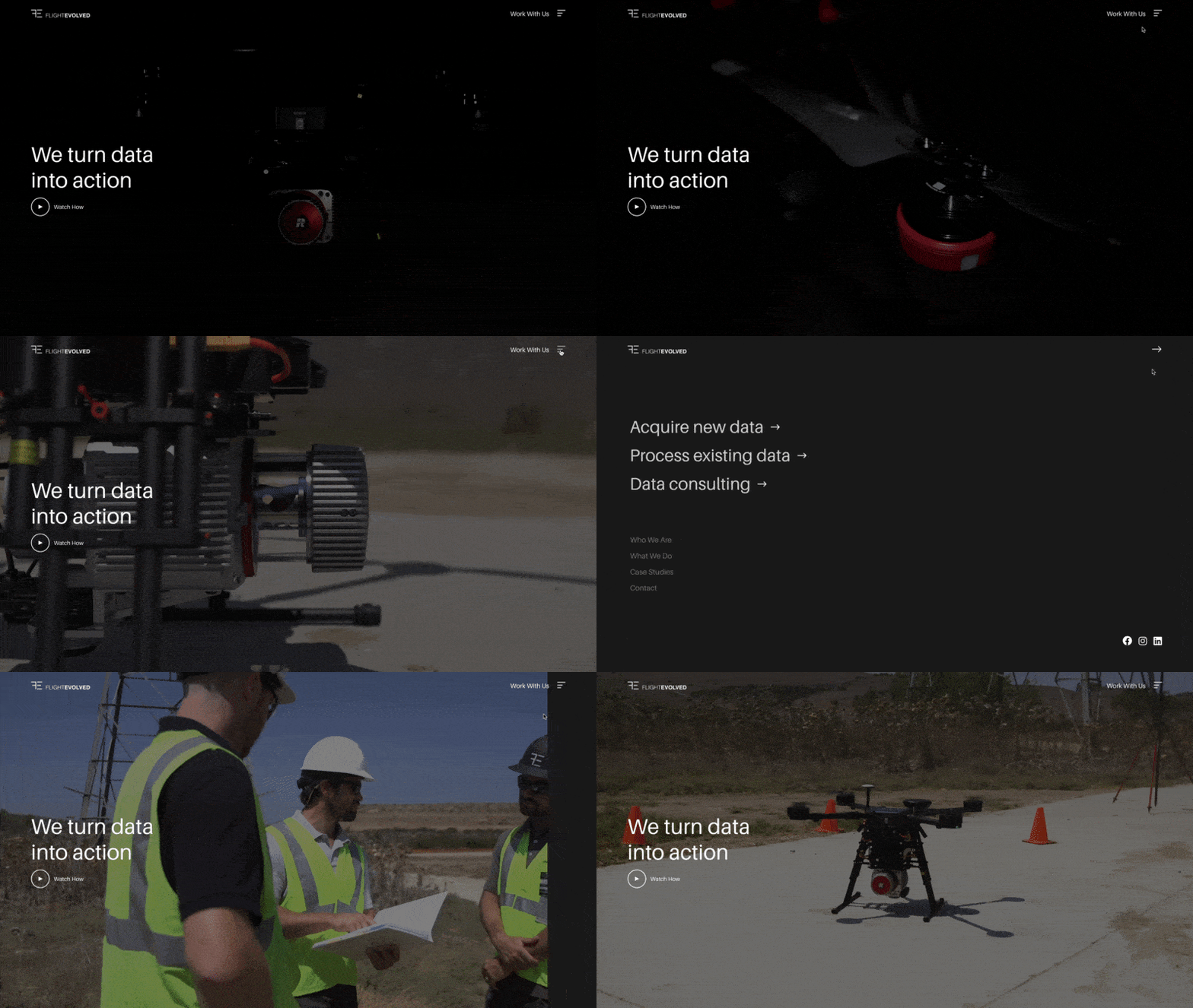
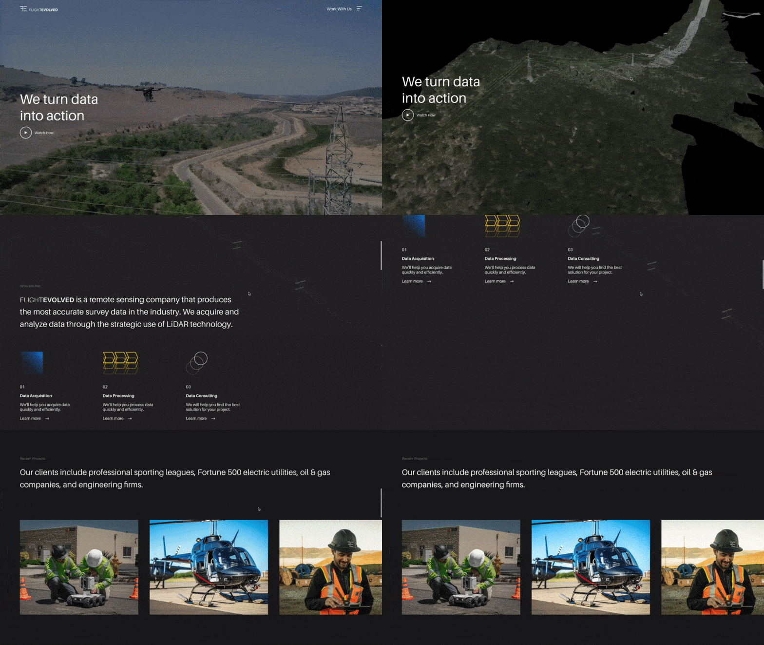
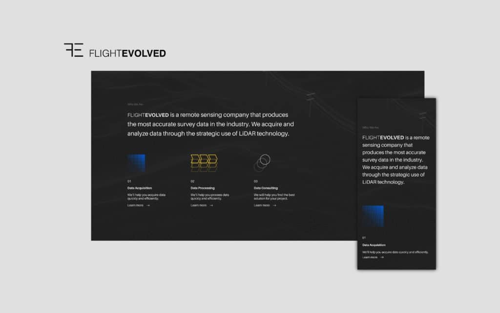
    Flight Evolved Website Home Page

    Through strategic workshops with leadership, we revealed that all their work boiled down to helping their clients do three things: Aquire Data, Process Data, and Understand Data. This process gave us a framework for how to communicate their offering effectively. So we split it up into three related services: Data Acquisition, Data Processing, and Data Consulting.

    Designed to impress

    Embracing Flight Evolved’s sleek brand identity and data-based approach, we designed a website that felt minimal in nature while looking technical in appearance.

    The details make the difference. That’s why we introduced interactive UI (user interface) elements like a sandwich menu that turns into an arrow—and an overlay menu that slides in from the left.

    UI animation

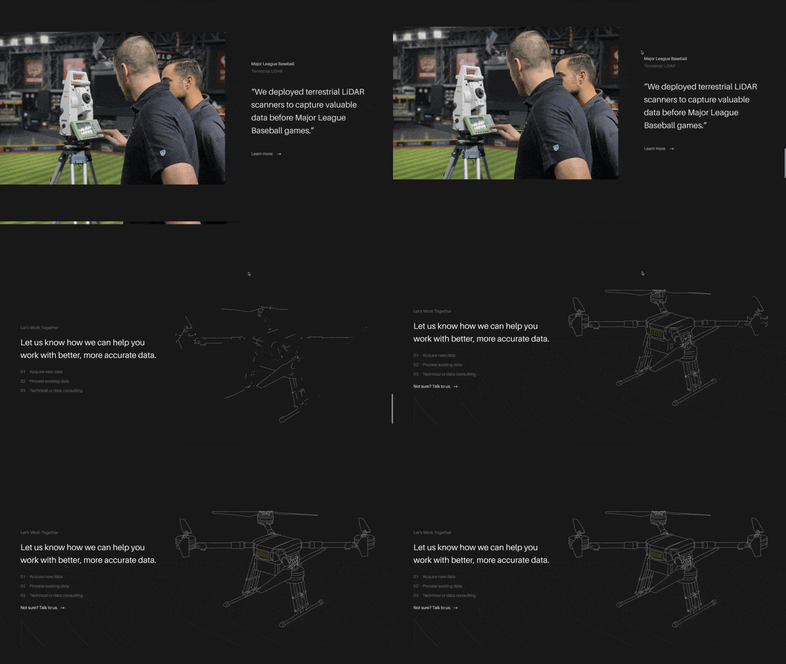
    We also implemented animated line art illustrations of their equipment. We worked directly with their motion design team to prepare an animated drone, rover, and helicopter.

    Animated SVGs

    Using advanced Java, we facilitated smooth background image and video transitions between sections.

    Background fade

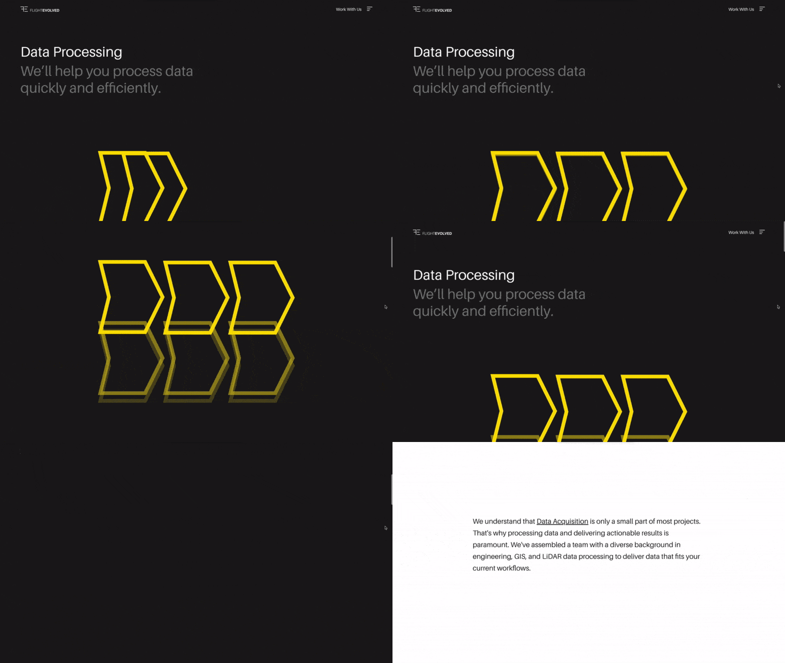
    Each service even got an animated illustration. We aimed to communicate Flight Evolved’s minimal yet technical approach.

    Animated service icons; branded services

    Showcase the work

    Historically, Flight Evolved’s website led prospects down various roads, many leading to empty pages and dead ends. Unless you knew what to look for on their website, it was challenging to find what you’re looking for, let alone understand what they did.

    Drip, Sip, Drink website flow

    Working directly with their team, we mapped out a Drip, Sip, Drink user path that would break their services into bite-sized categories and methodically communicate information. The end goal was to prove up every service with a handful of fascinating case studies and, in turn, invite the captivated readers into a sales conversation.

    “Structure had great insight and was very responsive and attentive. Tough to find this level of professionalism and customer service. Would, and have, recommended Structure to help grow your business.”

    David Ilgenfritz, COO at Flight Evolved

    That’s the good news; here’s the bad.

    In the spirit of our firm belief that vulnerability is valuable in every relationship, life, and work, we want to disclose the good and the bad of this project.

    At the end of the project, the leadership team made a few critical business decisions that shifted the company’s direction and prohibited them from launching the website we worked on together for months. To be honest, it sucks.

    In the end, Flight Evolved was a great partner. We felt like a literal extension of their team. I’m confident that, if you asked them, they’d say the same thing.

    If you want to see the work in-action, you can view the fully developed staging website here.


    Strategy

    Brand Strategy
    Content Strategy
    UX Strategy

    Design

    Brand Design
    UX / UI Design
    Creative Direction
    Visual Design

    Content

    Copywriting
    Art Direction

    Engineering

    Front-end Development
    Back-end Development
    Deployment Architecture
    Content Management System
    Quality Assurance

  • Edifice

    Edifice

    Edifice delivers storage sheds, tiny homes, and small structures with character to residents in New Mexico and the Great Southwest. Over a few months, we helped them establish a brand identity that felt familiar yet differentiated them from an ever-increasing field of competitors.

    Unearthing Identity

    Without an existing brand identity in place, we set out to unearth a meaningful story that would guide the project. Practically, our goals were to develop something that felt New Mexico in-nature, communicated uniqueness but familiarity, and was easily ownable by the team. We dove in, starting with the logo.

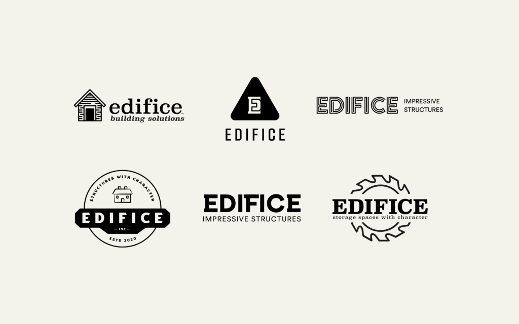
    Edifice Logo Comps

    We designed 22 logo concepts in various styles and compositions. Initially, the team wanted to take a minimalist approach, but we quickly shifted directions after an initial round of audience feedback made it clear that the route felt too impersonal. We went back to the drawing board and spent a little more time uncovering their vision before a more contemporary concept clicked.

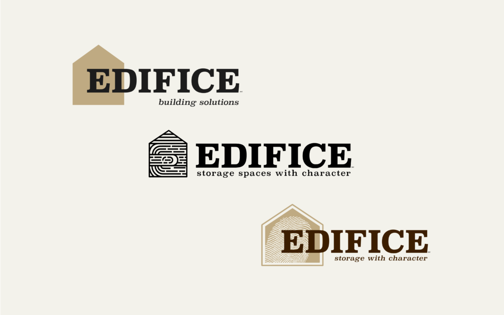
    Edifice Logo Stages

    The thumbprint inside the house represents Edifice’s dedication to making more than structures. It represents their focus on people over profit and communities over conversions. In short, the thumbprint represents humanity in every aspect of their work. It’s a simple, versatile element that helps a simple house illustration permeate meaning into every aspect of their brand.

    Edifice Logo

    To cap off the logo, we delivered a set of guidelines to help the team stay consistent as they fully owned this brand and took Edifice to the streets. These Visual Identity Guidelines defined various elements of the brand:

    • Primary, secondary, and tertiary logo marks
    • Primary and secondary colors
    • Heading and body fonts
    • Usage guidelines

    Creative Collateral

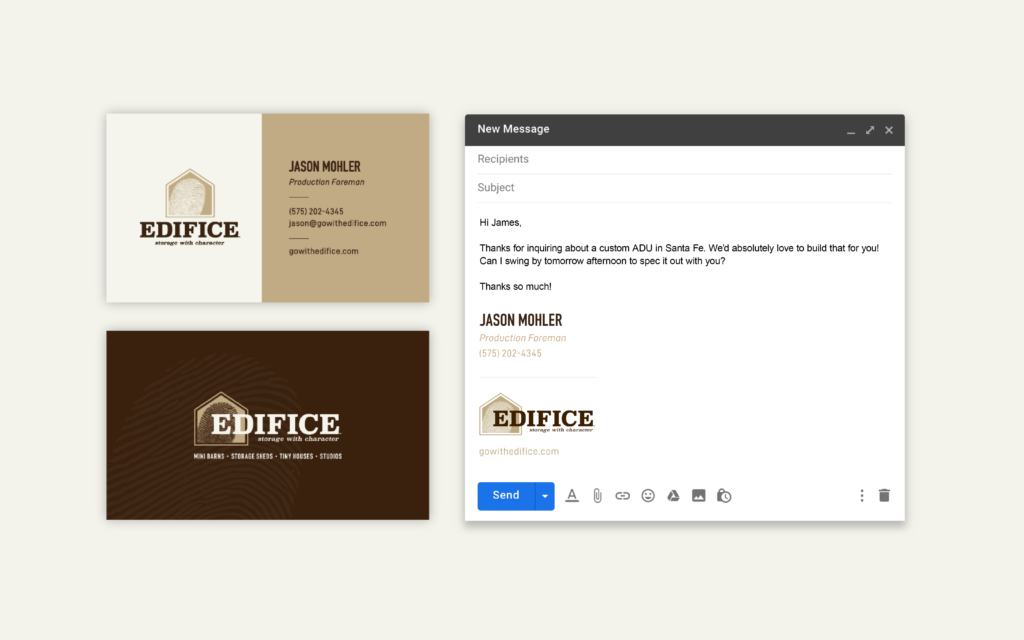
    In essence, while there was a significant physical brand reputation, there In this project, the logo set the stage for essential business collateral. We delivered personalized business cards and a fully-optimized email signature for each of their team members.

    Edifice Business Cards and Email Signature

    We also designed a cast-iron badge that Edifice will nail to each of the structures they build, reinforcing the personal-touch that flows through everything they do.

    Business Is Personal

    Here at Structure, we align closely with Edifice’s approach to business and relationships. It’s a very human, personal approach. Our goal is to make everything about the client and use our skills to benefit them, first and foremost.

    The relationship continues and we’re looking forward to partnering with Edifice to see their unique story unfold.


    Strategy

    Brand Strategy
    Research

    Design

    Brand Design
    Illustration
    Art Direction


  • BeGOAT Website Design

    BeGOAT Website Design

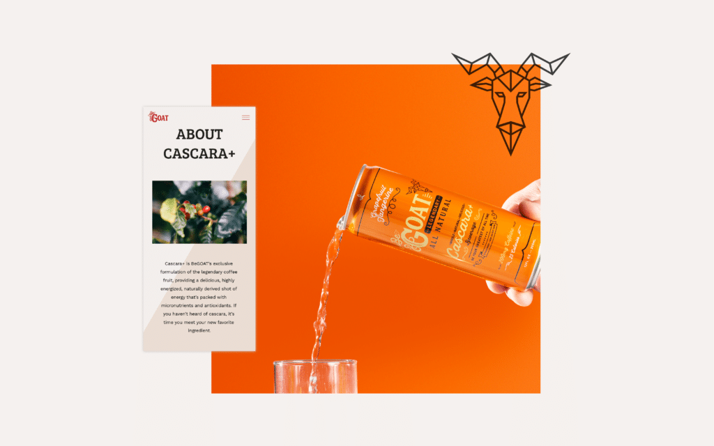
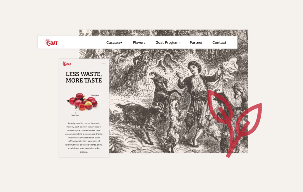
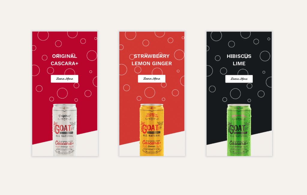
    BeGOAT is an innovative energy drink company that figured out a way to use the trash from coffee fruit and turn it into treasure. We worked to bring their brand to life with a fully-optimized custom website that was interactive and filled with energy.

    The Challenge

    As a new company, BeGOAT needed a website that showcased its product and launched their brand. Our goal for this project was to enable BeGOAT’s core business goals: create demand, deliver distributor leads, and make it easy for current distributors to manage their account and order more product.

    Working closely with RoadTrip, Structure expanded the new brand into a thoughtful digital experience that was appealing on the front end and easy-to-update on the back end.

    DrinkBeGoat.com was fully built on WordPress using Elementor Pro, with custom coded animations that incorporated some advanced interactive elements.

    The Solution

    This simple tech stack enabled RoadTrip and BeGOAT to easily make updates to the website content themselves, without having to engage a professional for the small things. As a new company, this objective was really important.

    As Structure, we were intrigued by the efficiency and sustainability of their product. Instead of using the coffee bean and discarding the coffee fruit, they harvested both and turned it into Cascara: a suite of caffeine, antioxidants, and micronutrients.


    Strategy

    UX Strategy
    Information Architecture
    Content Strategy

    Design

    UX / UI Design
    Creative Direction
    Visual Design
    Motion Design

    Engineering

    Front-end Development
    Content Management System


  • Western Interlock — Content Development

    Western Interlock — Content Development

    Western Interlock needed content development. They are a family-owned manufacturing company that makes high-end paving stones for the Northwest. We helped them reach, influence, and inspire a larger market by showing all generations how they can DIY with WI. 

    The Challenge

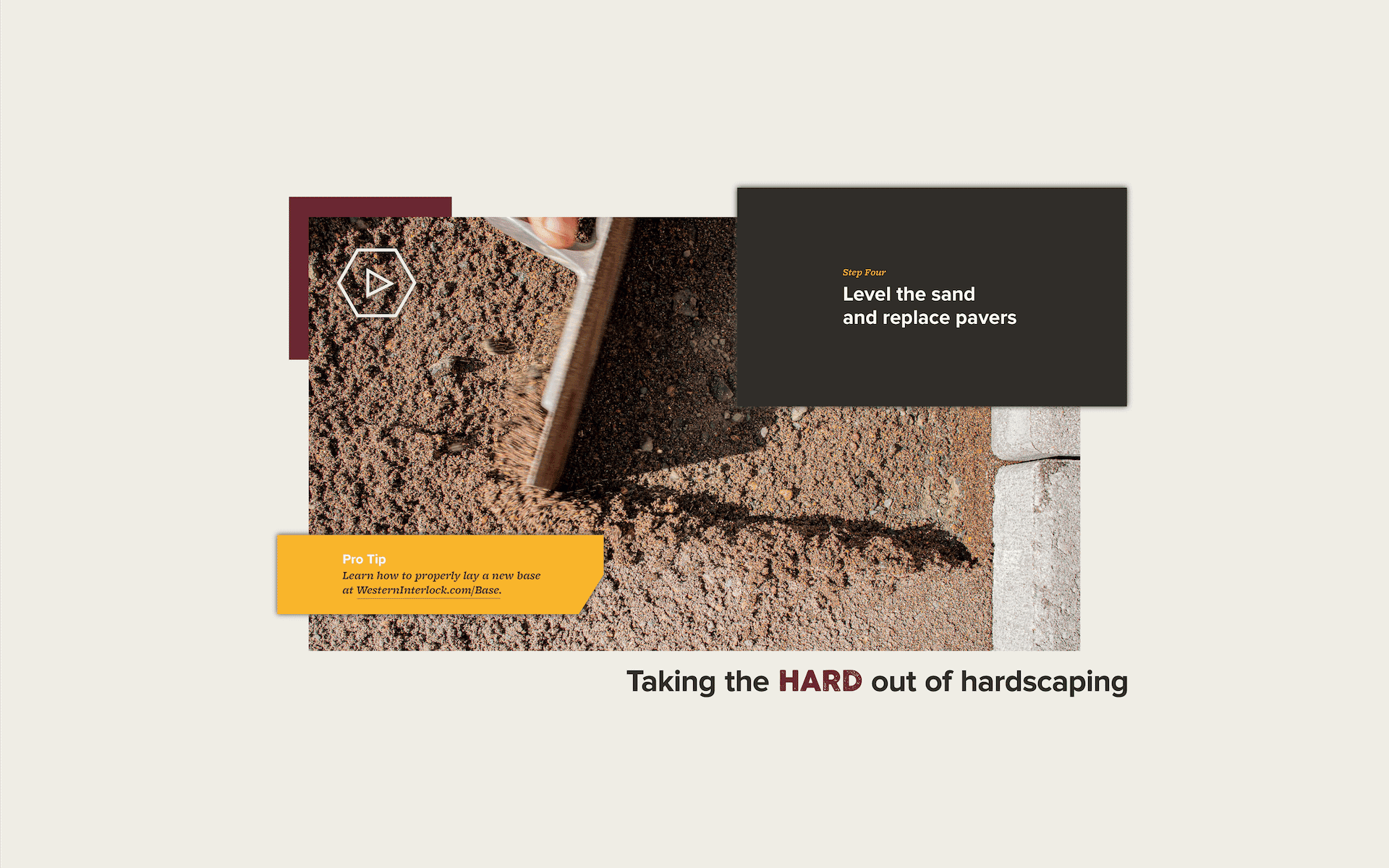
    In early 2019, Western Interlock came to us with a problem: buying and installing paving stones feels daunting, if not completely impossible. In short, their goal was to take the hard out of hardscaping. 

    Western Interlock was already seeing traction with in-person do-it-yourself seminars at their manufacturing facility in Rickreall, ORE. So we suggested scaling that campaign into the digital space. The result of our planning was a content marketing campaign called DIY with WI that would inspire potential customers and help them feel empowered to tackle projects without hesitation.

    Western Interlock Content Development

    Content Development & Company Development

    There was another challenge hidden behind the curtain. Not only were we helping people hardscape, but we were also helping a 25-year-old family-owned brick-and-mortar manufacturing brand update it’s marketing from physical to digital.

    In essence, while there was a significant physical brand reputation, there was little-to-no digital brand recognition. Part of our work was to transmit the Western Interlock story and culture to channels like Google, YouTube, Facebook.

    Western Interlock Content Development

    Marketing

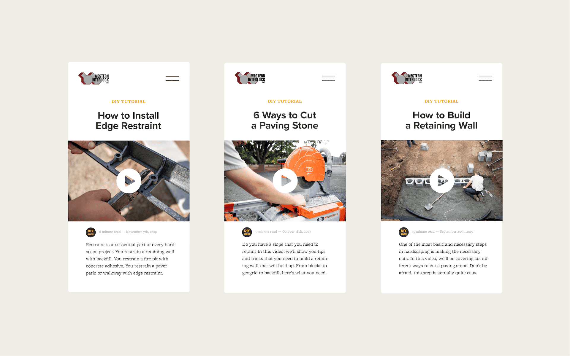
    We’ve published 150+ new tutorials in three years on How to Build a Retaining Wall, How to Cut a Paving Stone, How to Build a Fire Pit, and much more.

    Within a year of publishing the first DIY tutorial, Western Interlock saw a 351.97% organic increase in new users on their website, according to Google Analytics.

    Most notably, sales calls increased by 50.74%.

    “Sales Representatives keep telling me how this DIY with WI content cuts their talk time in half. Now we have well-documented answers to many customer’s most common questions about our products and how to use them. You’re making it much easier to make a sale and keep existing customers happy. Thank you!”

    Colin Domoschofsky, Marketing, Western Interlock

    By the end of 2019, we helped Western Interlock reach a new customer segment they may have never reached if they didn’t invest in such an approachable content development strategy. This only means one thing: sales are through the roof.

    Continuing the Content Development Campaign

    At Structure, we have a saying: Business Is Personal. This means we embrace uncommon levels of humility, selflessness, and transparency for the good of our clients. In short, we make everything about the client.

    We understand that this approach is a bit unconventional. But that’s what makes it so unique.

    “Structure has been amazing to work with. We are extremely satisfied with the work that they’ve done for us! I’d recommend them highly to anyone.”

    Nathan Wright, Director of Marketing, Western Interlock

    We’re proud of our work. However, we’re even more proud of the partnership we’ve built with Western Interlock. After three years, we’re still going strong.